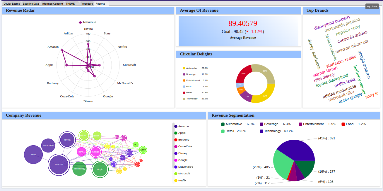
Dash Pro enhances the visual analytics experience by empowering users to craft dynamic dashboards for their projects. This feature allows for the seamless creation and customization of graphical charts, to modify and interact with data in multiple ways.
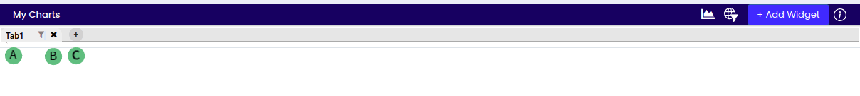
A: By default, the tab is created with the name “Tab1”. Tab(s) can be renamed by double-clicking on the title and then hitting the “Enter” key to confirm the change.
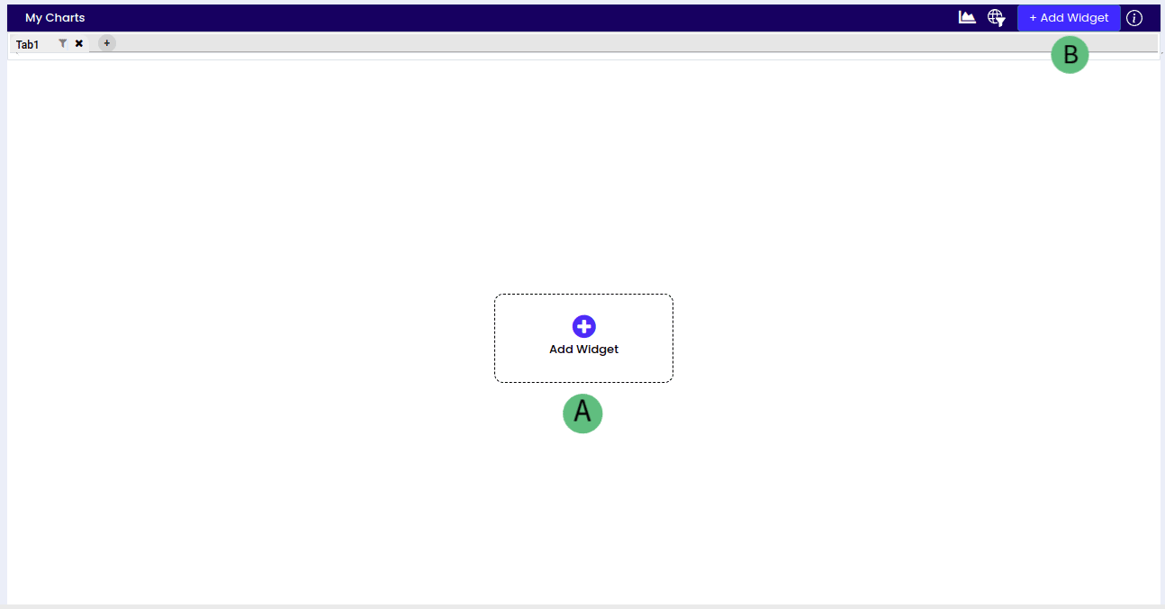
A and B: To initiate a new chart, utilize the ‘Add Widget’ function. This function is typically found either at the center of the dashboard or in the top right corner within the dashboard options specifically designated for widget creation.
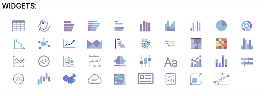
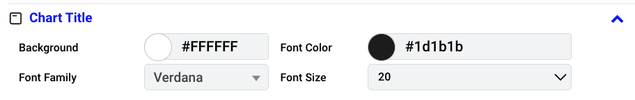
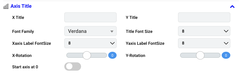
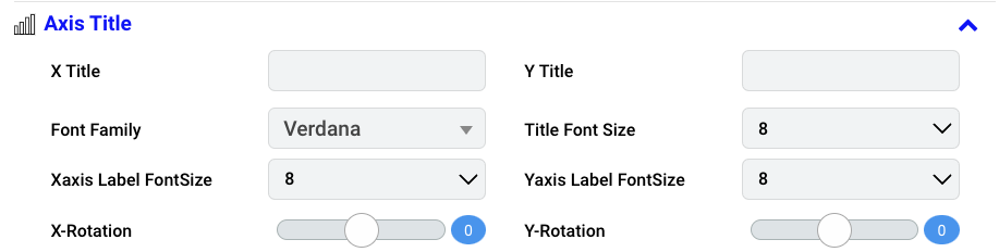
Graphs typically comprise key elements such as Axes, Axis Title, Chart Title, and Chart Format, essential for creative editing in visual representations.
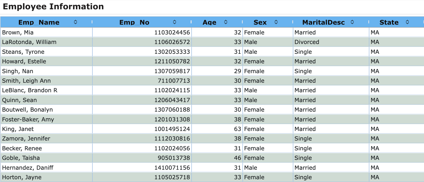
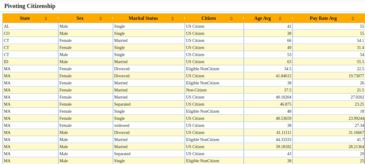
Table Columns: Vertical divisions in a table structure. Each column is designated for a specific category of information, indicated by a heading.
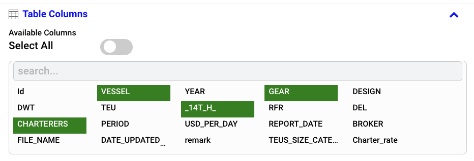
Enable the “Select All” feature to choose all available columns as needed otherwise choose the necessary columns individually based on your requirements.
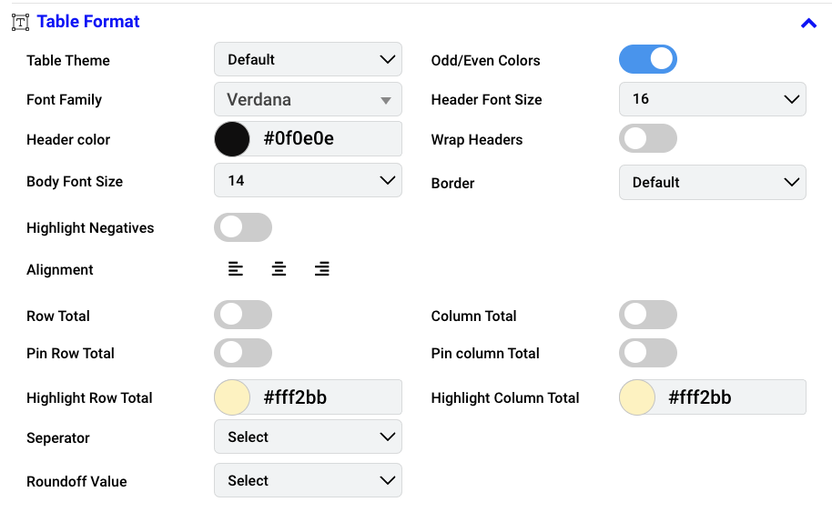
Table Theme: Choose a pre-defined theme from the dropdown menu to modify the table’s aesthetic.
Font Family: Choose your preferred font style for the chart’s elements and select the font family for the text within the table from a dropdown menu e.g., Narkism, Calibri.
Header Color: Set the color for the chart header by customizing it from the dropdown menu.
Body Font Size: Determine the text size for the body content in the chart by selecting the font size from 8 to 60.
Highlight Negatives: Highlight negative values in the chart by enabling the ‘highlight negatives’ feature if necessary.
Alignment: Adjust the positioning of text or elements within the table by choosing alignment options: left, center, and right.
Row Total: Calculate and display the sum of row values. Enable if necessary.
Column Total: Calculate and display the sum of column values. Enable if necessary.
Pin Row Total: Position row totals on the right side of the table. Enable based on your preferences.
Pin Column Total: Position column totals at the bottom of the table. Enable based on your preferences.
Highlight Row Total: Enhance visibility of row totals in the table. Customize the color based on your preferences.
Highlight Column Total: Enhance visibility of column totals in the table. Customize the color based on your preferences.
Separator: Select a symbol for distinguishing thousands or decimals in numerical values. Choose according to your preferences (e.g., ###,###,### or ##,##,##,###).
Roundoff Value: Determine how numerical values are rounded in the table. Choose a roundoff value within the range of 0 to 5.
Odd/Even Colors: Alternate background colors for rows in the table. Enable based on your preferences.
Header Font Size: Set the size of the text for headers in the table. Select the header font size from 8 to 60.
Wrap Headers: Adjust the text layout automatically for headers. Enable based on your preferences.
Border: Define the outlining of cells or elements in the table. Choose the border style from available options.
Table Theme: Choose a pre-defined theme from the dropdown menu to modify the table’s aesthetic.
Font Family: Choose your preferred font style for the chart’s elements and select the font family for the text within the table from a dropdown menu e.g., Narkism, Calibri.
Header Color: Set the color for the chart header by customizing it from the dropdown menu.
Hide Aggregation on Header: Enable the toggle to hide the aggregation located at the top of the header if needed.
Pannel Font Size: Refers to the text size within a visual panel.
Highlight Negatives: Highlight negative values in the chart by enabling the ‘highlight negatives’ feature if necessary.
Alignment: Adjust the positioning of text or elements within the table by choosing alignment options: left, center, and right.
Row Total: Calculate and display the sum of row values. Enable if necessary.
Column Total: Calculate and display the sum of column values. Enable if necessary.
Grand Total: Calculates the sum of all values in a table. Enable this feature based on your preferences.
Valuewise Total: Performs aggregation based on the selected variables under the columns section in a table. Enable this feature based on your preferences.
Highlight Column Total: Highlights the sum of column total. Enable this feature and customize the color according to your preferences.
Highlight Valuewise Total: Highlights the sum of individual values in a table. Customize the color based on your preferences..
Highlight Grand Total: Highlights the sum of all values in a table. Customize the color based on your preferences.
Expand Row Groups: Allows expansion of grouped rows in the table. Enable this feature based on your preferences.
Expand Column Groups: Allows expansion of grouped columns in the table. Enable this feature based on your preferences.
Collapse Row Groups: Hides the expanded rows in a table. Enable this feature based on your preferences.
Collapse Column Groups: Hides the expanded columns in a table. Enable this feature based on your preferences.
Separator: Select a symbol for distinguishing thousands or decimals in numerical values. Choose according to your preferences (e.g., ###,###,### or ##,##,##,###).
Roundoff Value: Determine how numerical values are rounded in the table. Choose a roundoff value within the range of 0 to 5.
Odd/Even Colors: Alternate background colors for rows in the table. Enable based on your preferences.
Header Font Size: Set the size of the text for headers in the table. Select the header font size from 8 to 60.
Wrap Headers: Adjust the text layout for headers automatically. Enable based on your preferences.
Border: Define the outlining of cells or elements in the table. Choose the border style from available options.
Body Font Size: Determine the text size for the body content in the chart by selecting the font size from 8 to 60.
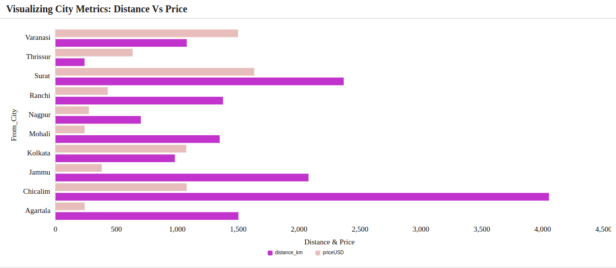
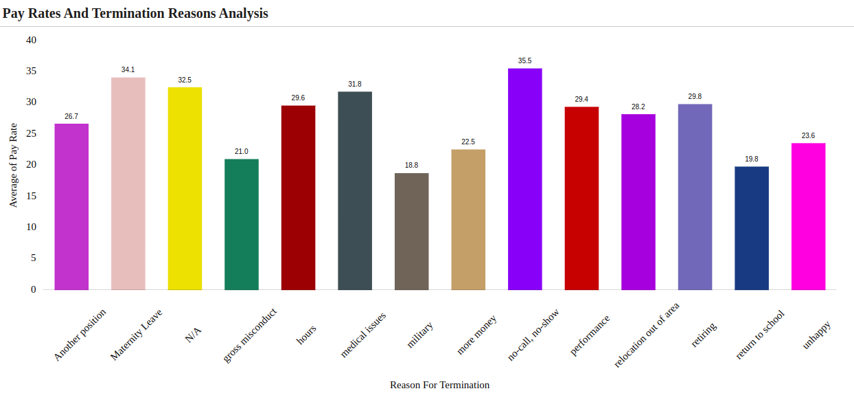
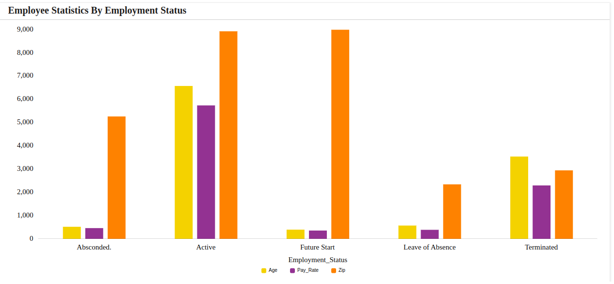
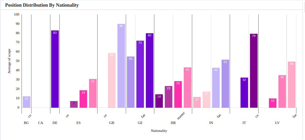
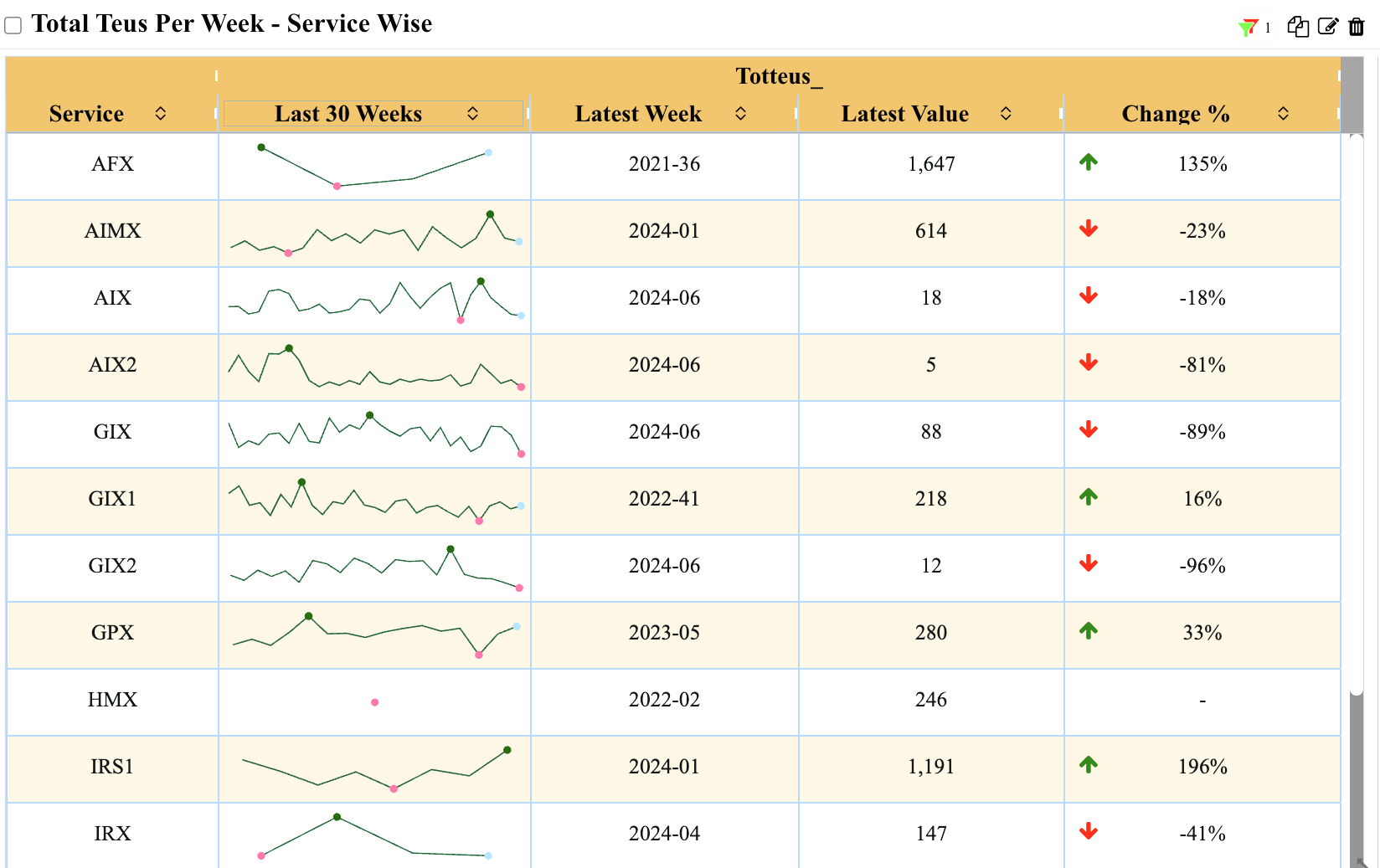
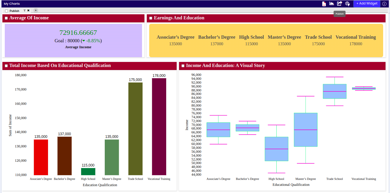
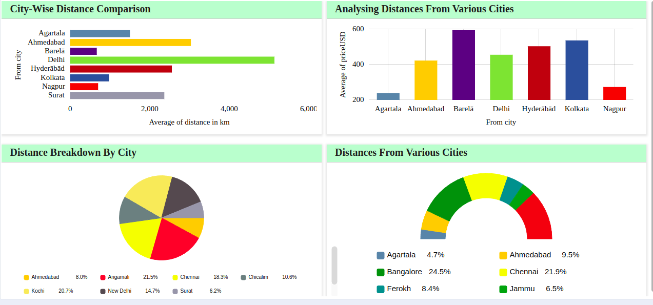
A bar chart plots numeric values for levels of a categorical feature as bars. Levels are plotted on one chart axis, and values are plotted on the other axis. Each categorical value claims one bar, and the length of each bar corresponds to the bar’s value. Bars are plotted on a common baseline to allow for easy comparison of values.
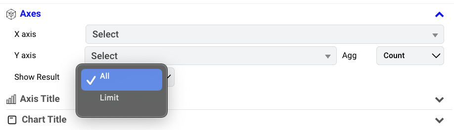
Show Result: Toggle through the “Show Result” dropdown: select “All” for a panoramic view or “Limit” for precision. Option for ‘Top’ to focus on heights or ‘Bottom’ for depths to tailor your data revelation.
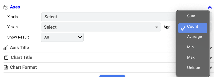
Aggregate Options: Aligns with the available options — Sum, Count, Average, Min, Max and Unique. Choose the aggregate that best fits your input.
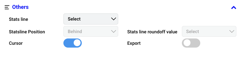
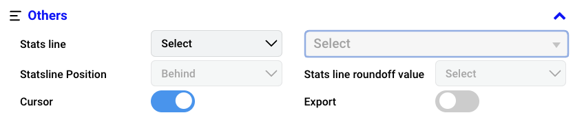
Stats line: Represents a statistical line overlaid on the chart, offering insights into data trends. Select Stats line from the available options such as Q1, Q3, Mean, Median, Standard Deviation, Min, Max and Custom.
Stats line Position: Sets the placement of the statistical line relative to data points on the chart. Select the position of the statistics line on the chart from the available option Behind (Behind the chart) and Above (Above the chart).
Cursor: Enable a cursor to visualize additional data details when hovering over the chart.
Stats line Roundoff Value: Determines Choose a roundoff value to determine how numerical values are rounded in the chart. Select from the 0 to 5.
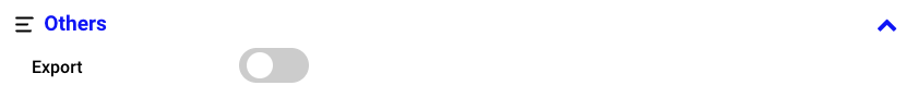
Export: In order to export the chart, enable the Export option and apply the changes. You can find the option to export the specific chart in both the chart and dashboard. Export the image as PNG, JPG, and SVG, and download the data as JSON, CSV, XLSX, and HTML. Additionally, print is also available.
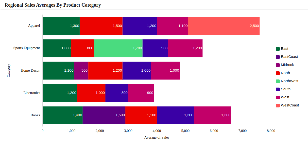
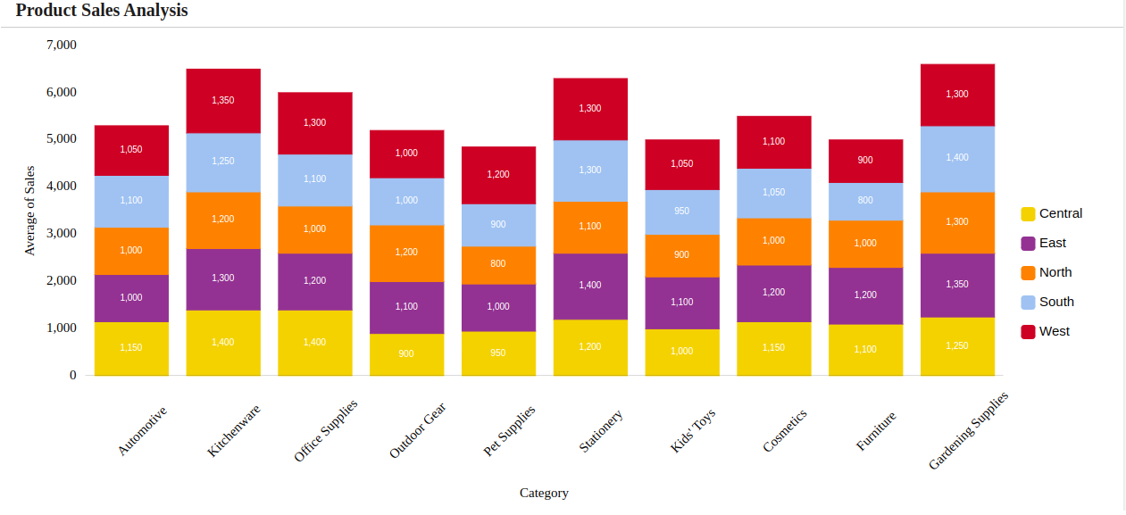
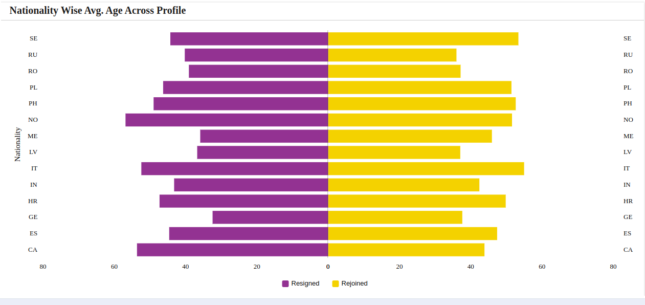
A stacked bar graph is a chart that uses bars to show comparisons between categories of data. Each bar in the chart represents a whole, and segments in the bar represent categories of that whole. this graph consists of multiple bar series stacked horizontally one after another. The length of each series is determined by the value in each data point.
Color: Assign distinct colors to each category to represent data uniquely within the chart.
Show Result Dropdown: Toggle through the “Show Result” dropdown: select “All” for a panoramic view or “Limit” for precision. Option for ‘Top’ to focus on heights or ‘Bottom’ for depths to tailor your data revelation.
Aggregate Options: Aligns with the available options — Sum, Count, Average, Min, Max and Unique. Choose the aggregate that best fits your input.
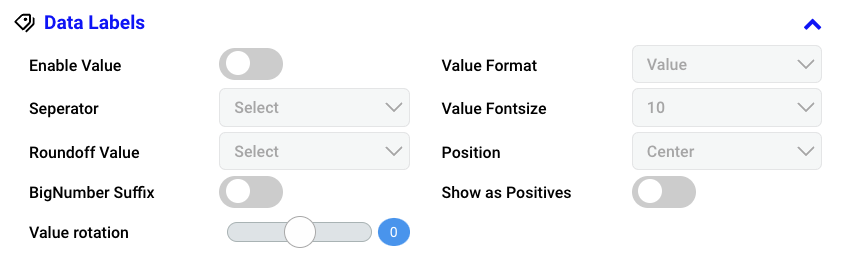
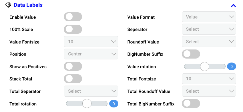
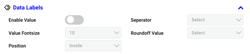
Enable Value: Displays actual data values on the chart. Enable based on your preferences.
Value Format: Choose the format in which the data values are displayed on a chart such as Value, Percentage.
100% Scale: Represents each bar as a percentage of the total.
Value Fontsize: Determines the size of the font for displaying data values on the chart. Select the value font size from the dropdown menu.
Position: Set where the data values are placed in relation to their corresponding data points.
Show as Positives: Displays negative values as positive for visual representation without altering the actual data in a chart. Enable If required.
Stack Total: Refers to the sum of values in a stacked chart, displaying the cumulative total for each category or data series at a given point. Enable based on your preferences.
Total Fontsize: Specifically denotes the font size applied to the stack total values in the chart.
Total Seperator: Choose the symbol used to separate thousands or decimals in the stack total values displayed in the chart, according to your preference.
Total Roundoff Value: Determines how numerical values for the stack total are rounded in the chart. Choose a roundoff value within the range of 0 to 5.
Total Rotation: Adjust the rotation angle for the display of total values in the stack.
Total BigNumber Suffix: Allows appending a suffix to large total stack numbers.
Separator: Chooses a symbol to mark thousands or decimals in numerical values. Dropdown to select the separator for the data values (#,### & #,##).
Roundoff Value: Define how numerical values are rounded off. Choose the desired roundoff value form the dropdown.
BigNumber Suffix: Adds a character (e.g., ‘K’ for thousands) to large numbers in data labels for clarity. Enable this feature if required.
Value Rotation: Adjusts the angle of data value labels on the chart. If required, adjust the orientation of the data value labels.
Value Format: Choose the format in which the data values are displayed on a chart such as Value, Percentage.
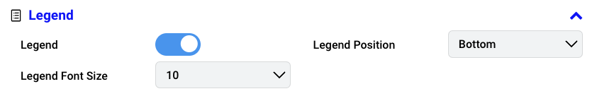
Legend: Visual element on a chart explaining the symbols or colors representing different data series. Enable chart legend as needed.
Legend Font Size: Specifies the size of the text in the chart legend. Select the font size for the legend’s text.
Legend Position: Determine the placement of the chart legend. Dropdown to choose the position of the legend on the chart such as Top, Left, Bottom and Right.
Stats line: Represents a statistical line overlaid on the chart, offering insights into data trends. Select Stats line from the available options such as Q1, Q3, Mean, Median, Standard Deviation, Min, Max, Custom.
Stats line Position: Sets the placement of the statistical line relative to data points on the chart. Select the position of the statistics line on the chart from the available option Behind (Behind the chart) and Above (Above the chart).
Cursor: Enable a cursor to visualize additional data details when hovering over the chart.
Stats line Roundoff Value: Choose a roundoff value to determine how numerical values are rounded in the chart. Select from the 0 to 5.
Export: In order to export the chart, enable the Export option and apply the changes. You can find the option to export the specific chart in both the chart and dashboard. Export the image as PNG, JPG, and SVG, and download the data as JSON, CSV, XLSX, and HTML. Additionally, print is also available.
Stats line: Represents a statistical line overlaid on the chart, offering insights into data trends. Select Stats line from the available options such as Q1, Q3, Mean, Median, Standard Deviation, Min, Max and Custom.
Stats line Position: Sets the placement of the statistical line relative to data points on the chart. Select the position of the statistics line on the chart from the available option Behind (Behind the chart) and Above (Above the chart).
Statsline Color: Customize the color of the statistical line overlaid on the chart.
Cursor: Enable a cursor to visualize additional data details when hovering over the chart.
Stats line Roundoff Value: Choose a roundoff value to determine how numerical values are rounded in the chart. Select from the 0 to 5.
Export: In order to export the chart, enable the Export option and apply the changes. You can find the option to export the specific chart in both the chart and dashboard. Export the image as PNG, JPG, and SVG, and download the data as JSON, CSV, XLSX, and HTML. Additionally, print is also available.
Column chart is one of the most common and, arguably, the easiest to read chart types when it comes to visualizing category-based values. Rectangular bars are placed along the category axis with bar length representing the value for a specific category.
Show Result Dropdown: Toggle through the “Show Result” dropdown: select “All” for a panoramic view or “Limit” for precision. Option for ‘Top’ to focus on heights or ‘Bottom’ for depths to tailor your data revelation.
Aggregate Options: Aligns with the available options — Sum, Count, Average, Min, Max and Unique. Choose the aggregate that best fits your input.
Stats line: Represents a statistical line overlaid on the chart, offering insights into data trends. Select Stats line from the available options such as Q1, Q3, Mean, Median, Standard Deviation, Min, Max and Custom.
Stats line Position: Sets the placement of the statistical line relative to data points on the chart. Select the position of the statistics line on the chart from the available option Behind (Behind the chart) and Above (Above the chart).
Cursor: Enable a cursor to visualize additional data details when hovering over the chart.
Stats line Roundoff Value: Choose a roundoff value to determine how numerical values are rounded in the chart. Select from the 0 to 5.
Export: In order to export the chart, enable the Export option and apply the changes. You can find the option to export the specific chart in both the chart and dashboard. Export the image as PNG, JPG, and SVG, and download the data as JSON, CSV, XLSX, and HTML. Additionally, print is also available.
Stacked column chart comprises several column series stacked vertically, one on another. The length of each series is determined by the value in each data point.
Color: Assign distinct colors to each category to represent data uniquely within the chart.
Show Result Dropdown: Toggle through the “Show Result” dropdown: select “All” for a panoramic view or “Limit” for precision. Option for ‘Top’ to focus on heights or ‘Bottom’ for depths to tailor your data revelation.
Aggregate Options: Aligns with the available options — Sum, Count, Average, Min, Max and Unique. Choose the aggregate that best fits your input.
Enable Value: Displays actual data values on the chart. Enable based on your preferences.
Value Format: Choose the format in which the data values are displayed on a chart such as Value, Percentage.
100% Scale: Represents each bar as a percentage of the total.
Value Fontsize: Determines the size of the font for displaying data values on the chart. Select the value font size from the dropdown menu.
Position: Set where the data values are placed in relation to their corresponding data points.
Show as Positives: Displays negative values as positive for visual representation without altering the actual data in a chart. Enable If required.
Stack Total: Refers to the sum of values in a stacked chart, displaying the cumulative total for each category or data series at a given point. Enable based on your preferences.
Total Fontsize: Specifically denotes the font size applied to the stack total values in the chart.
Total Seperator: Choose the symbol used to separate thousands or decimals in the stack total values displayed in the chart, according to your preference.
Total Roundoff Value: Determines how numerical values for the stack total are rounded in the chart. Choose a roundoff value within the range of 0 to 5.
Total Rotation: Adjust the rotation angle for the display of total values in the stack.
Total BigNumber Suffix: Allows appending a suffix to large total stack numbers.
Separator: Chooses a symbol to mark thousands or decimals in numerical values. Dropdown to select the separator for the data values (#,### & #,##).
Roundoff Value: Define how numerical values are rounded off. Choose the desired roundoff value form the dropdown.
BigNumber Suffix: Adds a character (e.g., ‘K’ for thousands) to large numbers in data labels for clarity. Enable this feature if required.
Value Rotation: Adjusts the angle of data value labels on the chart. If required, adjust the orientation of the data value labels.
Value Format: Choose the format in which the data values are displayed on a chart such as Value, Percentage.
Legend: Visual element on a chart explaining the symbols or colors representing different data series. Enable chart legend as needed.
Legend Font Size: Specifies the size of the text in the chart legend. Select the font size for the legend’s text.
Legend Position: Determine the placement of the chart legend. Dropdown to choose the position of the legend on the chart such as Top, Left, Bottom and Right.
Stats line: Represents a statistical line overlaid on the chart, offering insights into data trends. Select Stats line from the available options such as Q1, Q3, Mean, Median, Standard Deviation, Min, Max and Custom.
Stats line Position: Sets the placement of the statistical line relative to data points on the chart. Select the position of the statistics line on the chart from the available option Behind (Behind the chart) and Above (Above the chart).
Cursor: Enable a cursor to visualize additional data details when hovering over the chart.
Stats line Roundoff Value: Choose a roundoff value to determine how numerical values are rounded in the chart. Select from the 0 to 5.
Export: In order to export the chart, enable the Export option and apply the changes. You can find the option to export the specific chart in both the chart and dashboard. Export the image as PNG, JPG, and SVG, and download the data as JSON, CSV, XLSX, and HTML. Additionally, print is also available.
Legend: Visual element on a chart explaining the symbols or colors representing different data series. Enable chart legend as needed.
Legend Font Size: Specifies the size of the text in the chart legend. Select the font size for the legend’s text.
Legend Position: Determine the placement of the chart legend. Dropdown to choose the position of the legend on the chart such as Top, Left, Bottom and Right.
Export: In order to export the chart, enable the Export option and apply the changes. You can find the option to export the specific chart in both the chart and dashboard. Export the image as PNG, JPG, and SVG, and download the data as JSON, CSV, XLSX, and HTML. Additionally, print is also available.
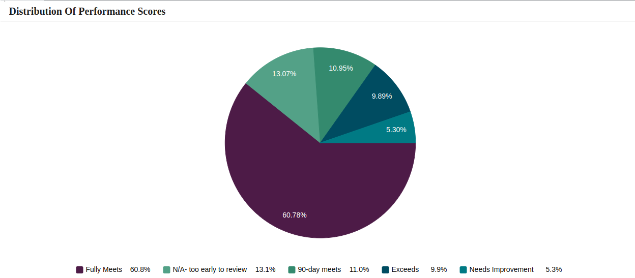
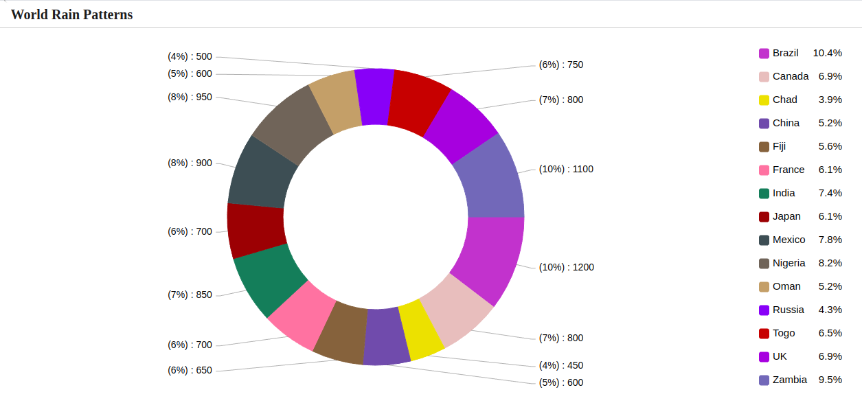
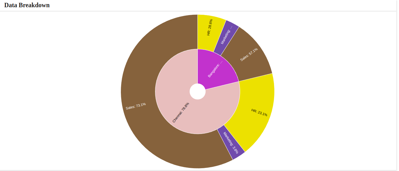
A Donut chart is a circular statistical graphic that represents data in a ring shape, illustrating the percentage distribution of categories within a whole.
Legend: Visual element on a chart explaining the symbols or colors representing different data series. Enable chart legend as needed.
Legend Font Size: Specifies the size of the text in the chart legend. Select the font size for the legend’s text.
Legend Position: Determine the placement of the chart legend. Dropdown to choose the position of the legend on the chart such as Top, Left, Bottom and Right.
Export: In order to export the chart, enable the Export option and apply the changes. You can find the option to export the specific chart in both the chart and dashboard. Export the image as PNG, JPG, and SVG, and download the data as JSON, CSV, XLSX, and HTML. Additionally, print is also available.
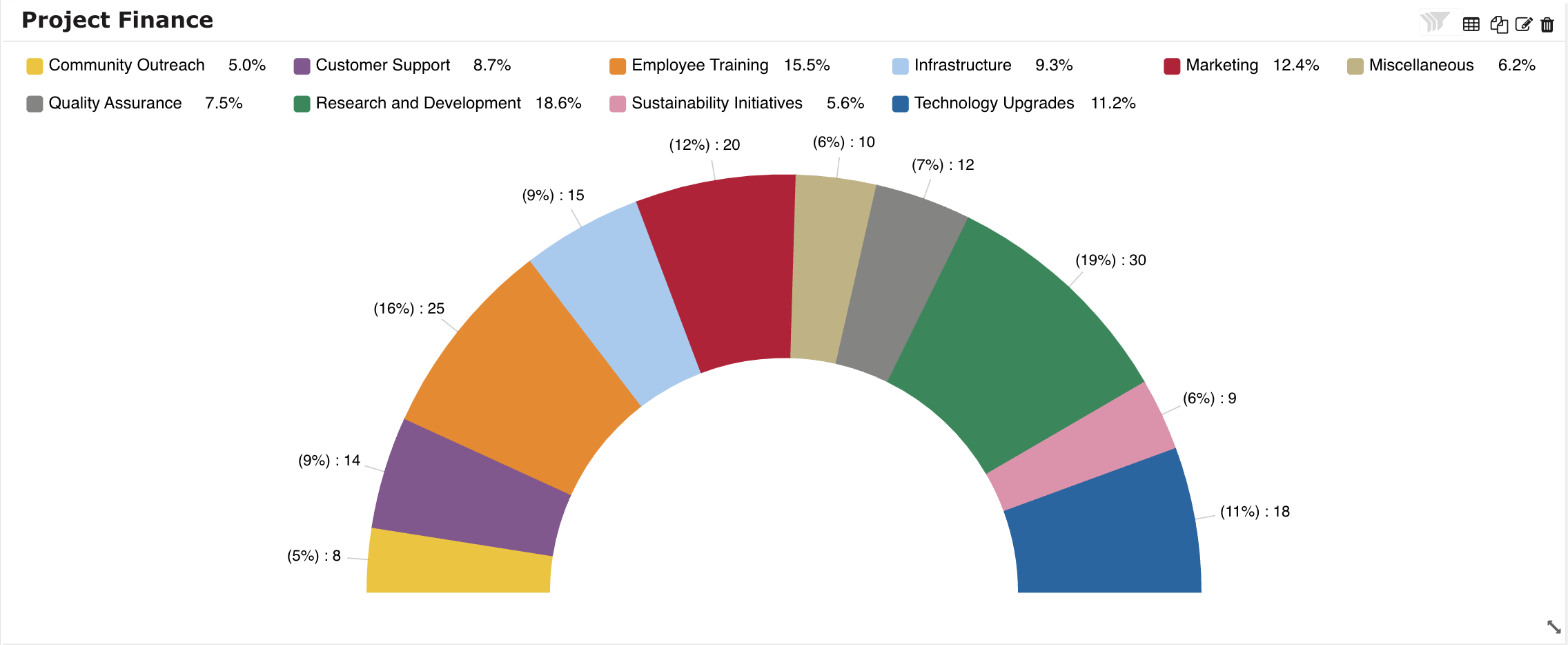
A semicircle is half of a circle, typically described as a two-dimensional geometric shape resembling half of the circumference of a circle, commonly used to show proportions or distributions.
Legend: Visual element on a chart explaining the symbols or colors representing different data series. Enable chart legend as needed.
Legend Font Size: Specifies the size of the text in the chart legend. Select the font size for the legend’s text.
Legend Position: Determine the placement of the chart legend. Dropdown to choose the position of the legend on the chart such as Top, Left, Bottom and Right.
Export: In order to export the chart, enable the Export option and apply the changes. You can find the option to export the specific chart in both the chart and dashboard. Export the image as PNG, JPG, and SVG, and download the data as JSON, CSV, XLSX, and HTML. Additionally, print is also available.
A Sun burst chart effectively illustrates hierarchical data, utilizing concentric rings to represent different levels and segments to signify categories or subcategories.
Legend: Visual element on a chart explaining the symbols or colors representing different data series. Enable chart legend as needed.
Legend Font Size: Specifies the size of the text in the chart legend. Select the font size for the legend’s text.
Legend Position: Determine the placement of the chart legend. Dropdown to choose the position of the legend on the chart such as Top, Left, Bottom and Right.
Export: In order to export the chart, enable the Export option and apply the changes. You can find the option to export the specific chart in both the chart and dashboard. Export the image as PNG, JPG, and SVG, and download the data as JSON, CSV, XLSX, and HTML. Additionally, print is also available.
Cursor: Enable a cursor to visualize additional data details when hovering over the chart.
Export: In order to export the chart, enable the Export option and apply the changes. You can find the option to export the specific chart in both the chart and dashboard. Export the image as PNG, JPG, and SVG, and download the data as JSON, CSV, XLSX, and HTML. Additionally, print is also available.
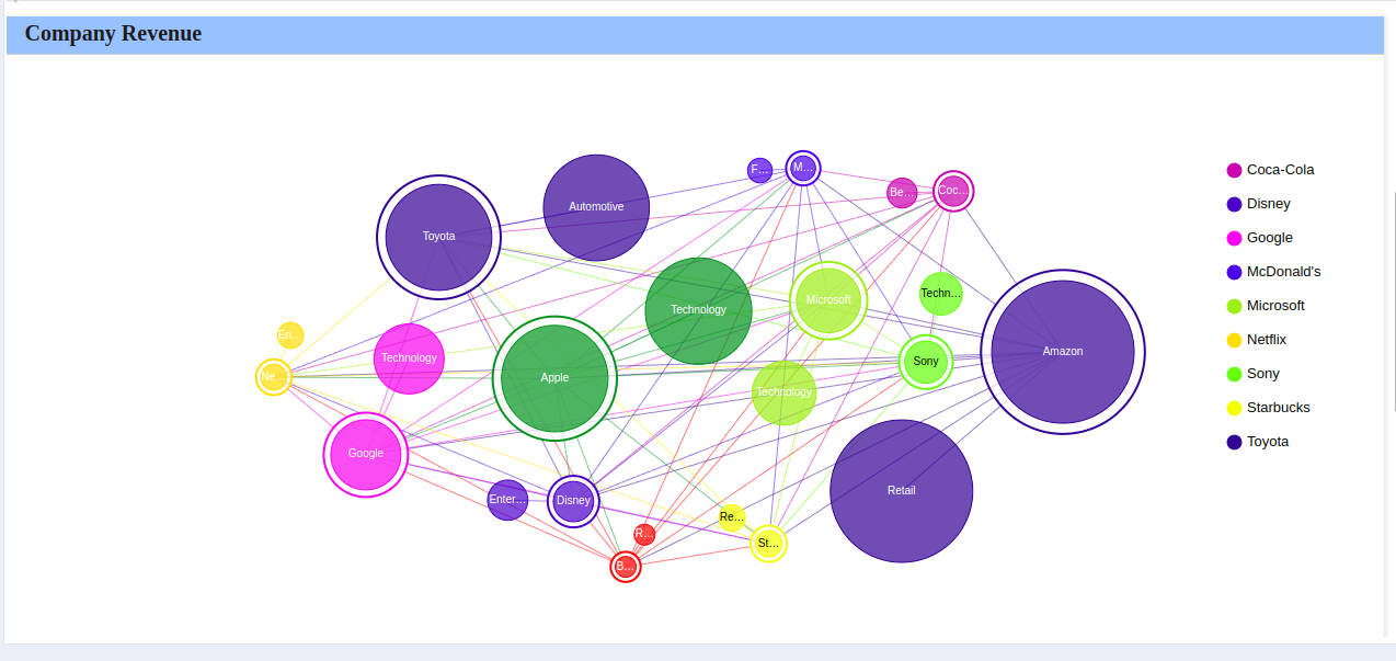
A Network chart visualizes relationships between entities (nodes) through connecting lines (edges). Useful for illustrating complex networks and dependencies in data.
Legend: Visual element on a chart explaining the symbols or colors representing different data series. Enable chart legend as needed.
Legend Font Size: Specifies the size of the text in the chart legend. Select the font size for the legend’s text.
Legend Position: Determine the placement of the chart legend. Dropdown to choose the position of the legend on the chart such as Top, Left, Bottom and Right.
Export: In order to export the chart, enable the Export option and apply the changes. You can find the option to export the specific chart in both the chart and dashboard. Export the image as PNG, JPG, and SVG, and download the data as JSON, CSV, XLSX, and HTML. Additionally, print is also available.
Show Result: Toggle through the “Show Result” dropdown: select “All” for a panoramic view or “Limit” for precision. Option for ‘Top’ to focus on heights or ‘Bottom’ for depths to tailor your data revelation.
Aggregate Options: Aligns with the available options — Sum, Count, Average, Min, Max and Unique. Choose the aggregate that best fits your input.
Legend: Visual element on a chart explaining the symbols or colors representing different data series. Enable chart legend as needed.
Legend Font Size: Specifies the size of the text in the chart legend. Select the font size for the legend’s text.
Legend Position: Determine the placement of the chart legend. Dropdown to choose the position of the legend on the chart such as Top, Left, Bottom and Right.
Indicates the percentage variance for the selected columns in the Y-Axis when Date variable are applied to the X-Axis.
Value Font Size: Refers to the specified text size for numerical or data values.
Label Font Size: Pertains to the specified text size for descriptive labels.
Percentage Font Size: Select font size preferences to customize the display of percentage values on the chart.
Deviation Font Family: Choose the font family to specify the font style for deviation.
Deviation Alignment: Choose alignment such as Left, Center and Right to determine the alignment of deviation values relative to their corresponding data points.
Overlap: Enabling overlap will overlap the deviation within the grid.
Order: Determines the arrangement sequence of data point.
Note
% Deviation is applicable for Line, Area, and Multiple Axis chart.
Stats line: Represents a statistical line overlaid on the chart, offering insights into data trends. Select Stats line from the available options such as Q1, Q3, Mean, Median, Standard Deviation, Min, Max and Custom.
Stats line Position: Sets the placement of the statistical line relative to data points on the chart. Select the position of the statistics line on the chart from the available option Behind (Behind the chart) and Above (Above the chart).
Cursor: Enable a cursor to visualize additional data details when hovering over the chart.
Stats line Roundoff Value: Choose a roundoff value to determine how numerical values are rounded in the chart. Select from the 0 to 5.
Export: In order to export the chart, enable the Export option and apply the changes. You can find the option to export the specific chart in both the chart and dashboard. Export the image as PNG, JPG, and SVG, and download the data as JSON, CSV, XLSX, and HTML. Additionally, print is also available.
Show Result Dropdown: Toggle through the “Show Result” dropdown: select “All” for a panoramic view or “Limit” for precision. Opt for ‘Top’ to focus on heights or ‘Bottom’ for depths to tailor your data revelation.
Aggregate Options: Aligns with the available options — Sum, Count, Average, Min, Max and Unique. Choose the aggregate that best fits your input.
Legend: Visual element on a chart explaining the symbols or colors representing different data series. Enable chart legend as needed.
Legend Font Size: Specifies the size of the text in the chart legend. Select the font size for the legend’s text.
Legend Position: Determine the placement of the chart legend. Dropdown to choose the position of the legend on the chart such as Top, Left, Bottom and Right.
Indicates the percentage variance for the selected columns in the Y-Axis when Date variable are applied to the X-Axis.
Value Font Size: Refers to the specified text size for numerical or data values.
Label Font Size: Pertains to the specified text size for descriptive labels.
Percentage Font Size: Select font size preferences to customize the display of percentage values on the chart.
Deviation Font Family: Choose the font family to specify the font style for deviation.
Deviation Alignment: Choose alignment such as Left, Center and Right to determine the alignment of deviation values relative to their corresponding data points.
Overlap: Enabling overlap will overlap the deviation within the grid.
Order: Determines the arrangement sequence of data point.
Note
% Deviation is applicable for Line, Area, and Multiple Axis chart.
Stats line: Represents a statistical line overlaid on the chart, offering insights into data trends. Select Stats line from the available options such as Q1, Q3, Mean, Median, Standard Deviation, Min, Max and Custom.
Stats line Position: Sets the placement of the statistical line relative to data points on the chart. Select the position of the statistics line on the chart from the available option Behind (Behind the chart) and Above (Above the chart).
Cursor: Enable a cursor to visualize additional data details when hovering over the chart.
Stats line Roundoff Value: Choose a roundoff value to determine how numerical values are rounded in the chart. Select from the 0 to 5.
Export: In order to export the chart, enable the Export option and apply the changes. You can find the option to export the specific chart in both the chart and dashboard. Export the image as PNG, JPG, and SVG, and download the data as JSON, CSV, XLSX, and HTML. Additionally, print is also available.
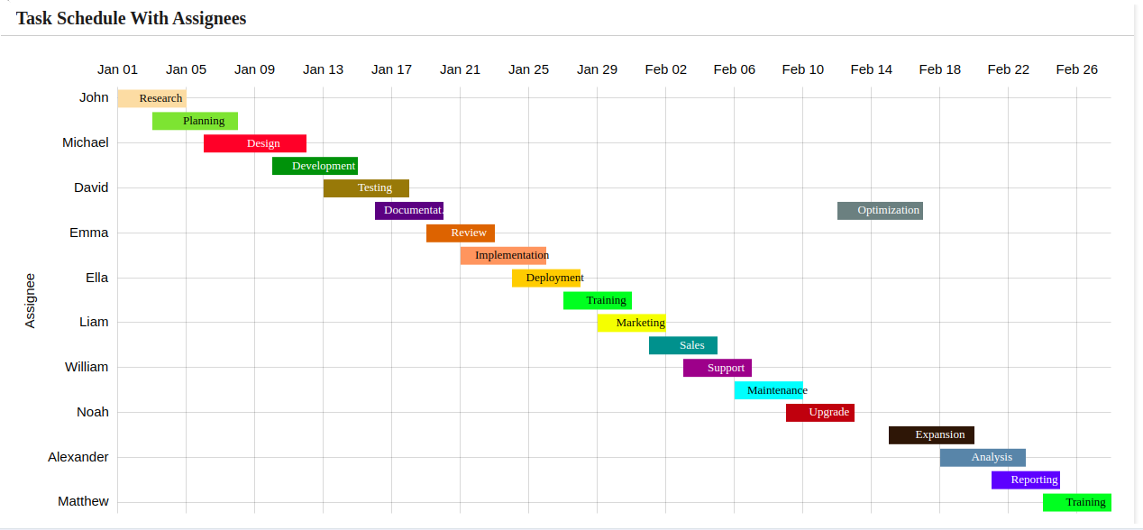
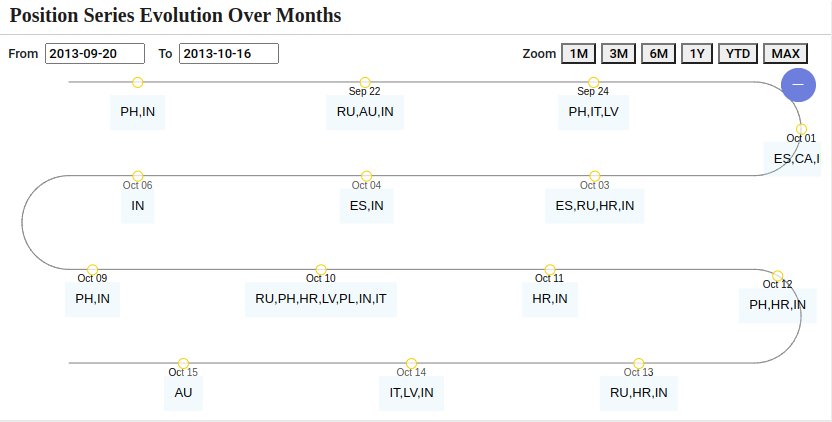
Gantt chart are typically used to display schedules or other time-based activities. It is a variation of a bar chart with a time-based horizontal axis and bars starting at arbitrary values.
Cursor: Enable a cursor to visualize additional data details when hovering over the chart.
Export: In order to export the chart, enable the Export option and apply the changes. You can find the option to export the specific chart in both the chart and dashboard. Export the image as PNG, JPG, and SVG, and download the data as JSON, CSV, XLSX, and HTML. Additionally, print is also available.
Scatter chart is used to display values in a two-dimensional coordinate system. Each point’s location is determined by one of its coordinates on one axis of the chart and the other coordinate on another axis.
Cursor: Enable a cursor to visualize additional data details when hovering over the chart.
Export: In order to export the chart, enable the Export option and apply the changes. You can find the option to export the specific chart in both the chart and dashboard. Export the image as PNG, JPG, and SVG, and download the data as JSON, CSV, XLSX, and HTML. Additionally, print is also available.
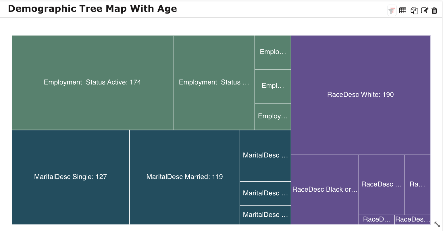
Tree Map displays hierarchical data in the shape of rectangles proportional in size to their value as part of the whole. Each rectangle can be distributed into sub-items according to the values of its children in the hierarchy.
Cursor: Enable a cursor to visualize additional data details when hovering over the chart.
Export: In order to export the chart, enable the Export option and apply the changes. You can find the option to export the specific chart in both the chart and dashboard. Export the image as PNG, JPG, and SVG, and download the data as JSON, CSV, XLSX, and HTML. Additionally, print is also available.
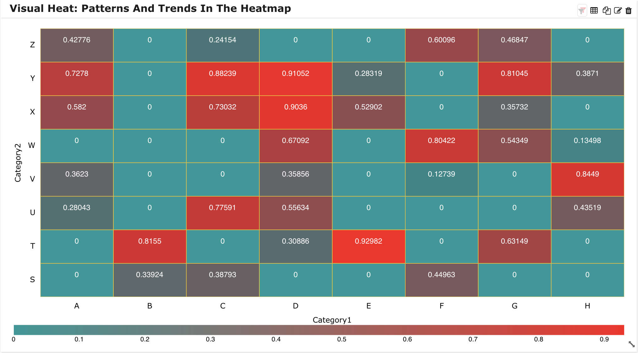
It’s a two-dimensional expression of data in which values are defined by colors. It represents data in a tabular format with user-defined color ranges like low, average, and high and provides an immediate visual summary of the data.
Cursor: Enable a cursor to visualize additional data details when hovering over the chart.
Export: In order to export the chart, enable the Export option and apply the changes. You can find the option to export the specific chart in both the chart and dashboard. Export the image as PNG, JPG, and SVG, and download the data as JSON, CSV, XLSX, and HTML. Additionally, print is also available.
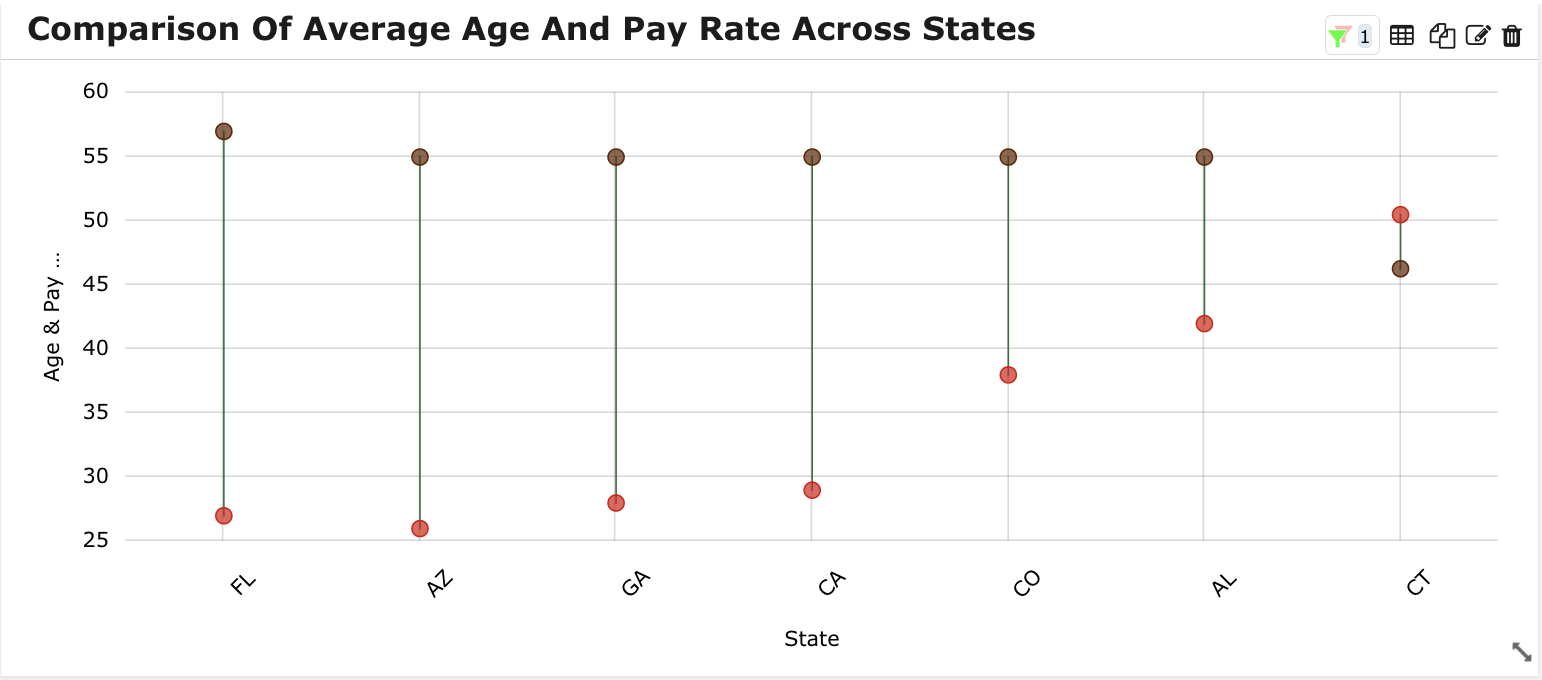
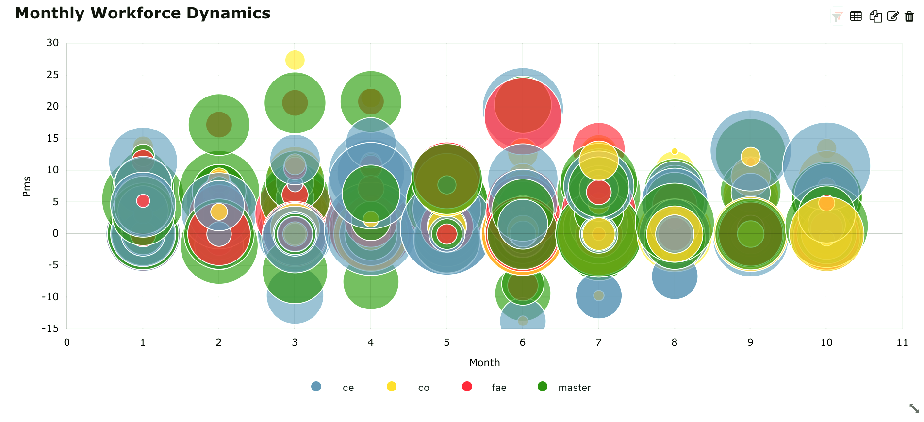
This graph extends the bar chart, plotting numeric values for levels of two categorical variables instead of one. Bars are grouped by position for levels of one categorical variable, with color indicating the secondary category level within each group.
Cursor: Enable a cursor to visualize additional data details when hovering over the chart.
Export: In order to export the chart, enable the Export option and apply the changes. You can find the option to export the specific chart in both the chart and dashboard. Export the image as PNG, JPG, and SVG, and download the data as JSON, CSV, XLSX, and HTML. Additionally, print is also available.
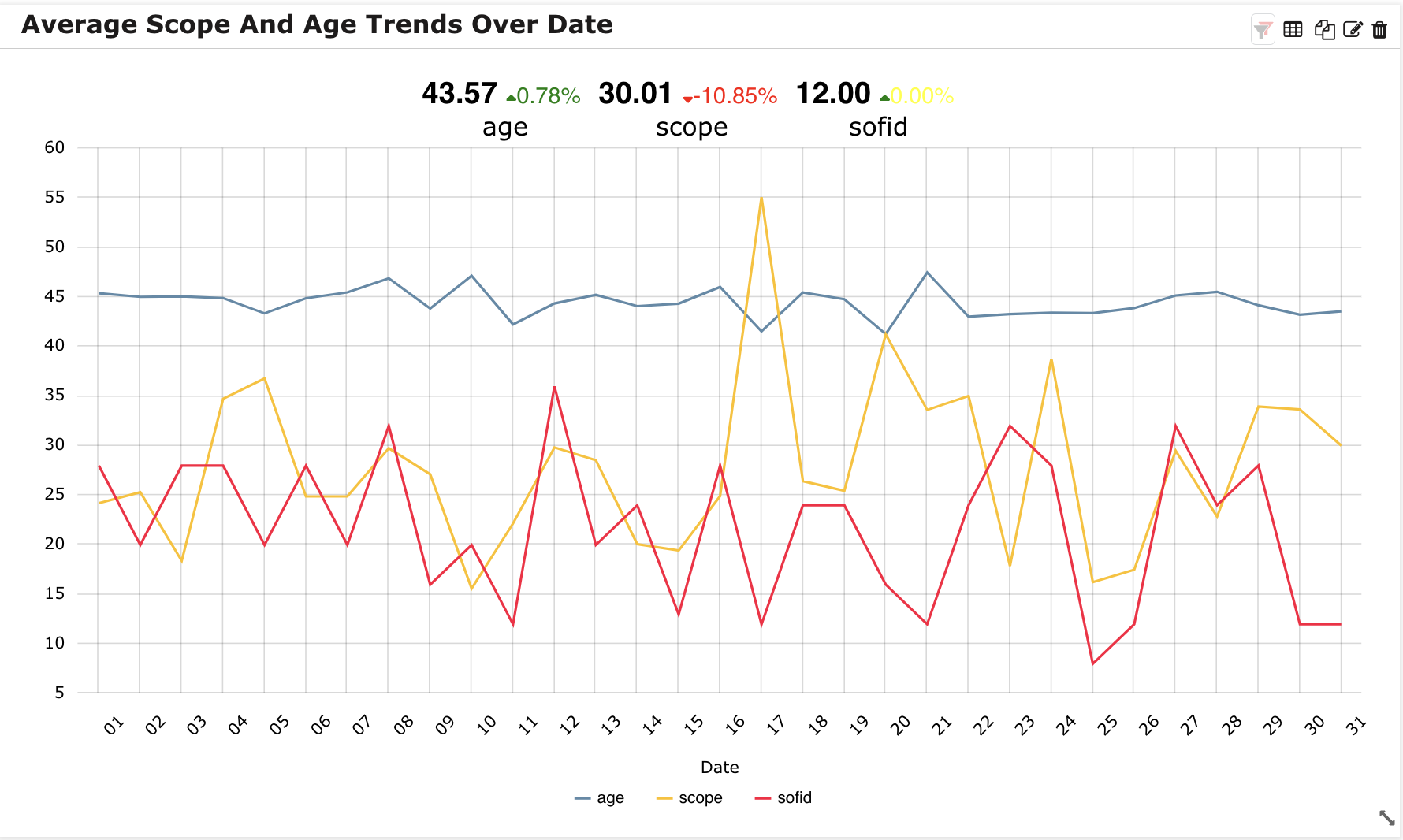
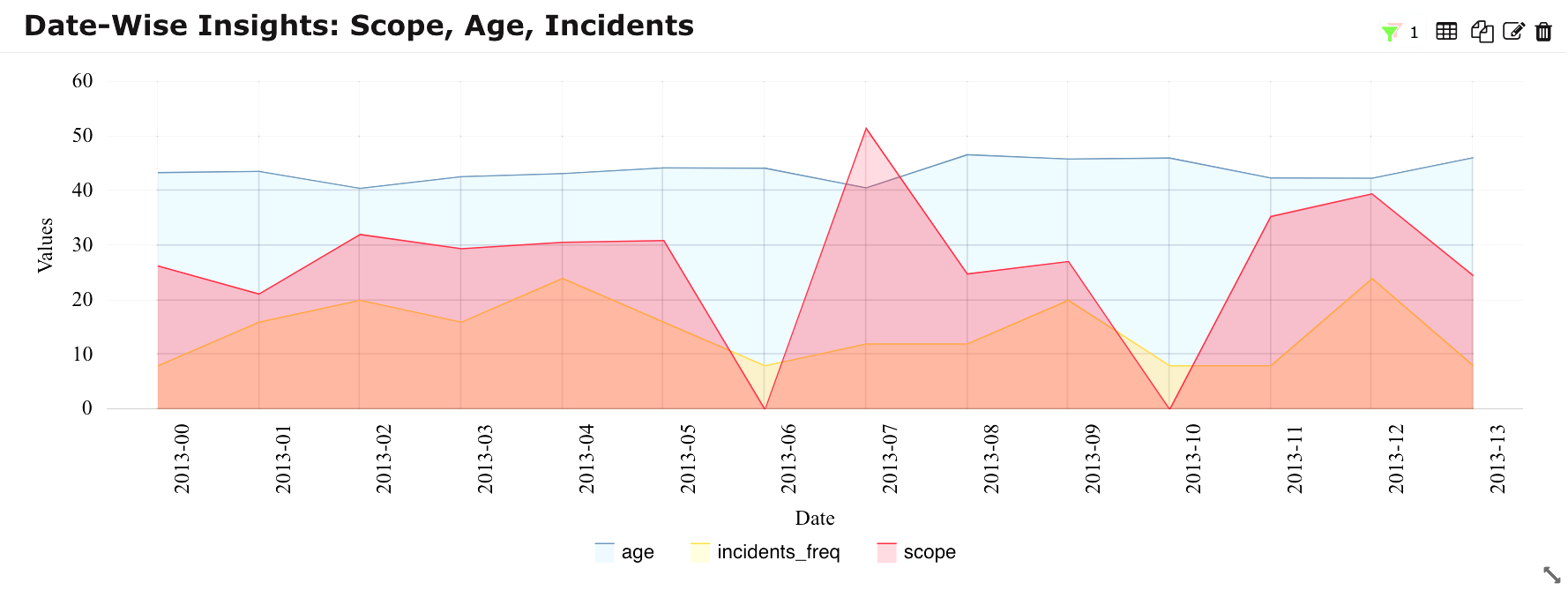
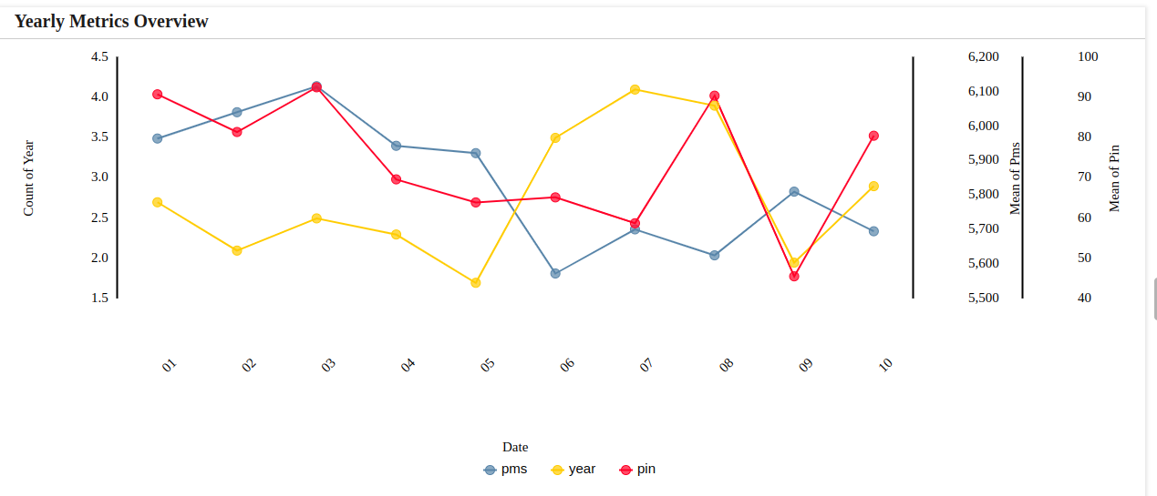
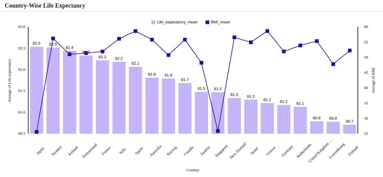
A Multiple Axis chart is an interactive line chart that plots data using multiple axis. This allows the plotting data sets to have different ranges. Data values are plotted as data points that are connected by line segments. Multiple y-axis are rendered along the left and right sides of the chart.
Legend: Visual element on a chart explaining the symbols or colors representing different data series. Enable chart legend as needed.
Legend Font Size: Specifies the size of the text in the chart legend. Select the font size for the legend’s text.
Legend Position: Determine the placement of the chart legend. Dropdown to choose the position of the legend on the chart such as Top, Left, Bottom and Right.
Indicates the percentage variance for the selected columns in the Y-Axis when Date variable are applied to the X-Axis.
Value Font Size: Refers to the specified text size for numerical or data values.
Label Font Size: Pertains to the specified text size for descriptive labels.
Percentage Font Size: Select font size preferences to customize the display of percentage values on the chart.
Deviation Font Family: Choose the font family to specify the font style for deviation.
Deviation Alignment: Choose alignment such as Left, Center and Right to determine the alignment of deviation values relative to their corresponding data points.
Overlap: Enabling overlap will overlap the deviation within the grid.
Order: Determines the arrangement sequence of data point.
Note
% Deviation is applicable for Line, Area, and Multiple Axis chart.
Stats line: Represents a statistical line overlaid on the chart, offering insights into data trends. Select Stats line from the available options such as Q1, Q3, Mean, Median, Standard Deviation, Min, Max and Custom.
Stats line Position: Sets the placement of the statistical line relative to data points on the chart. Select the position of the statistics line on the chart from the available option Behind (Behind the chart) and Above (Above the chart).
Cursor: Enable a cursor to visualize additional data details when hovering over the chart.
Stats line Roundoff Value: Choose a roundoff value to determine how numerical values are rounded in the chart. Select from the 0 to 5.
Export: In order to export the chart, enable the Export option and apply the changes. You can find the option to export the specific chart in both the chart and dashboard. Export the image as PNG, JPG, and SVG, and download the data as JSON, CSV, XLSX, and HTML. Additionally, print is also available.
A Radar Line chart is a graphical method of displaying multivariate data in the form of a two-dimensional chart of three or more quantitative variables represented on axes starting from the same point.
Legend: Visual element on a chart explaining the symbols or colors representing different data series. Enable chart legend as needed.
Legend Font Size: Specifies the size of the text in the chart legend. Select the font size for the legend’s text.
Legend Position: Determine the placement of the chart legend. Dropdown to choose the position of the legend on the chart such as Top, Left, Bottom and Right.
Cursor: Enable a cursor to visualize additional data details when hovering over the chart.
Export: In order to export the chart, enable the Export option and apply the changes. You can find the option to export the specific chart in both the chart and dashboard. Export the image as PNG, JPG, and SVG, and download the data as JSON, CSV, XLSX, and HTML. Additionally, print is also available.
Legend Position: Determine the placement of the chart legend. Dropdown to choose the position of the legend on the chart such as Top, Left, Bottom and Right.
Legend Font Size: Specifies the size of the text in the chart legend. Select the font size for the legend’s text.
Cursor: Enable a cursor to visualize additional data details when hovering over the chart.
Export: In order to export the chart, enable the Export option and apply the changes. You can find the option to export the specific chart in both the chart and dashboard. Export the image as PNG, JPG, and SVG, and download the data as JSON, CSV, XLSX, and HTML. Additionally, print is also available.
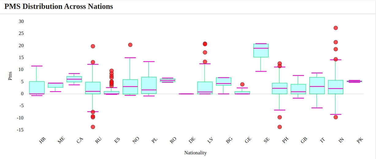
The method to summarize a set of data that is measured using an interval scale is called a boxplot. A Box Plot is a way of displaying statistical data based on five numbers: Lower fence, Lower quartile, median, Upper quartile, and Upper fence.
Cursor: Enable a cursor to visualize additional data details when hovering over the chart.
Export: In order to export the chart, enable the Export option and apply the changes. You can find the option to export the specific chart in both the chart and dashboard. Export the image as PNG, JPG, and SVG, and download the data as JSON, CSV, XLSX, and HTML. Additionally, print is also available.
Position: Specifies the alignment or placement of text elements.
Font Family: Preferred style of text for the chart’s elements. Choose the font family for the text within the table from a dropdown menu.(Eg., Narkism, Calibri,)
Label Formatting: Refers to the customization of the appearance and style of labels.
Bar with line graph is a graphical representation of datasets based on three parameters for observations. The two parameters lying on the X-axis and the Y-axis are used to plot the bars, while the third parameter is used to plot the line over the bar.
You can select Line or Scatter based on your preferences.
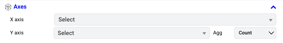
Select X and Y axis from the dropdown menu.
Series: select numeric values. You can select less than or equal to 10 column.
Show Result: Toggle through the “Show Result” dropdown: select “All” for a panoramic view or “Limit” for precision. Option for ‘Top’ to focus on heights or ‘Bottom’ for depths to tailor your data revelation.
Aggregate Options: Aligns with the available options — Sum, Count, Average, Min, Max and Unique. Choose the aggregate that best fits your input.
Sort Type: Defining how data is organized within a chart, such as Quick Sort or Field Sort,
Quick Sort: Sort based on category and value i.e it will sort the selected variables in X & Y axis.
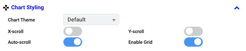
Applies a diverse set of styles to elements in charts.
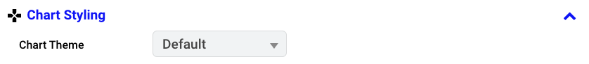
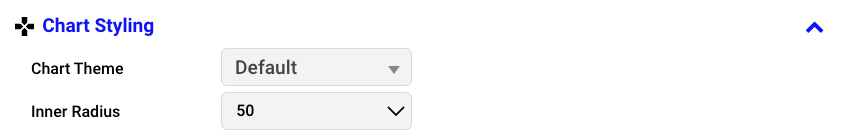
Chart Theme: Choose a pre-defined theme from the dropdown menu to modify the chart’s aesthetic.
Line Bullet: Marks key data points on the line. Customize the color to your preference.
Stroke Width: Refers to the thickness or width of a line or border in a chart. Choose the width within the range of 1 to 4.
X-Scroll: Enable horizontal scrolling in a chart for navigating X-axis data points.
Auto-Scroll: Enable automatic scrolling through data points in the chart.
X-label Position: Determines the alignment of labels along the X-axis in a chart. Define the position of the X-label such as Center, Left, Right.
Line Stroke: Specifies the thickness or width of a line. Customize the color based on your preferences.
Bullet Type: To denote the specific marker representing data points on a chart. Specify the shape of the bullet type, such as Rectangle, Triangle, or Circle.
Line Style: Defines how the connecting line in a chart appears. Choose the line style such as Solid, Dotted, Dashed, Dotted & dashed.
Y-Scroll: Enable vertical scrolling in a chart for navigating Y-axis data points.
Enable Grid: The grid option to include lines on the chart. Enable if needed.
Grid-Distance: Defines the spacing between gridlines on a chart. Choose the desired grid distance.
Legend: Visual element on a chart explaining the symbols or colors representing different data series. Enable chart legend as needed.
Legend Font Size: Specifies the size of the text in the chart legend. Select the font size for the legend’s text.
Legend Position: Determine the placement of the chart legend. Dropdown to choose the position of the legend on the chart such as Top, Left, Bottom and Right.
Stats line: Represents a statistical line overlaid on the chart, offering insights into data trends. Select Stats line from the available options such as Q1, Q3, Mean, Median, Standard Deviation, Min, Max and Custom.
Stats line Position: Sets the placement of the statistical line relative to data points on the chart. Select the position of the statistics line on the chart from the available option Behind (Behind the chart) and Above (Above the chart).
Cursor: Enable a cursor to visualize additional data details when hovering over the chart.
Stats line Roundoff Value: Choose a roundoff value to determine how numerical values are rounded in the chart. Select from the 0 to 5.
Export: In order to export the chart, enable the Export option and apply the changes. You can find the option to export the specific chart in both the chart and dashboard. Export the image as PNG, JPG, and SVG, and download the data as JSON, CSV, XLSX, and HTML. Additionally, print is also available.
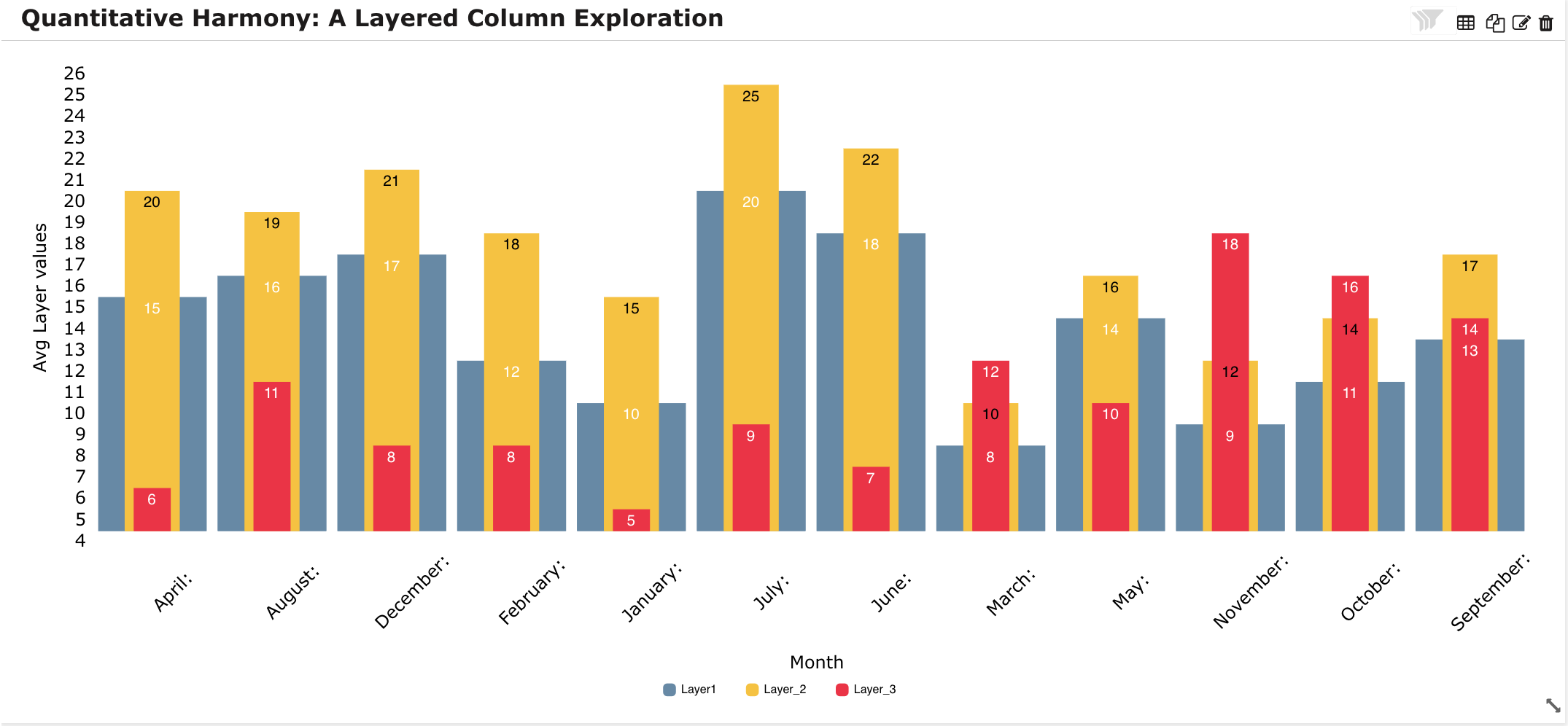
A Layered Column is the best and most “standard” way to display multiple column series. When each series has an equal and fairly limited number of items, layering series on top of each other presents a much more impactful visualization.
Legend: Visual element on a chart explaining the symbols or colors representing different data series. Enable chart legend as needed.
Legend Font Size: Specifies the size of the text in the chart legend. Select the font size for the legend’s text.
Legend Position: Determine the placement of the chart legend. Dropdown to choose the position of the legend on the chart such as Top, Left, Bottom and Right.
Cursor: Enable a cursor to visualize additional data details when hovering over the chart.
Export: In order to export the chart, enable the Export option and apply the changes. You can find the option to export the specific chart in both the chart and dashboard. Export the image as PNG, JPG, and SVG, and download the data as JSON, CSV, XLSX, and HTML. Additionally, print is also available.
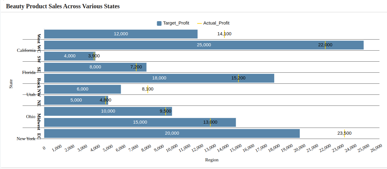
A Bullet graph is a great replacement for traditional dashboard gauges and meters. It is used to visually track performance against a target, displaying results in a single column. It empowers to display way more information in a more compact space by getting rid of unnecessary decoration in favor of data clarity and usability.
Legend: Visual element on a chart explaining the symbols or colors representing different data series. Enable chart legend as needed.
Legend Font Size: Specifies the size of the text in the chart legend. Select the font size for the legend’s text.
Legend Position: Determine the placement of the chart legend. Dropdown to choose the position of the legend on the chart such as Top, Left, Bottom and Right.
Cursor: Enable a cursor to visualize additional data details when hovering over the chart.
Export: In order to export the chart, enable the Export option and apply the changes. You can find the option to export the specific chart in both the chart and dashboard. Export the image as PNG, JPG, and SVG, and download the data as JSON, CSV, XLSX, and HTML. Additionally, print is also available.
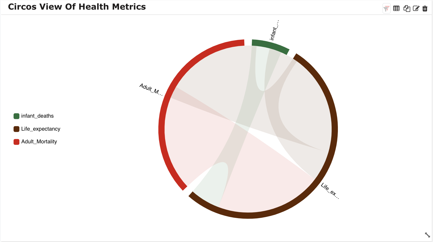
A Circos chart is a circular data visualization that helps illustrate relationships and connections among different variables in a dataset using a circular layout.
Legend: Visual element on a chart explaining the symbols or colors representing different data series. Enable chart legend as needed.
Legend Font Size: Specifies the size of the text in the chart legend. Select the font size for the legend’s text.
Legend Position: Determine the placement of the chart legend. Dropdown to choose the position of the legend on the chart such as Top, Left, Bottom and Right.
Export: In order to export the chart, enable the Export option and apply the changes. You can find the option to export the specific chart in both the chart and dashboard. Export the image as PNG, JPG, and SVG, and download the data as JSON, CSV, XLSX, and HTML. Additionally, print is also available.
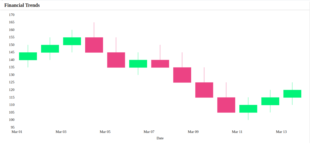
A Candle stick is a type of price chart that displays the high, low, open, and closing prices of a security for a specific period. Candlesticks show that emotion by visually representing the size of price moves with different colors.
Cursor: Enable a cursor to visualize additional data details when hovering over the chart.
Export: In order to export the chart, enable the Export option and apply the changes. You can find the option to export the specific chart in both the chart and dashboard. Export the image as PNG, JPG, and SVG, and download the data as JSON, CSV, XLSX, and HTML. Additionally, print is also available.
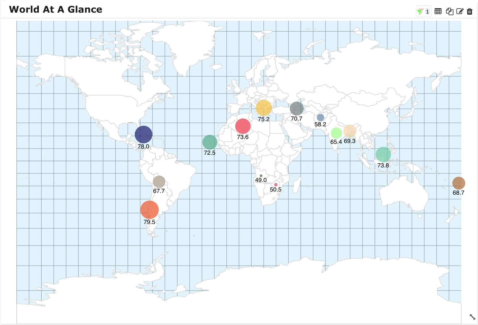
Map with Bubble is a variant of a bubble chart where bubble location is determined by geographic location. It helps to visualize location and proportion in a simple way.
Line Stroke: Specifies the thickness or width of a line. Customize the color based on your preferences.
Country Fill: Refers to the color applied to represent different countries on the chart. Customize the color based on your preferences.
Enable Grid: The grid option to include lines on the chart. Enable if needed.
Background: Refers to the color applied to the map canvas. Customize the color based on your preferences.
Bullet Type: To denote the specific marker representing data points on a chart. Specify the shape of the bullet type, such as Rectangle, Triangle, or Circle.
Export: In order to export the chart, enable the Export option and apply the changes. You can find the option to export the specific chart in both the chart and dashboard. Export the image as PNG, JPG, and SVG, and download the data as JSON, CSV, XLSX, and HTML. Additionally, print is also available.
Category: Select categorical column based on your preferences.
N grams: Refers to sequences of N consecutive words that are analyzed for their frequency and visual representation.Select the grams based on your preferences.
Note
Default N-grams is 1.
Top K frequent words: Refers to the selection of the ‘K’ most frequently occurring words in a given dataset or text. Provide limit based on your preferences. Set 0 for no limit.
Export: In order to export the chart, enable the Export option and apply the changes. You can find the option to export the specific chart in both the chart and dashboard. Export the image as PNG, JPG, and SVG, and download the data as JSON, CSV, XLSX, and HTML. Additionally, print is also available.
Position: Refers to the placement or arrangement of data points. For element placement, choose from options such as Left, Center, Right, and Bottom, each with nested choices for further customization.
Text Alignment: Adjusts the positioning of text. Choose alignment options for the table: left, center, and right.
Order: Determines the arrangement sequence of data point.
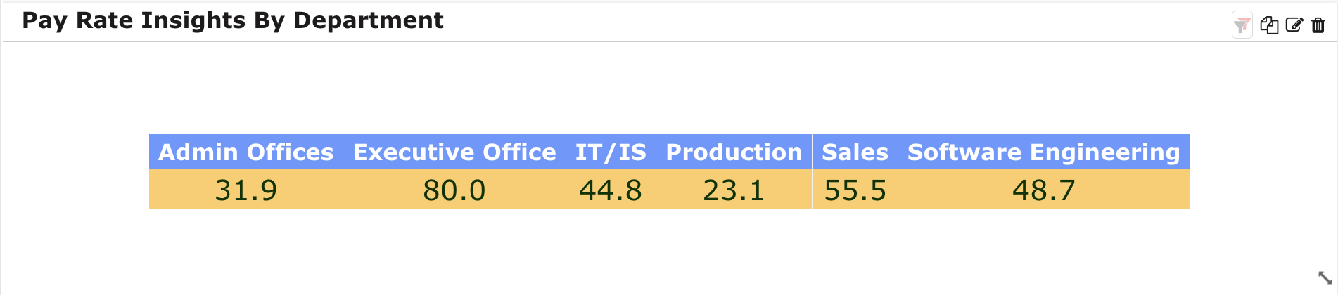
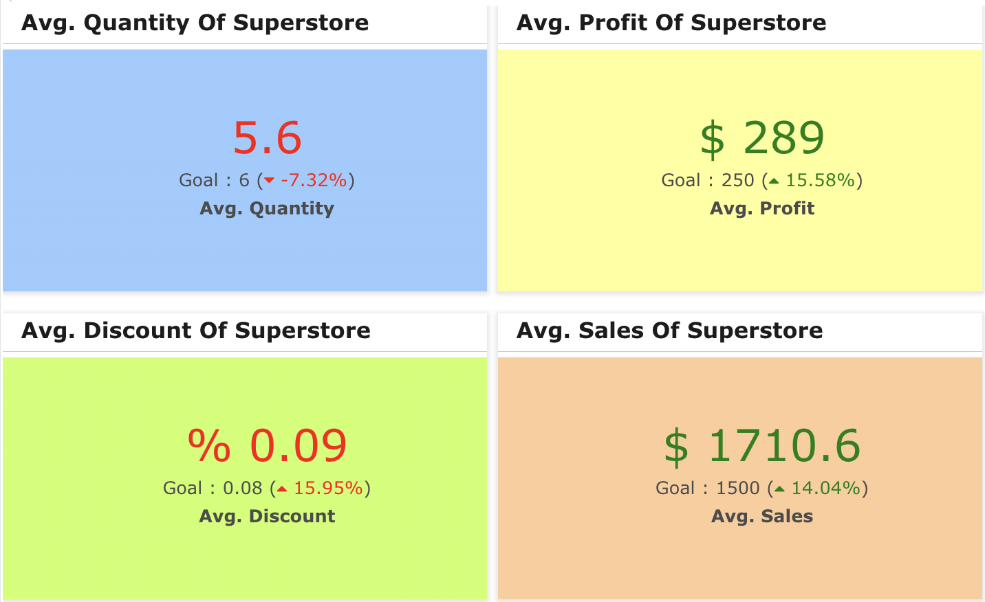
A card is used to display data with high clarity, color, definition, and overall appearance. A card provides a high-quality visual display by processing and executing data using advanced features, and functions.
Card: Represents a concise, self-contained unit displaying specific information or metrics. Select the aggregation method based on your preferences and choose the variables. Click on the ‘+’ button after providing the inputs.
Goal: Refers to a specific target or objective associated with the information presented on that card. After clicking on ‘+,’ you will find a table of inputs, and by enabling the goal, it will be added to the table. Then, specify the goal according to your preferences, and enable the inverse (refers to the option of displaying a metric in a reversed or opposite manner) if needed.
Prefix: Textual addition placed before a numeric value. Add a prefix if it is required.
Card Icon: Visual symbol or image associated with a card element in design. Drag and drop the icon that is needed.
Position: Refers to the specific location or arrangement of the card icon. Select the position: Top, Center, Bottom.
Size: Specifies the size of the card icon. Select the size based on your preferences.
Position: Refers to the placement or arrangement of data points. For element placement, choose from options such as Left, Center, Right, and Bottom, each with nested choices for further customization.
Text Alignment: Adjusts the positioning of text. Choose alignment options for the table: left, center, and right.
Order: Determines the arrangement sequence of data point.
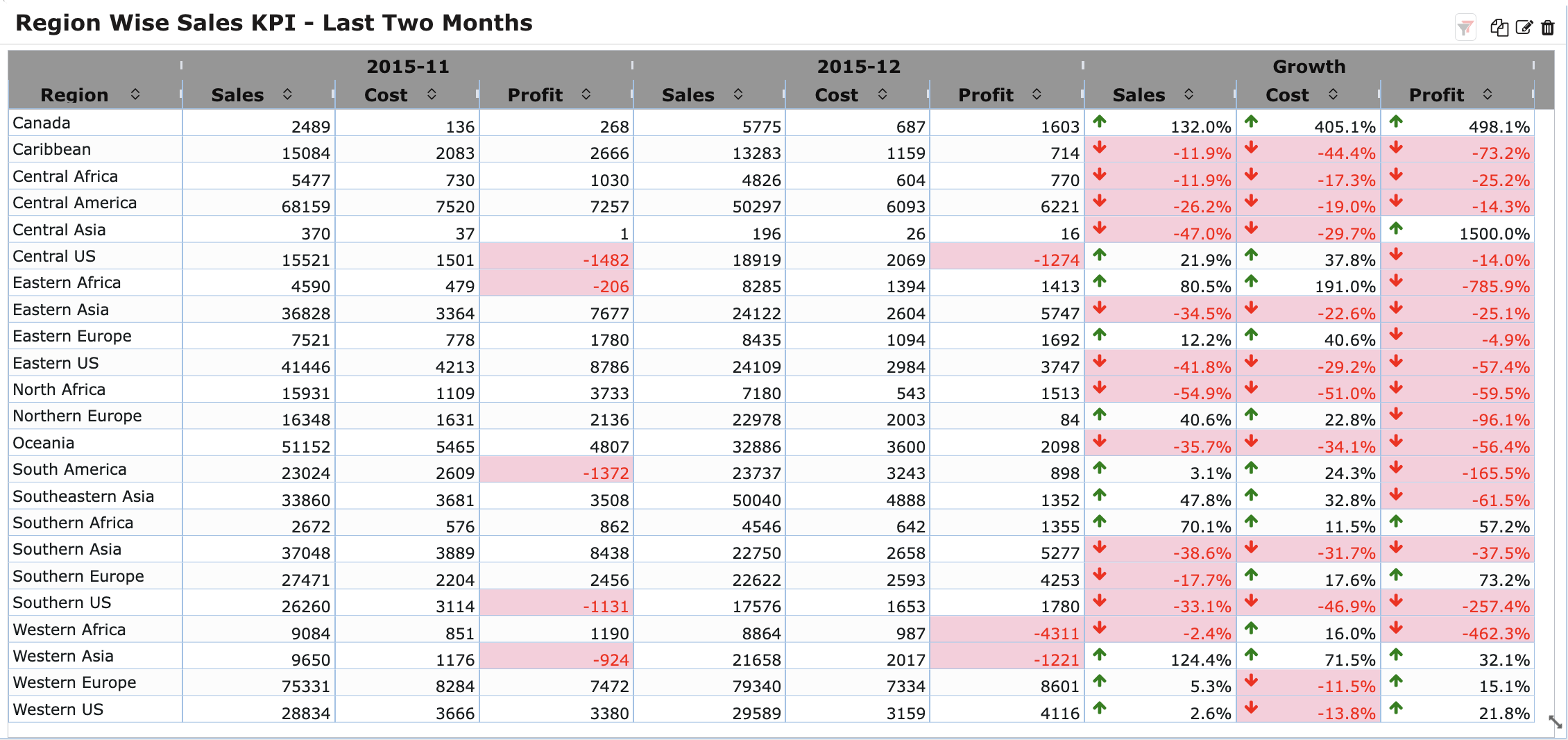
A KPI Card provides a concise snapshot of Key Performance Indicators, offering a quick and visual representation of essential metrics for efficient monitoring and decision-making.
Time Line: Represents how a metric or key performance indicator has changed over time. Select any date column based on your preferences.
KPI Name: Refers to the title or label assigned to a selected variable.
Period: Customize the time duration such as day, week, quarter, month, year and numeric intervals based on your preferences for measuring and displaying key performance metrics.
Group: Define the Group based on your preferences.
Table Theme: Choose a pre-defined theme from the dropdown menu to modify the table’s aesthetic.
Font Family: Choose your preferred font style for the chart’s elements and select the font family for the text within the table from a dropdown menu e.g., Narkism, Calibri.
Header Color: Set the color for the chart header by customizing it from the dropdown menu.
Body Font Size: Determine the text size for the body content in the chart by selecting the font size from 8 to 60.
Highlight Negatives: Highlight negative values in the chart by enabling the ‘highlight negatives’ feature if necessary.
Alignment: Adjust the positioning of text or elements within the table by choosing alignment options: left, center, and right.
Expand Row Groups: Allows expansion of grouped rows in the table. Enable this feature based on your preferences.
Separator: Selects a symbol for distinguishing thousands or decimals in numerical values on the table. Choose the separator according to your preferences (e.g., ###,###,### or ##,##,##,###).
Roundoff Value: Determines how numerical values are rounded in the table. Choose the roundoff value within the range of 0 to 5.
Odd/Even Colors: Alternates background colors for rows in the table. Enable this feature based on your preferences.
Wrap Headers: Adjusts the text layout for headers automatically. Enable this feature according to your preferences.
Border: Defines the outlining of cells or elements in a table. Choose the border style from available options.
Header Font Size: Set the size of the text for headers in the table. Select the header font size from 8 to 60.
Table Theme: A predefined set of styles.Choose table theme from the available options.
Font Family: Preferred style of text for the chart’s elements. Choose the font family for the text within the table from a dropdown menu.(Eg., Narkism, Calibri,)
Header Color: Sets the color for the header in the chart. Customize the header color from the dropdown menu.
Body Font Size: Determines the size of the text for the body content in the chart. Select the body font size from 8 to 60.
Highlight Negatives: Emphasizes negative values in the chart.Enable the highlight negatives feature if needed.
Alignment: Adjusts the positioning of text or elements within the table. Choose alignment options for the table: left, center, and right.
Separator: Selects a symbol for distinguishing thousands or decimals in numerical values on the table. Choose the separator according to your preferences (e.g., ###,###,### or ##,##,##,###).
Roundoff Value: Determines how numerical values are rounded in the table. Choose the roundoff value within the range of 0 to 5.
Odd/Even Colors: Alternates background colors for rows in the table. Enable this feature based on your preferences.
Wrap Headers: Adjusts the text layout for headers automatically. Enable this feature according to your preferences.
Border: Defines the outlining of cells or elements in a table. Choose the border style from available options.
Header Font Size: Set the size of the text for headers in the table. Select the header font size from 8 to 60.
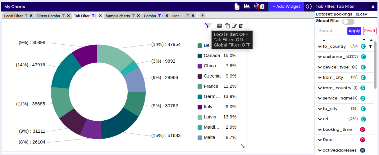
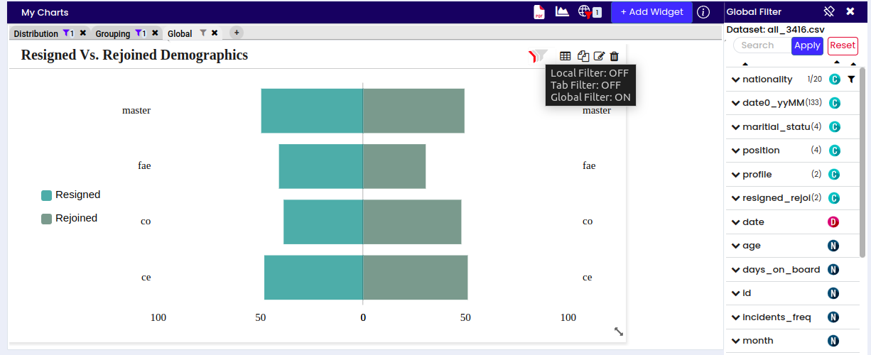
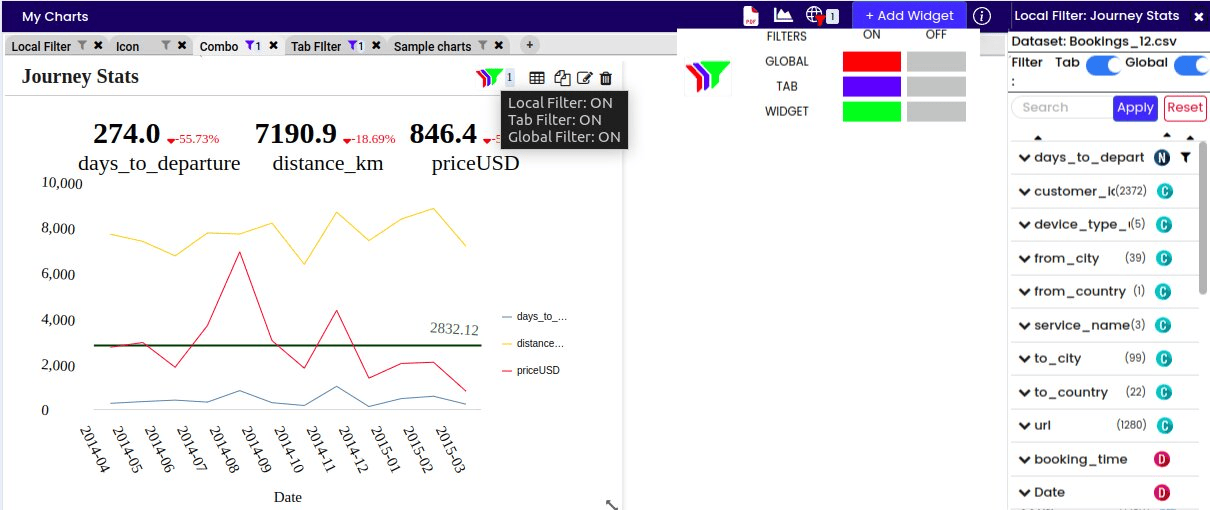
This feature allows for the simultaneous application of three distinct filters - Local, Tab-wise, and Global - to the chart. The highlighted color indicates the selected filter options, facilitating clarity and ease of use.
You can utilize the filter in two ways: After saving the chart, click on the filter icon where all filters are initially disabled; upon applying a filter, it automatically activates and is highlighted. Alternatively, access filter options while editing the chart within the chart section.
Equal to: Filters data where the numerical value is exactly equal to a specified value. For example, filtering sales data for transactions where the amount equals $1000.
Not Equal to: Filters data where the numerical value is not equal to a specified value. For instance, excluding transactions with a sales amount of $1000.
Is Greater Than: Filters data where the numerical value is greater than a specified threshold. For example, filtering sales data for transactions with amounts greater than $1000.
Is Greater Than or Equal to: Filters data where the numerical value is either greater than or equal to a specified threshold. For instance, filtering sales data for transactions with amounts greater than or equal to $1000.
Is Less Than: Filters data where the numerical value is less than a specified threshold. For example, filtering sales data for transactions with amounts less than $1000.
Is Less Than or Equal to: Filters data where the numerical value is either less than or equal to a specified threshold. For instance, filtering sales data for transactions with amounts less than or equal to $1000.
Is Null: Filters data where the numerical value is null or missing.
Is Not Null: Filters data where the numerical value is not null or missing.
Between: Filters data where the numerical value falls within a specified range. For example, filtering sales data for transactions with amounts between $500 and $1000.
Note
This filter is applicable to Categorical and Text data types.
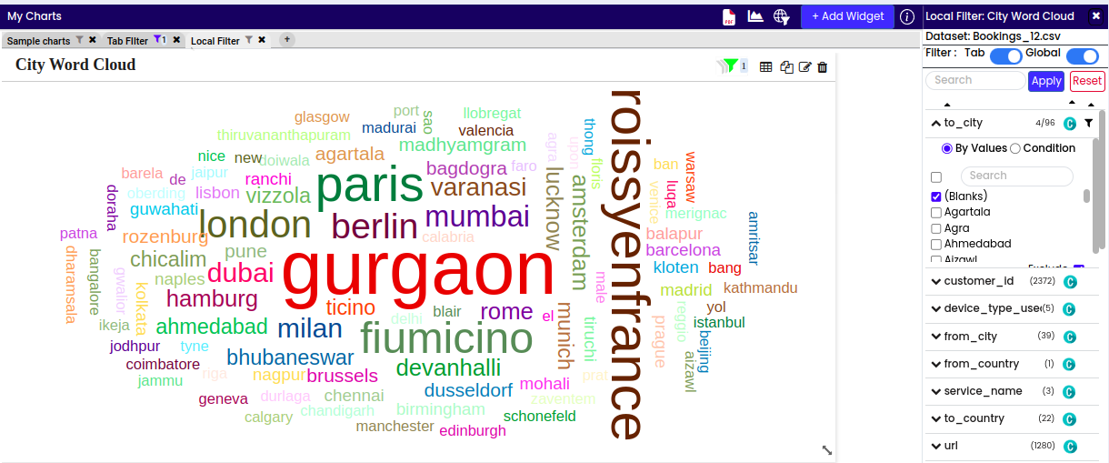
This type of filter allows selection of specific categories or values within the categorical data for filtering. For instance, filtering data for a particular product category or customer segment.
Additionally, there is an option to exclude selected values if needed:
Exclude Option: If necessary to exclude the chosen values from the filter, select this option. For example, if filtering product categories and there’s a need to exclude a specific category from the analysis.
Apply Button: After selecting desired values and choosing whether to exclude them, click the apply button to confirm and implement the filter settings.
Reset Button: To reset the filters, click on the reset button.
Equal to: Filters data where the numerical value is exactly equal to a specified value. For example, filtering sales data for transactions where the amount equals $1000.
Not Equal to: Filters data where the numerical value is not equal to a specified value. For instance, excluding transactions with a sales amount of $1000.
Is Greater Than: Filters data where the numerical value is greater than a specified threshold. For example, filtering sales data for transactions with amounts greater than $1000.
Is Greater Than or Equal to: Filters data where the numerical value is either greater than or equal to a specified threshold. For instance, filtering sales data for transactions with amounts greater than or equal to $1000.
Is Less Than: Filters data where the numerical value is less than a specified threshold. For example, filtering sales data for transactions with amounts less than $1000.
Is Less Than or Equal to: Filters data where the numerical value is either less than or equal to a specified threshold. For instance, filtering sales data for transactions with amounts less than or equal to $1000.
Is Null: Filters data where the numerical value is null or missing.
Is Not Null: Filters data where the numerical value is not null or missing.
Between: Filters data where the numerical value falls within a specified range. For example, filtering sales data for transactions with amounts between $500 and $1000.
Condition filters for text data allows to set conditions based on text attributes. This might involve filtering text data based on the presence or absence of certain words or phrases. For example, filtering customer reviews for comments containing the word “complaint.” Examples of condition-based filters include filtering for text equal to, not equal to, begins with, does not begins with,etc.,
Equal to: Filters text data where the content exactly matches a specified word or phrase. For instance, filtering customer feedback for comments equal to “positive.”
Not Equal to: Filters text data where the content does not match a specified word or phrase. For example, excluding customer reviews that are not equal to “satisfied.”
Begins with: Filters text data where the content starts with a specified word or phrase. For instance, filtering product descriptions that begin with “premium.”
Does Not Begin with: Excludes text data where the content does not start with a specified word or phrase. For example, excluding articles that do not begin with “latest.”
Ends with: Filters text data where the content ends with a specified word or phrase. For example, filtering file names that end with “.txt”.
Does Not End with: Excludes text data where the content does not end with a specified word or phrase. For instance, excluding URLs that do not end with “.com”.
Contains: Filters text data where the content includes a specified word or phrase. For example, filtering emails containing the word “urgent.”
Does Not Contain: Excludes text data where the content does not include a specified word or phrase. For instance, excluding blog posts that do not contain the word “technology”.
Equal to: Filters data where the numerical value is exactly equal to a specified value. For example, filtering sales data for transactions where the amount equals $1000.
Not Equal to: Filters data where the numerical value is not equal to a specified value. For instance, excluding transactions with a sales amount of $1000.
Is Greater Than: Filters data where the numerical value is greater than a specified threshold. For example, filtering sales data for transactions with amounts greater than $1000.
Is Greater Than or Equal to: Filters data where the numerical value is either greater than or equal to a specified threshold. For instance, filtering sales data for transactions with amounts greater than or equal to $1000.
Is Less Than: Filters data where the numerical value is less than a specified threshold. For example, filtering sales data for transactions with amounts less than $1000.
Is Less Than or Equal to: Filters data where the numerical value is either less than or equal to a specified threshold. For instance, filtering sales data for transactions with amounts less than or equal to $1000.
Is Null: Filters data where the numerical value is null or missing.
Is Not Null: Filters data where the numerical value is not null or missing.
Between: Filters data where the numerical value falls within a specified range. For example, filtering sales data for transactions with amounts between $500 and $1000.
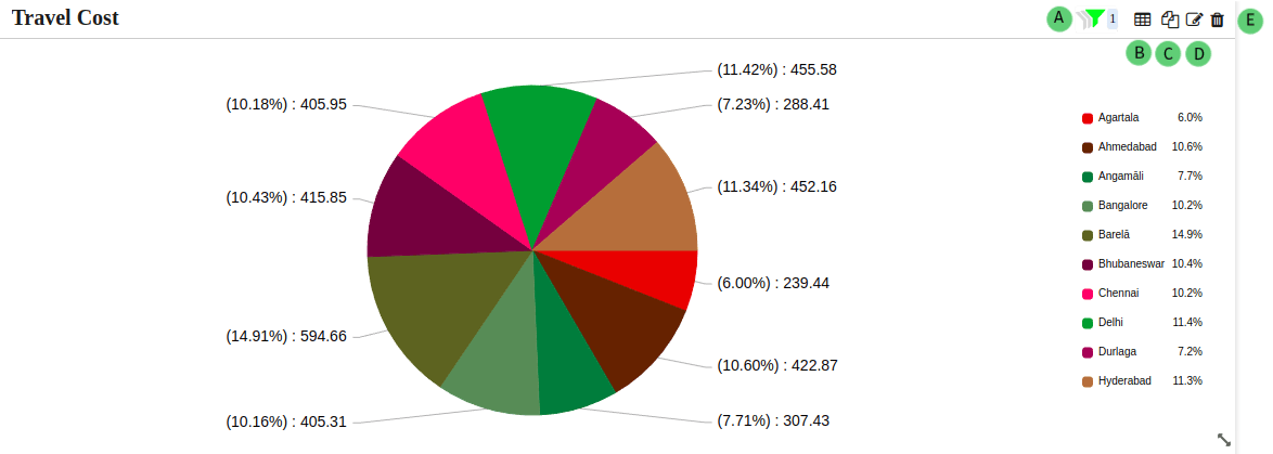
Filter (A): Filter the data using available features such as Local, Tab-wise, and Global filters. The number indicates the count of filters applied to the chart.
Table View (B): View the chart in table format by clicking on the table icon.
Export individual charts or groups of charts as PDF files for sharing or presentation purposes. Additionally, the selected specific chart can be exported as images in formats like PNG, JPG, and SVG, or as data in JSON, CSV, XLSX, or HTML formats. Print functionality is also available for the selected chart.
This feature enables the compilation of visual insights into comprehensive reports. Furthermore, there’s an option to export the entire dashboard as a PDF file.
The availability of multiple export formats and printing options enhances flexibility in sharing and presenting data-driven insights.
While users have full control over creating, editing, and exporting charts, they do not possess the authority to publish charts to public dashboards.
The access restriction ensures that only authorized administrators (admins) can publish visualizations to dashboards, preserving data integrity and security.
Click on the ‘Publish’ icon to publish the chart(s).
Color continuation is the way of expressing the continuity of colors. It ensures consistent representation of factors or categories across visualizations by maintaining uniform color schemes. It enhances clarity and interpretation, aiding effective communication of insights and decision-making in data visualization.