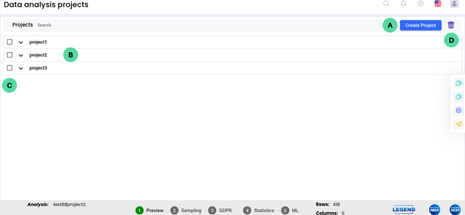
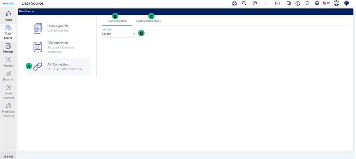
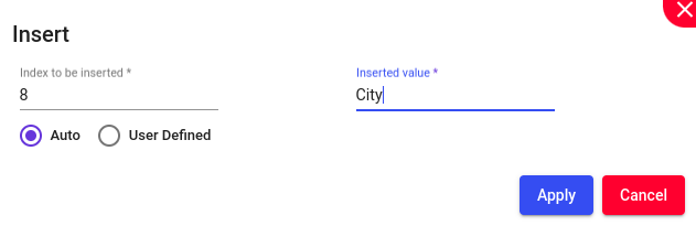
Click on the DashPro icon, which will redirect you into the project creation screen. This will take the users into the screen where the project can be created.
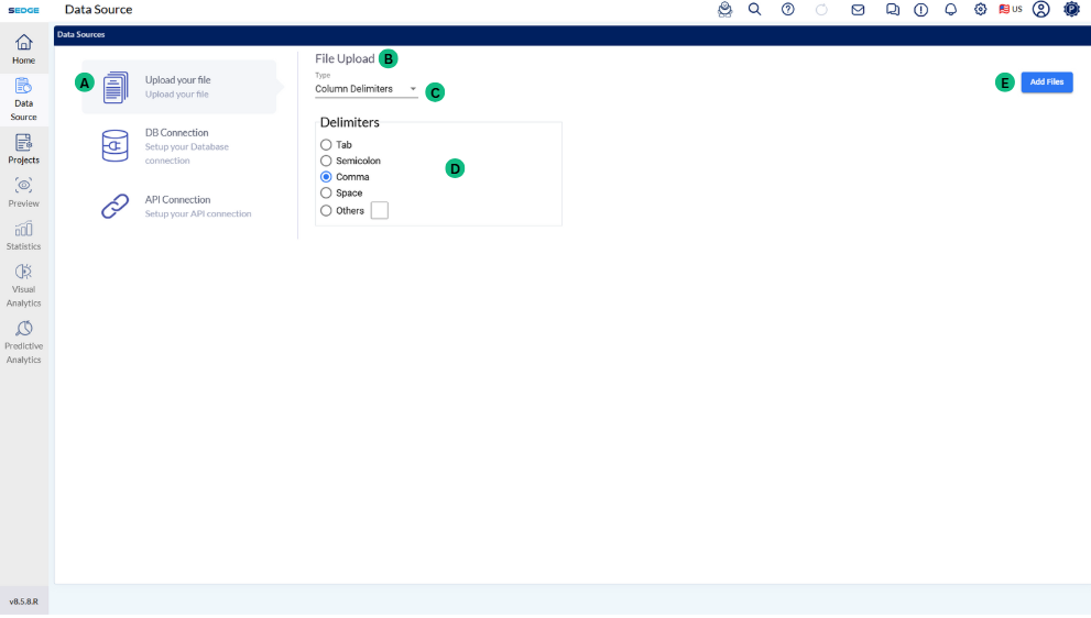
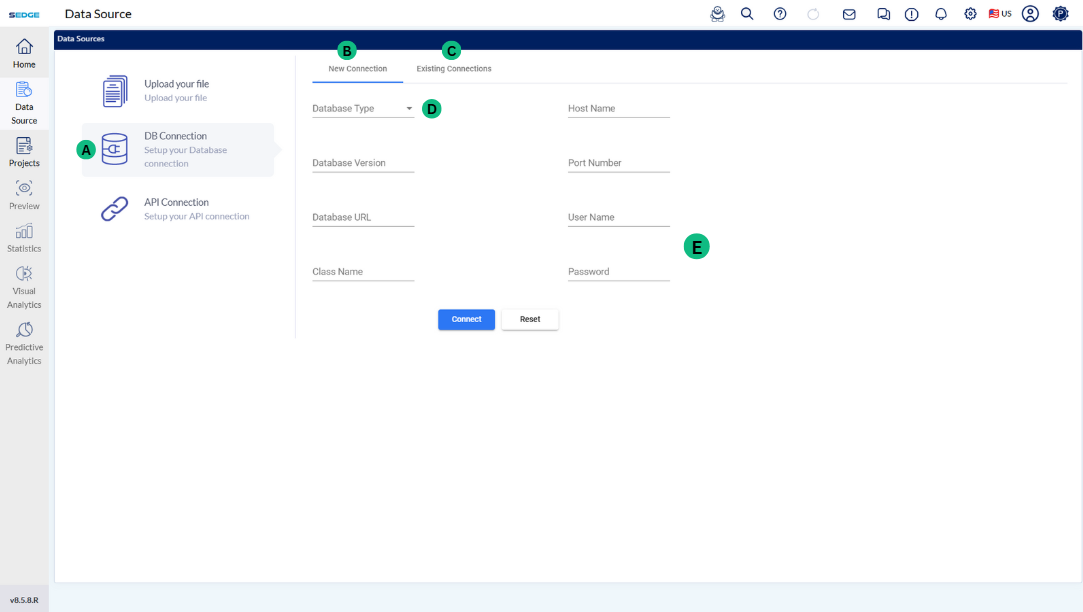
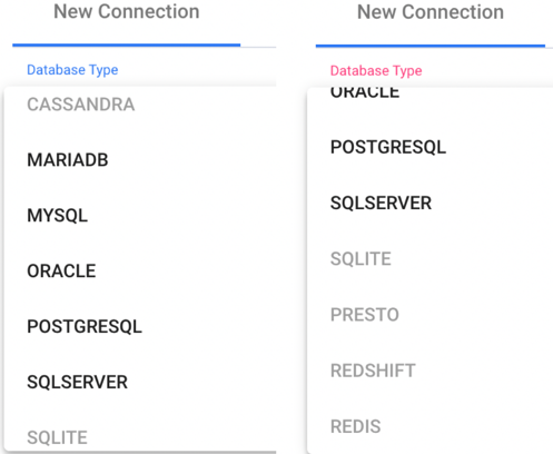
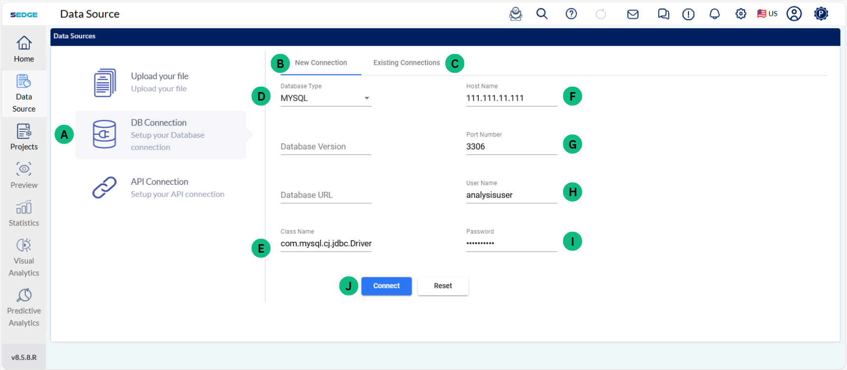
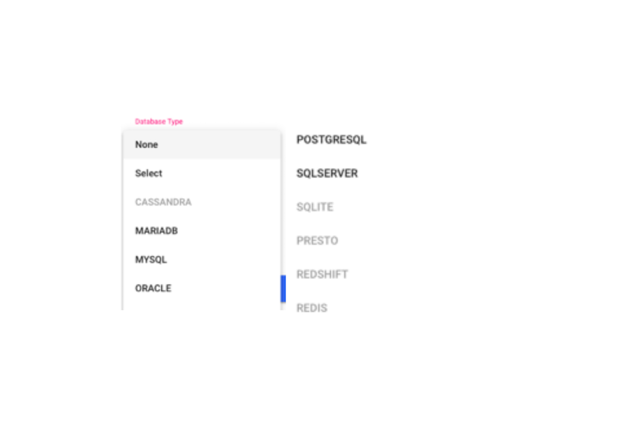
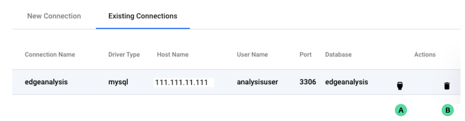
This section is about the data upload into SEDGE from different types of database. SEDGE has the functionality of connecting to different database such as MYSQL, Mariadb, Oracle and Postgresql.
The future release of SEDGE will also cover other database such as Cassandra, SQLite, Presto, Redshift and Redis. If you need assistance in connecting to these DB, talk to our support team, and they can provide functionality to connect to these databases also
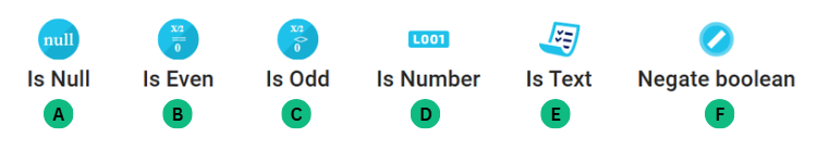
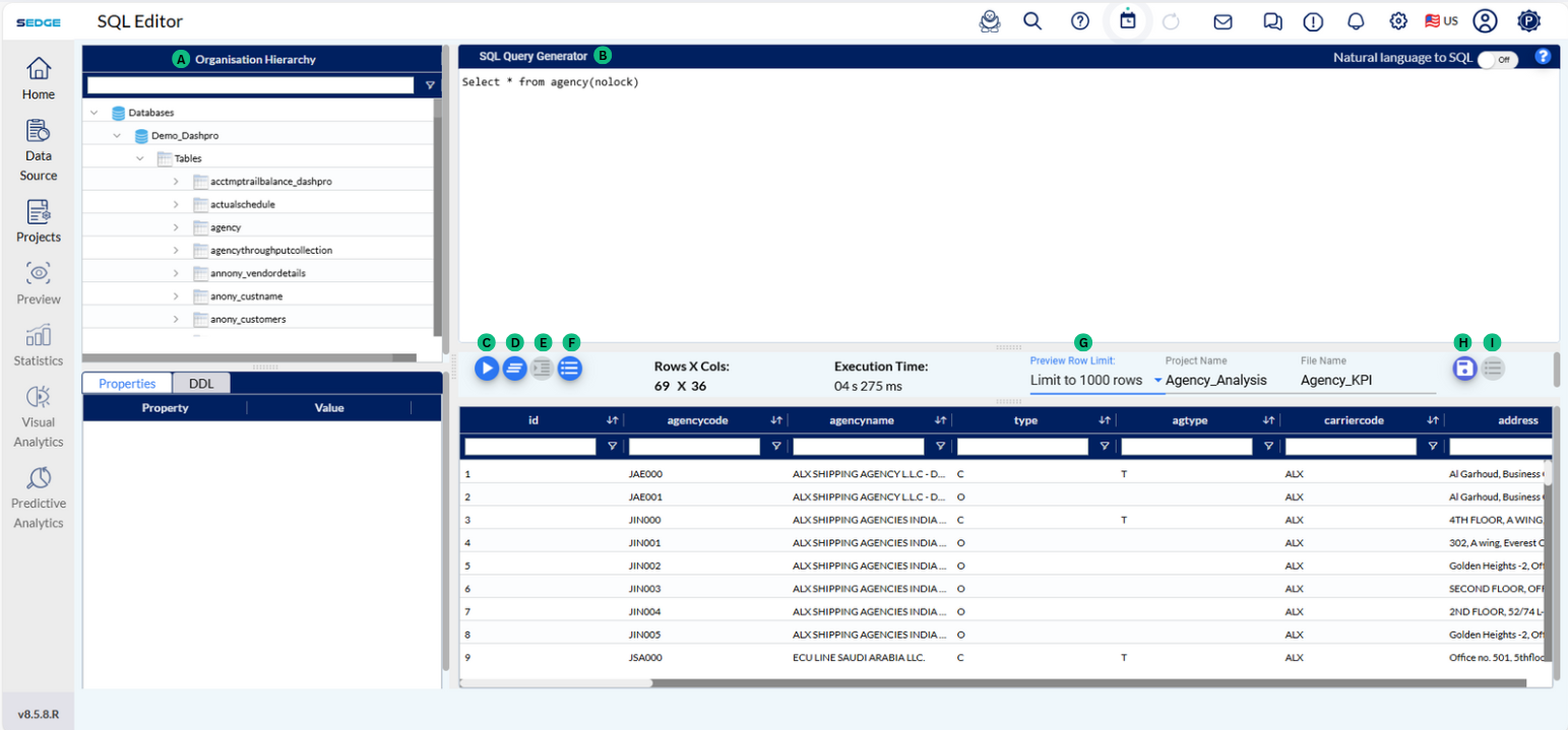
A - This section displays the tables available within the selected database in your SQL workspace. You can browse and query these tables as needed.
B – This is where you can write and manage your SQL queries. It supports all types of SQL operations such as retrieving data, filtering, sorting, joining tables, and performing calculations or data transformations.
C – After writing your SQL query, click this button to run it and view the results in the preview section below.
D – This button clears the SQL editor, allowing you to start fresh with a new query.
E – Automatically formats your SQL code for better readability and structure.
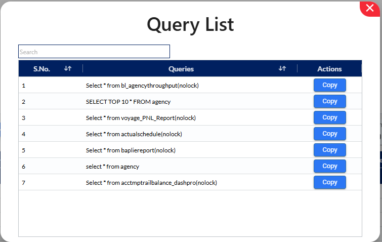
F – Click to expand and view a history of past queries, allowing easy access and reuse.
G – Allows you to control how many rows are fetched and displayed in the result preview pane after executing a query. You can choose from preset options such as:
Limit to 100 rows
Limit to 500 rows
Limit to 1000 rows
Limit to 10,000 rows
Limit to 50,000 rows
Limit to 100,000 rows
H – Saves the current result set. You must provide a project name and file name to save, and the saved output will be listed under your Projects page in SEDGE.
I – Allows you to export the query results into formats like CSV or Excel for further use or sharing.
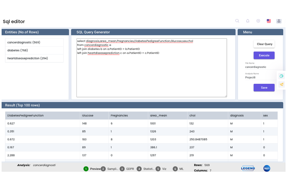
We can use the SQL Query Generator to combine data from multiple tables using joins, which help relate information across datasets. It supports various types of joins, including Inner Join, Left Join, Right Join, and Full Join — enabling flexible data merging based on matching fields such as IDs or keys.
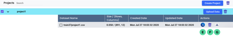
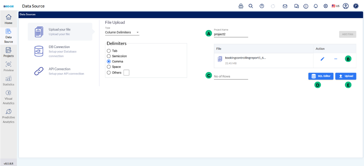
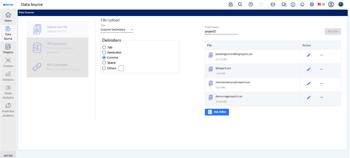
A - After selecting your file, You can enter a Project Name (optional). If left empty, the system will use the file name by default.
B - In the Action column:
Use the ✏️ icon to rename the file.
Use the ➖ icon to remove the file.
C - In the No of Rows box, enter how many rows you want to upload from the file. This helps when working with large files.
D - Use the SQL Editor to preview or modify the uploaded data using SQL queries before continuing.
E - After completing these steps, click the Upload button to proceed to the data preview page. The upload may take some time depending on the file size.
Users also have the option of zipping the CSV file, as large size CSV file can be uploaded.
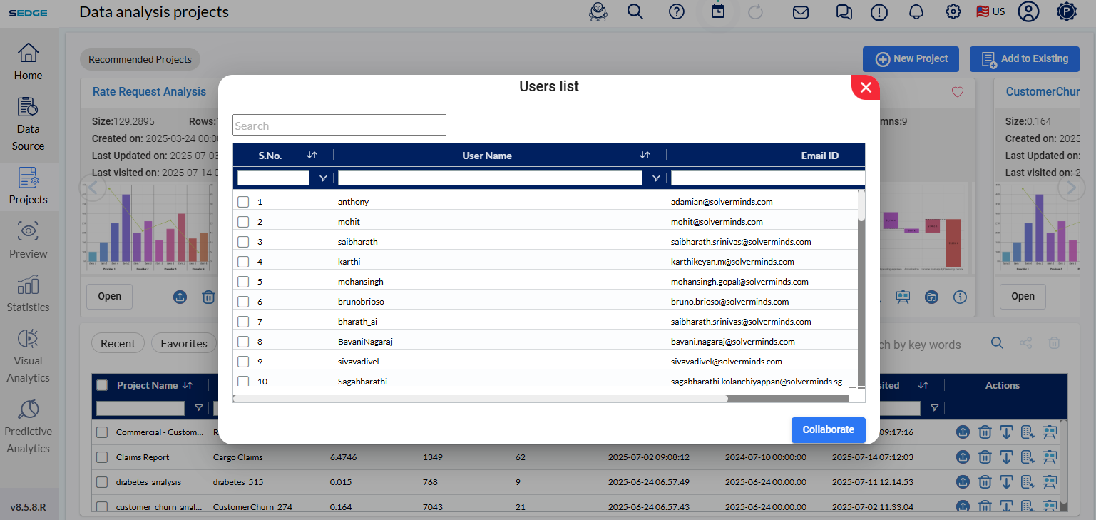
File collaboration in SEDGE facilitates the sending and receiving of files and collaboration among users. This functionality helps in collaborating and exchanging opinions with the other users in SEDGE. This offers a wide array of advantages, especially among users from different geographic locations and diverse timelines. It only takes a single click to send and enable the file access to the user.
For our demonstration, we have chosen the “Titanic” data. In the future steps, we will be forecasting, based on the available data, what was the chance of survival on board of Titanic.
In this case, the factors taken into consideration are: class, name, sex, age, number of family members, parch, ticket number, fare, cabin, and point of embarkment. Some of these factors might not be relevant for the predictive analysis, so we will also demonstrate how to erase or ignore some of the data.
Note
This page is just a preview of the full data, only a small sample is displayed over here to get the first image.
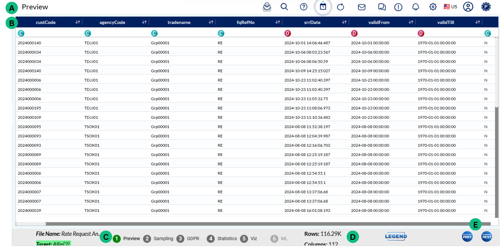
A - This row displays all the variables in the current analysis. You can sort the data by clicking on the arrows next to the respective variable
B - This row identifies if the data in a column are categorical or numerical (C or N)
C - Monitor in which phase of the analysis you are currently located – identified by the green colour
D - Information about the total number of rows and columns in the uploaded file
E - Action buttons to move either to the next step or return to the previous step
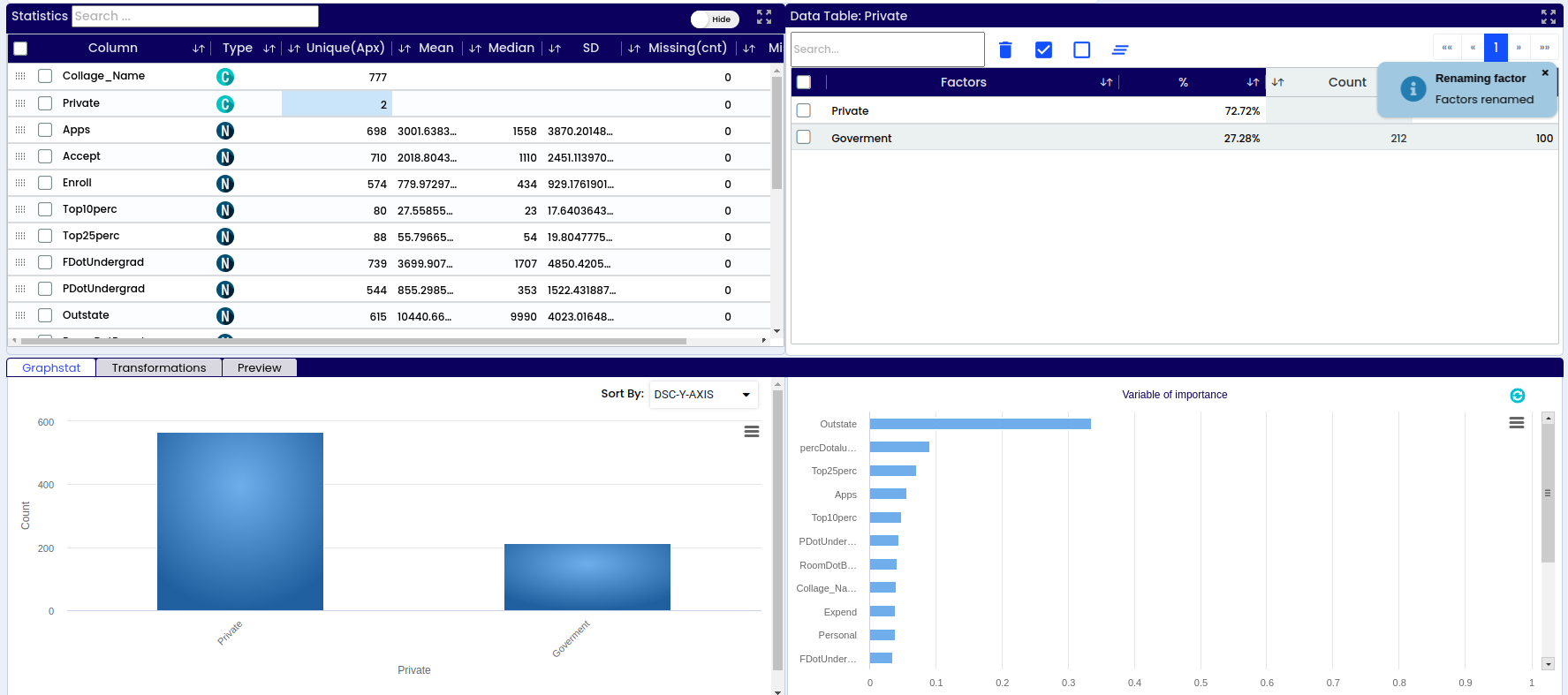
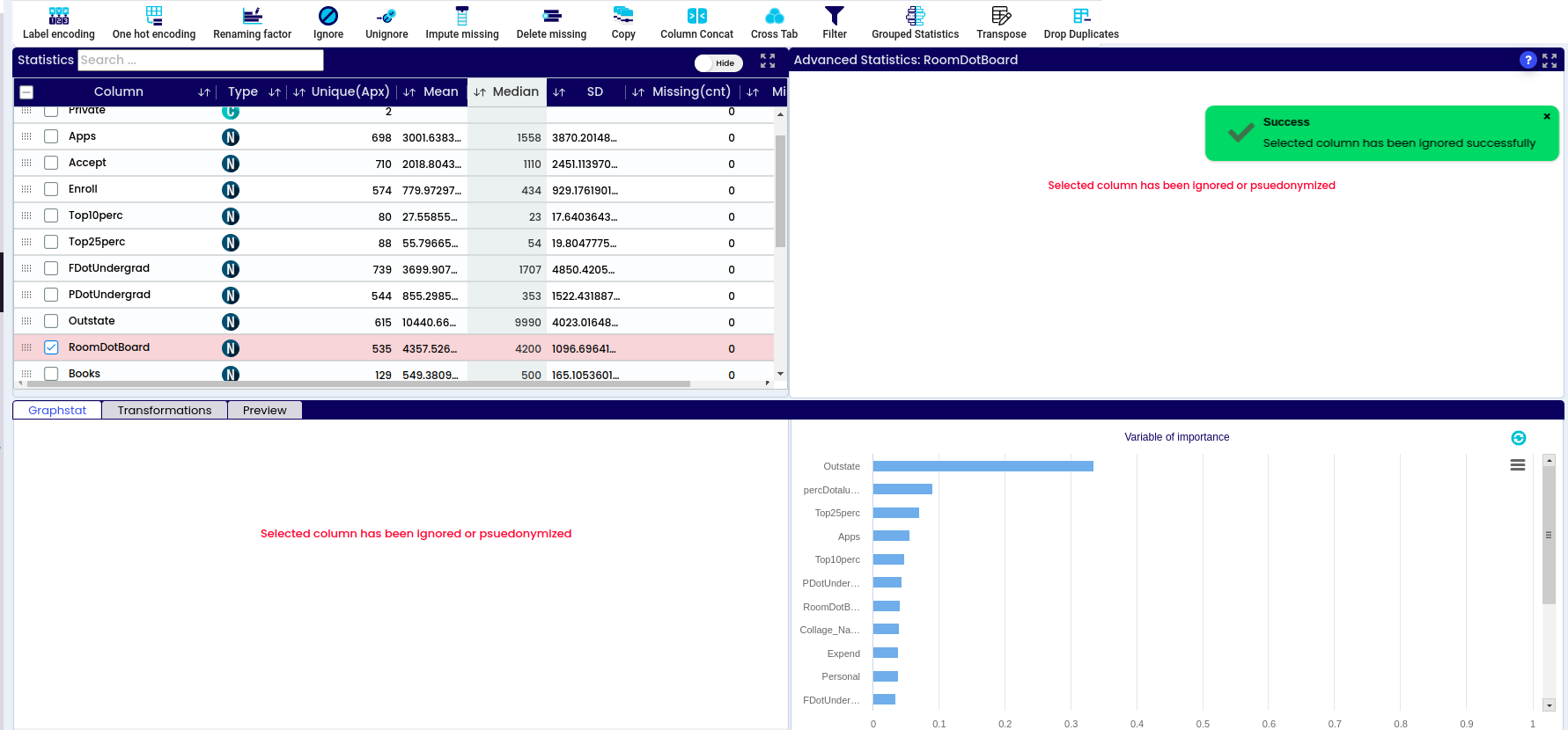
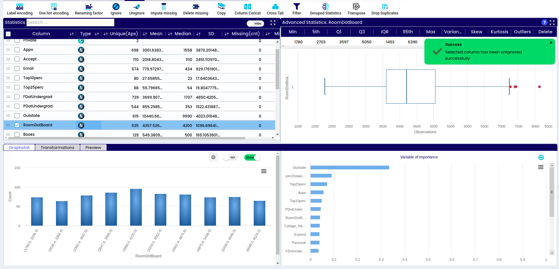
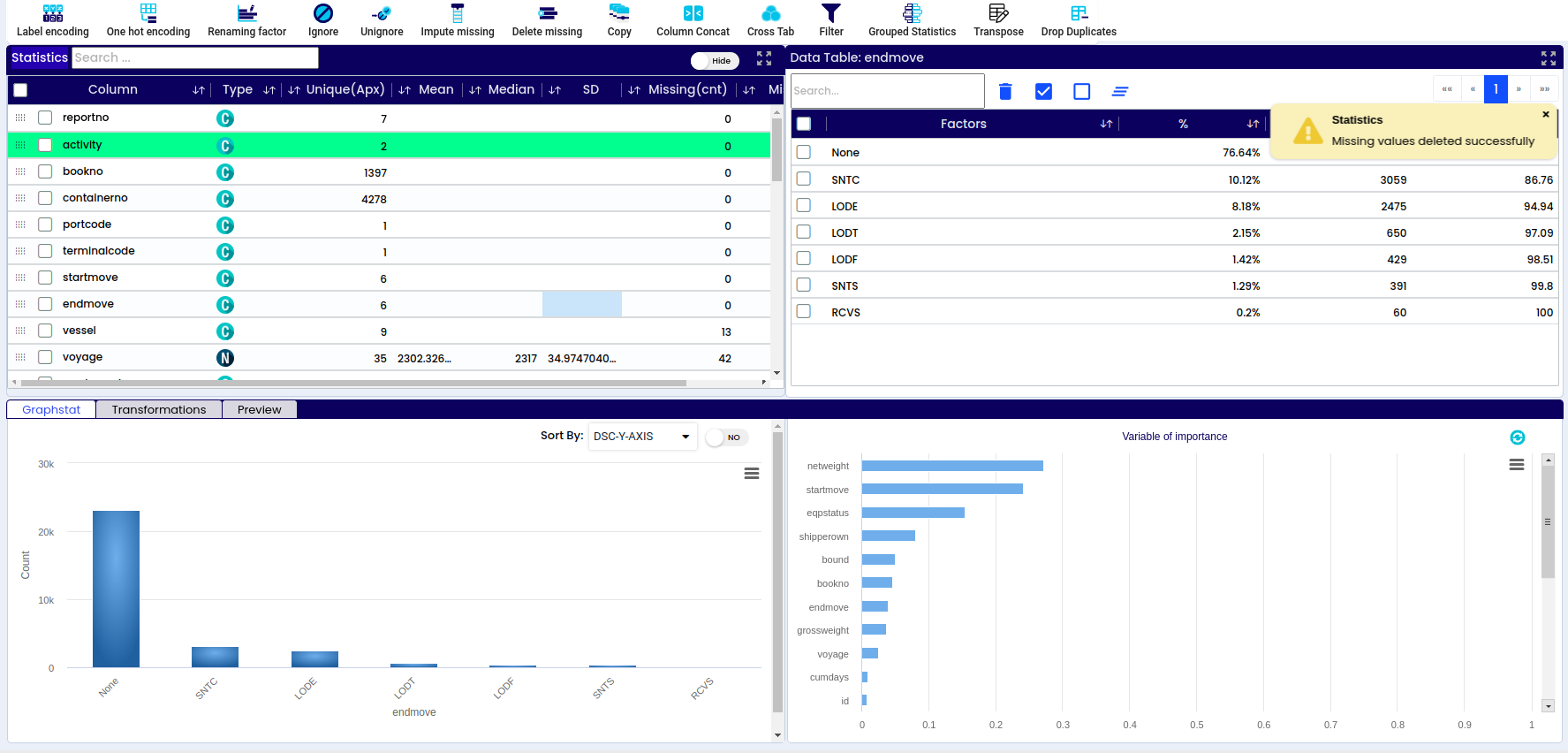
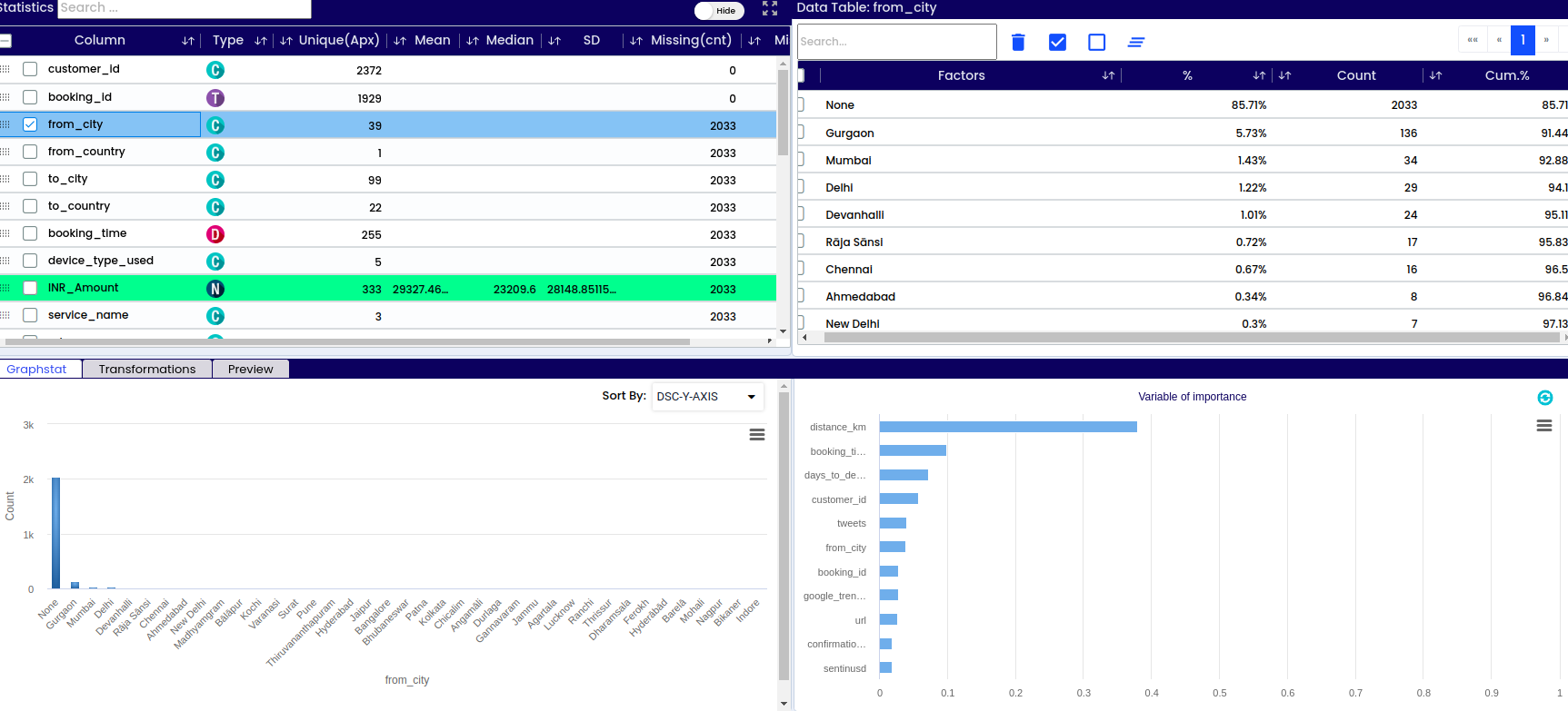
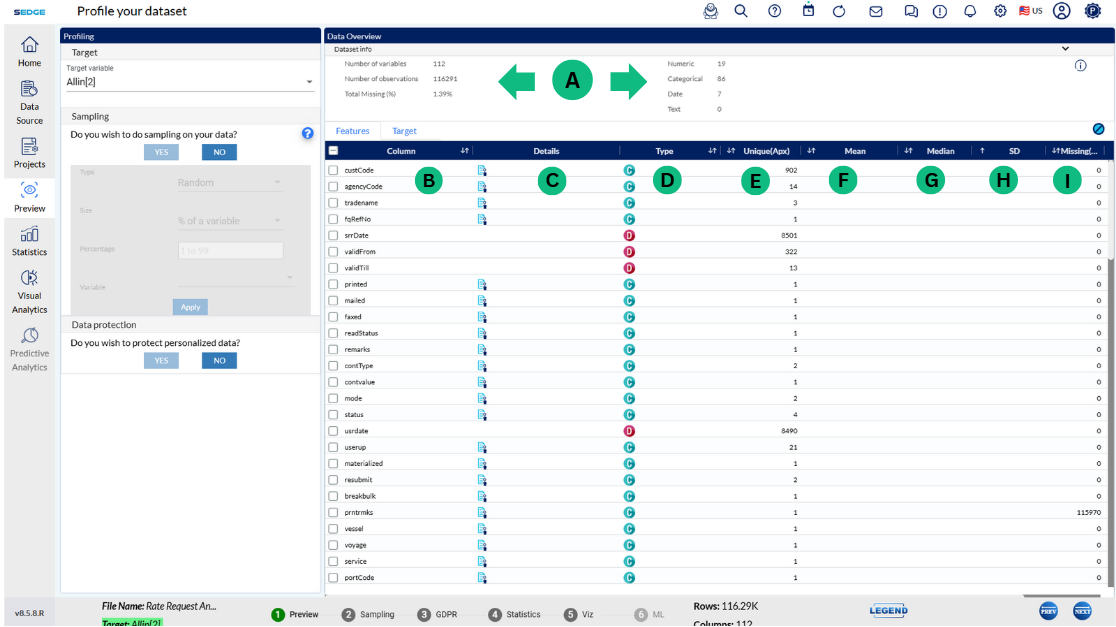
A - Dataset info – basic information about the respective data set like number or variables, number of observations/rows, percentage of missing data, warnings
B - List of all columns/variables in the data set
D - Information if the variable is categorical or numerical
E - How many unique values are there within each variable (sex – male or female – 2 possible values, name – unlimited number of values)
F - Mean – the average value of the respective numerical variable. Found by adding all numbers in the data set and then dividing by the total number of variables in the data set
G - Median – the middle value in the data set – value that separates the higher half of the data sample from the lower half
H - SD – standard deviation represents how close or far the values are dispersed from the mean
I - Total number of missing values within the respective variable
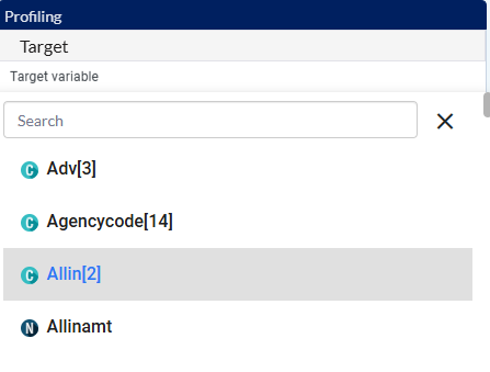
J - In this tab, you have to select the target you are going to be predicting. It is one of the variables that are already part of the dataset. In our case, we are going to be predicting if the Titanic passenger did or did not survive
After selecting your preferences click on Apply button
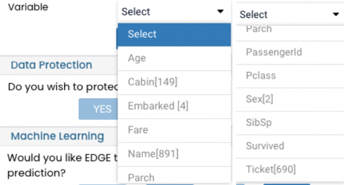
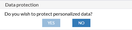
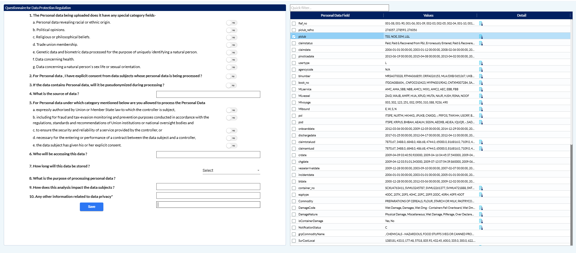
L - GDPR - Data pseudonymization
Depending on the nature of your data, you can choose if you wish to protect personal data or no. If you select yes, next step will take you to the GDPR page where you will select which data you want to hide. If you do not need to hide any of the data, select NO button and the GDPR page will be skipped
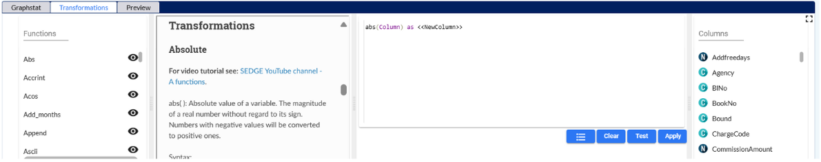
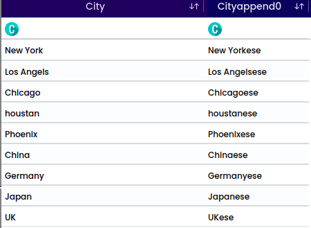
The operation converts a numerical value into its absolute value, exclusively accepting numerical inputs. For instance, temperature can be transformed into its absolute value to determine its distance from zero. Upon applying an operation, successful validation appear in the top-right corner. A newly generated column is displayed at the bottom of the preview. After column addition, the variable of importance may alter; to observe its impact.
image showing message notification after ABS function (absolute)
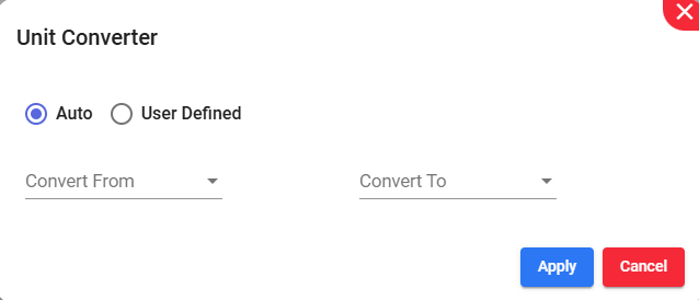
Simplifies converting measurements between different units. For example, Converting inches to centimeters or pounds to kilograms using a unit converter.
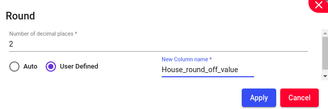
Round numbers to a specified number of digits, such as rounding housing measurements to 2 digits. This function should allow for manual or automatic selection of the column name and if required, enable the user to manually choose the name of the new column.
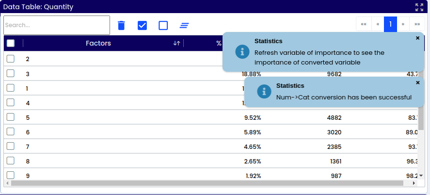
Converting a numerical column to a categorical format. In case of missing values, they can be managed by either deletion or imputation, techniques elaborated upon in the forthcoming “Data” chapter.
Upon applying this function, the successful validation will appear.
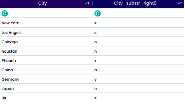
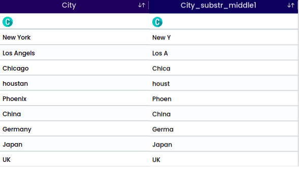
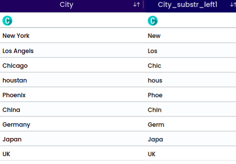
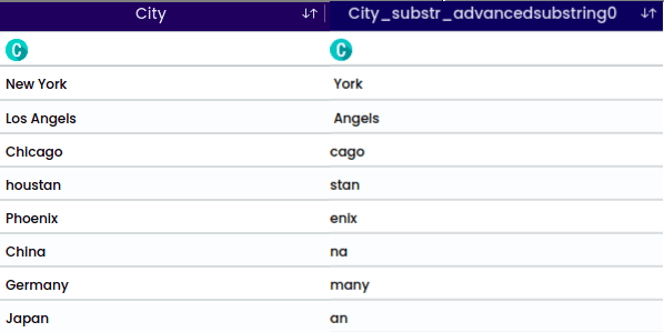
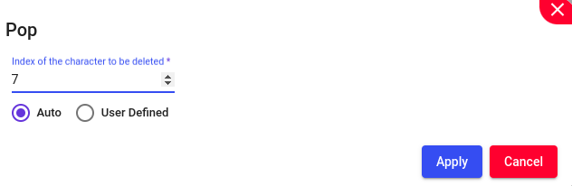
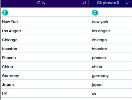
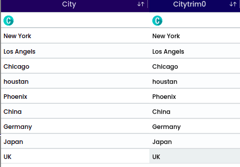
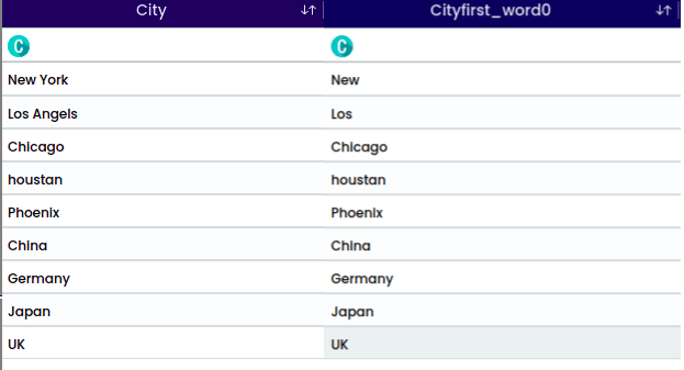
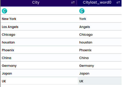
A Substring is a contiguous sequence of characters within a larger string. It is a portion of a string that is extracted or considered separately based on its starting position and length.
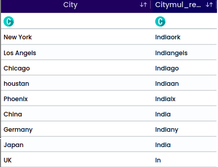
For the string “houstan”, the selected position is “Middle” with a start index 1 and length of 5. This operation will return the middle portion. For the middle position it is required to select the start index.
For the string “New York”, the selected position is “Exclude String” with a length of 3 and a start index of 1. This operation will exclude the specified characters from the string.
The output will be: York.
Example for substring for the position - Exclude String
For the string “Los Angels” and the selected character “s” with the position “after”, the operation will split the string after each occurrence of the character “s”.
The output will be: Angel.
Example for substring for the position - Spelit by Character/Pattern
Note
For the position “Middle” and “Exclude String” it is required to select the start index.
For the position “Split by character/pattern” it is required to choose either “Before” or “After.
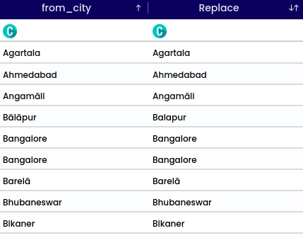
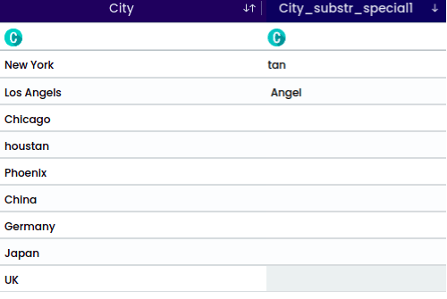
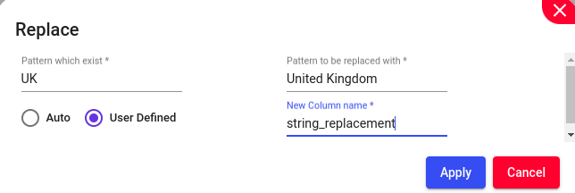
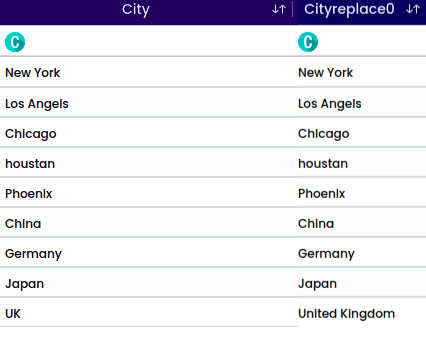
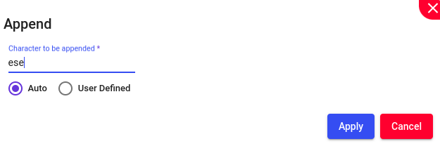
Replace one or more characters with another pattern/set of strings. Under ‘Pattern which exist,’ provide the pattern that needs to be changed. Then, under ‘Pattern to be replaced with,’ specify the pattern for replacement.
To replace “UK” with “United Kingdom,” provide the following:
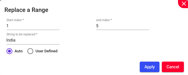
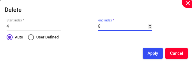
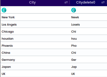
Replace set of strings based on its occurrence index value. specify the start and end indices of the substring to be replaced along with the replacement text.
Example: Original word: “Chine”
To replace a range of characters from index 1 to index 5 with “India” provide the following,
Start index: 1
End index: 5
String to be replaced: “India”
After completing the replacement operation, the updated word will be: India
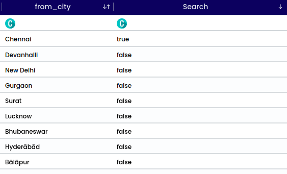
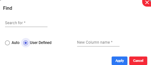
To determine if an entry matches a searched string, compare each entry against the specified string. If a match is found, return the matched string. If no match is found, return False to indicate that the string is not present in the column.
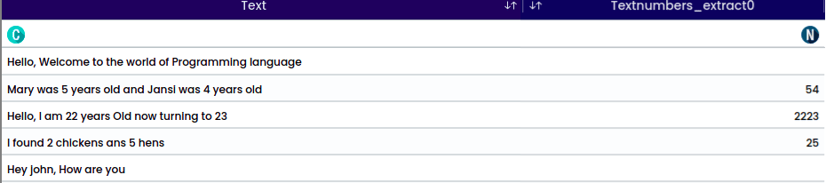
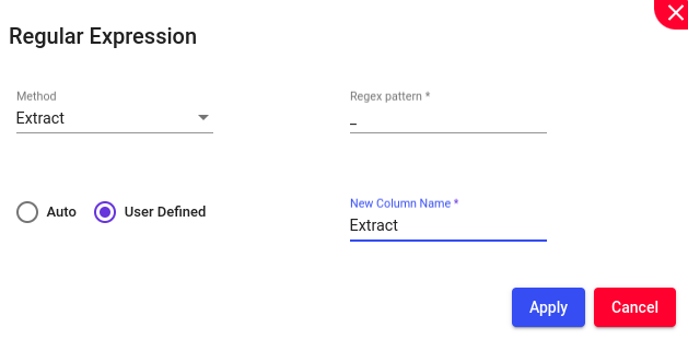
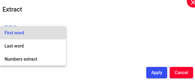
To extract numerical values from text This function is useful for isolating and retrieving numbers embedded within text, simplifying the process of data cleaning and preprocessing.
Convert categorical variables into numerical values only when the selected categorical column contains numbers exclusively. Upon applying this function, the successful validation will appear.
Note
String Operations can be performed only to the String variables.
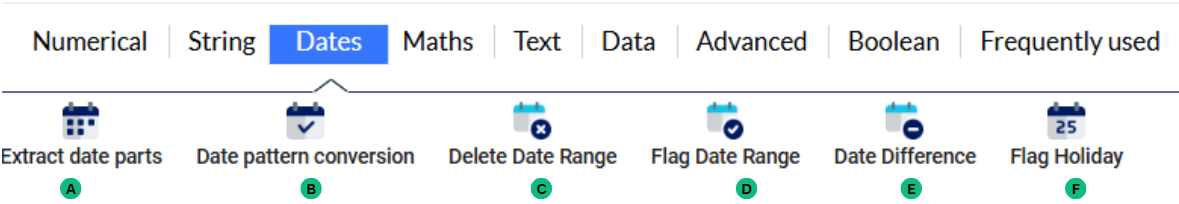
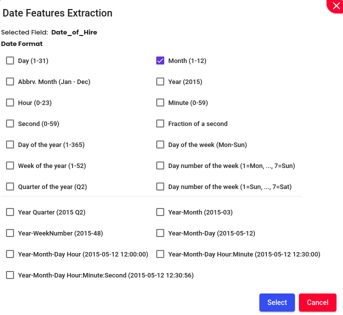
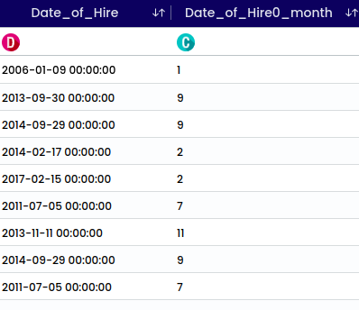
The Dates function with the menu, helps to strip out the date, month, Year, etc., from a date column. These stripped out date, month and year, act as additional feature for the model.
Example: Lets try to extract Month from the “Date of Hire” column,
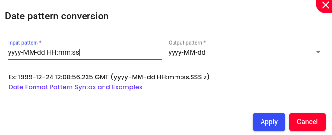
This function is used to convert the date pattern in a different, more suitable way for the research. After selecting the input and desired output pattern click on the apply button.
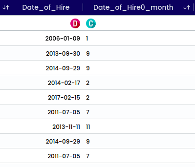
Example: Lets convert the date pattern, from “yyyy-MM-dd HH:mm:ss” to “yyyy-MM-dd”
This will covert the existing column with the selected date pattern.
There are several types of date patterns and shortcuts, that can be present in a date variable. Can Design own format patterns for dates and times from the list of symbols in the following table:
Characters that are not letters are treated as quoted text. That is, they will appear in the formatted text even if they are not enclosed within single quotes.
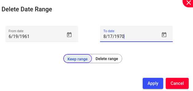
Removing or deleting all records or entries that fall within a specified range of dates from a dataset.
Steps to perform:
Select “From date” and “To date”
Select Keep range (will keep only the selected range of dates) or Delete range (will delete only the selected range of dates) based on your preferences.
Example: Lets keep only the records from “6/19/1961” To “8/17/1970”
This will alter the existing column and will keep only the selected range of values.
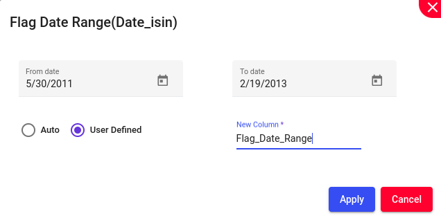
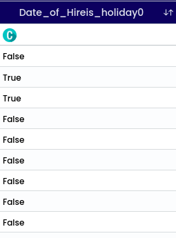
Marking or highlighting all records or entries that fall within a specified range of dates. This is often done to identify, review, or take specific actions on the data within that range.
Example: Lets try to flag from “5/30/2011” to “2/19/2013”
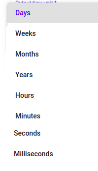
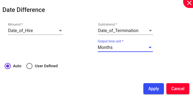
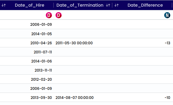
Calculation of the amount of time between two dates. This can be measured in various units such as days, months, or years.
Steps to perform:
select Minuend (The number from which another number (the subtrahend) is to be subtracted) and Subtrahend (The number that is to be subtracted from the minuend).
choose output time unit from the dropdown menu.
Example: Lets try to do difference for the columns ‘Date of Hire” and “Date of Termination”
This will generate a new column at the bottom of the preview.
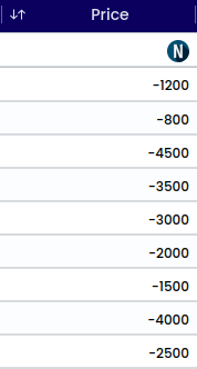
Convert a positive to negative sign and vice versa. Choose between positive or negative conversion, and the result will be displayed in the existing column.
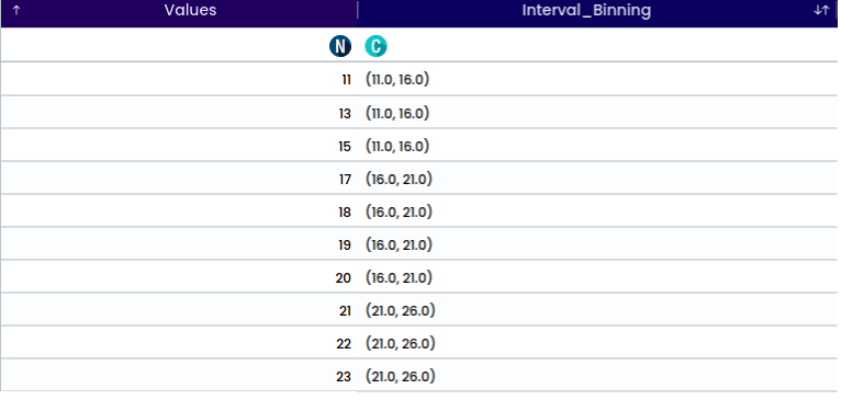
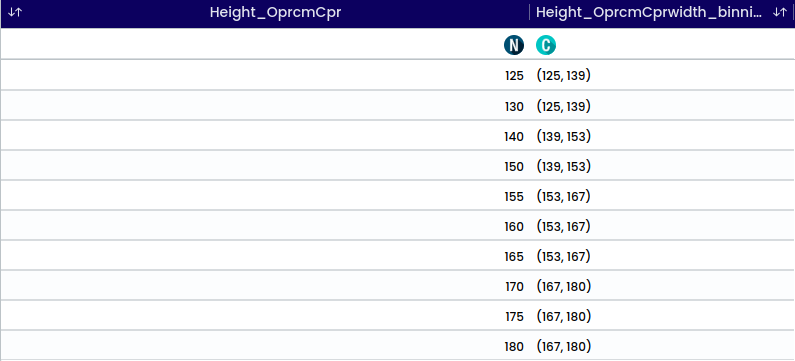
Equal width binning is a type of interval binning where each bin has the same width.
For example, if the data representing the heights of students in a class ranging from 120 cm to 180 cm, and need to create 4 bins,
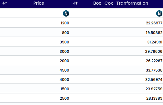
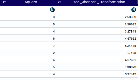
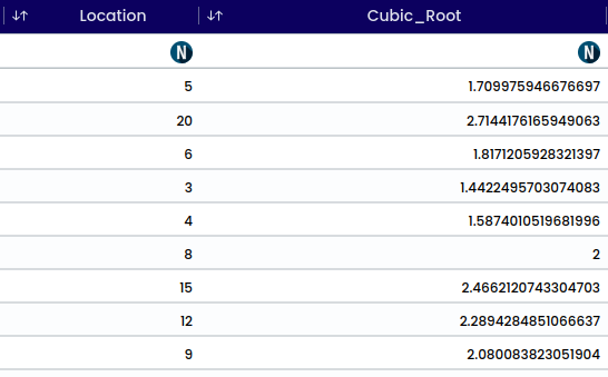
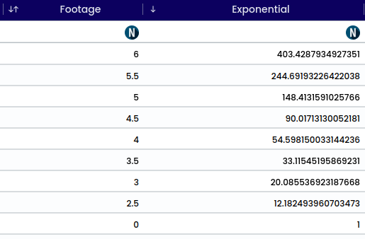
This function includes several mathematical operations - Box cox, Yeo Johnson, Cubic root, Exponential, Log, Normalization, Power2, Power3, Reciprocal, Square root and Standardization. After selecting your chosen operation a new column is created at the bottom.
The Box-Cox transformation is a statistical method used to stabilize variance and make data more normally distributed (symmetric bell-shaped distribution where the mean, median, and mode are all equal)
This dataset is skewed to the right, indicating that most of the house prices are lower.
To apply the Box-Cox transformation mathematically,
Choose a range of values for the λ (lambda) parameter to test the transformation. Let’s say we try λ values ranging from -2 to 2.
For each λ value, calculate the transformed values using the Box-Cox transformation formula:
The lambda (λ), which varies from -5 to 5. All values of λ are considered and the optimal value for your data is selected; The “optimal value” is the one which results in the best approximation of a normal distribution curve.
The Yeo-Johnson transformation extends the Box-Cox transformation to handle both positive and negative values, as well as zero values. It is useful for stabilizing variance and making data more normally distributed.
Factors influencing the lambda value include the data’s skewness, distribution, variance, sensitivity to outliers and optimization method. The lambda value is empirically determined to maximize the normality and symmetry of the transformed data.
The value when multiplied by itself twice, yields the original number is referred to as the cubic root. For instance, the cubic root of 8 is 2.
.. math:
Exponential refers to a mathematical operation or function where a constant (the base) is raised to the power of an exponent, resulting in a rapidly increasing or decreasing function. It is commonly represented as a^x, where a is the base and x is the exponent.
An example of an exponential function is f(x) = 2^x. Let’s evaluate this function for some values of x:
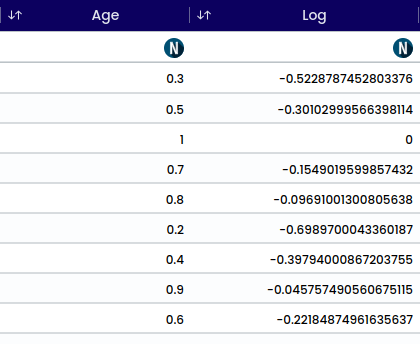
The log transformation is a mathematical operation that calculates the logarithm of a number. It is commonly used to transform skewed data to make it more symmetrically distributed.
The transformation formula is as follows:
y_i = \log(x_i)
where:
x_i is the original value,
y_i is the transformed value.
Example:
\log_{10}(100) = \frac{\ln(100)}{\ln(10)}
We can substitute \ln(100) and \ln(10) with their respective values:
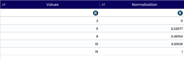
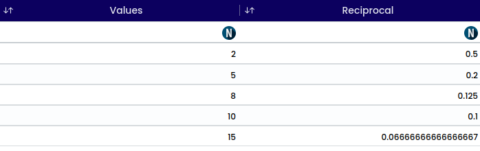
Normalization is a technique used to scale numeric features to a standard range, typically between 0 and 1 or between -1 and 1. It is used statistical analyses to ensure that all features have the same scale and to prevent features with larger values from dominating those with smaller values.
For Example, Consider the following dataset,
{Data} = [2, 5, 8, 10, 15]
To normalize these values using min-max scaling, we’ll use the formula:
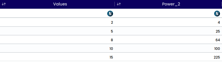
The term “Power of 2” typically refers to the operation of exponentiation, where a number is raised to the second power. In mathematical notation, it is represented as "x^2" where, x is the base number. This operation involves multiplying the base number by itself.
For example:
2^{2} = 4
In general, raising a number to the power of 2 is known as squaring that number.
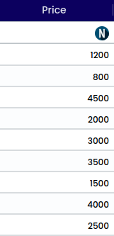
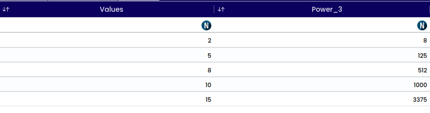
The term “power of 3” also refers to exponentiation, where a number is raised to the third power. In mathematical notation, it is represented as "x^3" where, x is the base number. This operation involves multiplying the base number by itself twice.
For example:
1200^{3} = 1,728,000,000
In general, raising a number to the power of 3 is known as cubing that number.
The reciprocal of a number is calculated by dividing 1 by that number.
Mathematically, if we have a number represented as x, the reciprocal of x is represented as \frac{1}{x}.
For example:
x = 5, the reciprocal of 5 = 1/5.
Similarly, x = 0.5, the reciprocal of 0.5 is 1/0.5 = 2.
The reciprocal of a number essentially represents how many times that number can fit into 1. For instance, the reciprocal of 5 is (1/5) means that 5 fits into 1 one-fifth of a time.
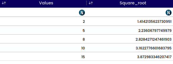
The square root of a number is a value that, when multiplied by itself, gives the original number. In mathematical notation, the square root of a number x is represented as √x.
For example:
\sqrt{25} = 5. Since 5 * 5 = 25
The square root operation can also be denoted using exponentiation: x^(1/2). This means raising x to the power of one-half, which is equivalent to taking the square root of x.
In statistics, standardization is a process used to transform data so that it has a mean of zero and a standard deviation of one. This technique is applied to individual variables within a dataset, making them comparable and facilitating statistical analysis.
The formula for standardizing a variable x is:
z = \frac{x - \mu}{\sigma}
Where:
x is the original value of the variable,
\mu is the mean of the variable,
\sigma is the standard deviation of the variable, and
z is the standardized value.
Standardization transforms the distribution of the data to have a mean of zero and a standard deviation of one. This process does not change the shape of the distribution but places it on a common scale, allowing for easier comparison between variables and datasets.
Standardization is particularly useful in statistical modeling, machine learning, and data analysis, where it helps improve the interpretability and performance of models by ensuring that variables are on a consistent scale.
Example:
Consider the data x= [5, 20, 8, 3, 4, 6, 15, 12, 9, 10]
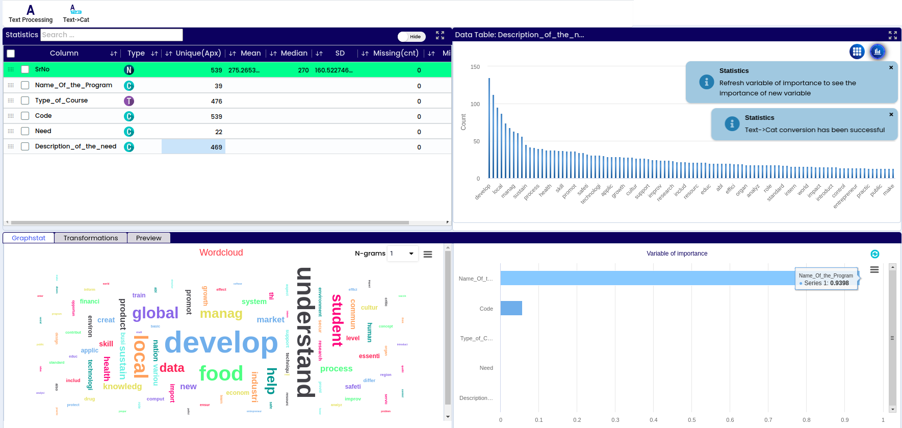
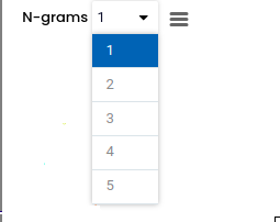
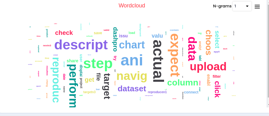
Text processing is used to analyze most used words in a written text. Can also be used to identify SPAM emails, by searching for specific key words. By doing the text processing you will get the top 100 used words as new columns.
Select the preferred N grams from 1 to 5.
Select the Encode type such as : Boolean( 0 or 1), Count.
Select Custom stop words if required.
Click on apply button.
Note
The output will appear at the bottom of the page. You can also preview the output on the preview page.
This operation will not generate a new column for the output; instead, it will only modify the data type within the same column, altering the output accordingly.
Note
Text functions can be performed only for the Text variable.
One hot encoding is another method used to represent categorical variables in a format suitable for machine learning algorithms. Instead of assigning numerical labels like label encoding, one hot encoding creates binary vectors for each category.
Note
This function is applicable for both categorical and text columns. It does not require a user-defined output column name; instead, it will automatically generate a column name for the output.
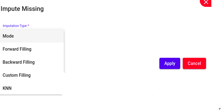
Involves filling in missing data points in a dataset.
Techniques available for Numerical Data Type include:
Mean (Often known as the average, represents the central tendency of a dataset. It’s computed by adding up all values and dividing by the total count of values.)
Median (Middle value in a dataset when the values are arranged in ascending or descending order. If there’s an even number of values, it’s the average of the two middle values.)
Mode (Value that appears most frequently in a dataset. It’s the most common observation or value in the data.)
Default
Moving Average (Smooths out fluctuations in data by calculating the average of a subset of data points within a sliding window.)
Forward Filling (Copying the last observed value forward to fill in missing values.)
Backward Filling (Copying the next observed value backward to fill in missing values in a dataset.)
Custom Filling (Filling missing values using a user-defined method.)
Average of previous and next (Involves taking the average of the values immediately preceding and following the missing value to estimate its value.)
KNN (Missing values are replaced with the average or median value of the k nearest neighbors.)
The available techniques for “Categorical” variable are,
Deleting rows with missing values can be a preferred approach when those values are critical for analysis and cannot be easily imputed.
This function removes all rows containing missing values across all columns in the dataset, ensuring that only complete observations are retained for analysis.
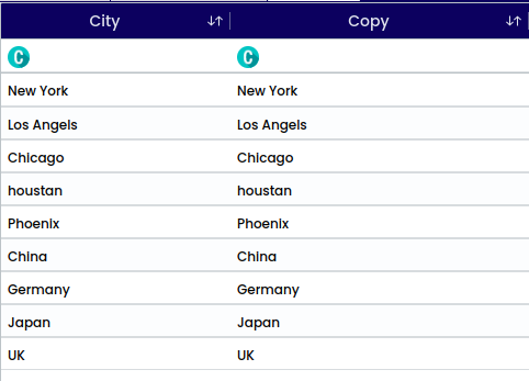
Copying a column or creating a duplicate allows for performing two different operations on the same column, which can be useful. This process simply involves creating a copy of the column, and then proceeding with the desired operations. The new column is created at the bottom.
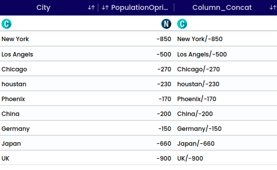
The function is used to concatenate two or more columns into one column. For instance, if there are columns for “First name” and “Surname,” they can be merged into a single column.
For example, “Name” and “Sex” columns are being combined. A delimiter is manually selected to clearly mark the transition between the values of the first and second columns.
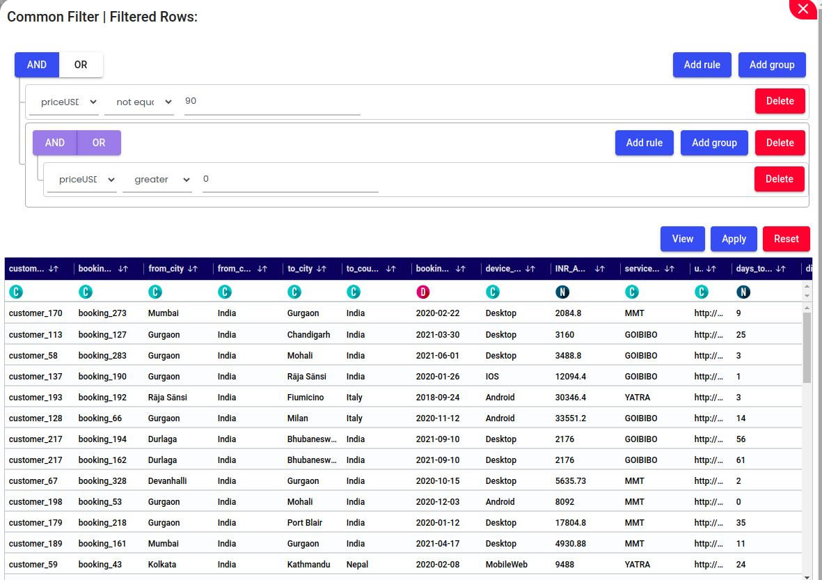
Add Rule – Click this to add a new filtering condition (e.g., priceUSD greater than 100).
Add Group – Allows you to create a nested group of filter rules with its own AND/OR logic.
AND / OR Toggle – Used to define the logical relationship between multiple filter rules. Choose AND to apply all conditions or OR to apply any one of them.
View – Shows a live preview of the filtered data based on current rules.
Apply – Applies all active filters and updates the dataset view accordingly.
Reset – Clears all defined filters and resets the dataset to its original, unfiltered state.
Delete – Removes an individual rule or an entire group of conditions.
Filter Rule Components
Column Selector: Choose the column to filter (e.g., priceUSD).
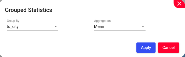
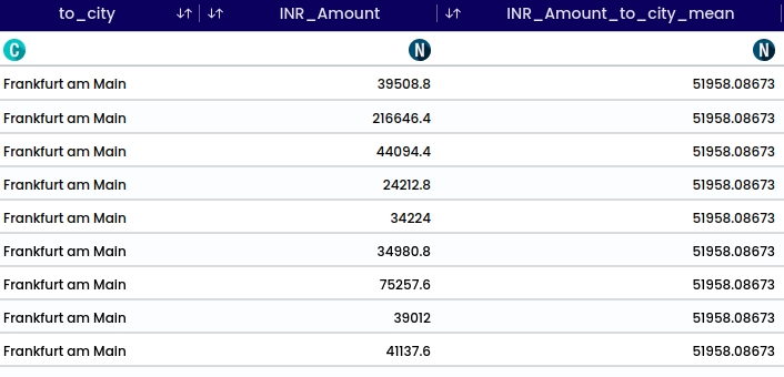
Grouped statistics organize data into groups and calculate statistical measures for each group, offering detailed insights into how variables behave within specific categories.
Note
This filter is only applicable to Numerical data types.
The available aggregation are:
Mean (Often known as the average, represents the central tendency of a dataset. It’s computed by adding up all values and dividing by the total count of values.)
Median (Middle value in a dataset when the values are arranged in ascending or descending order. If there’s an even number of values, it’s the average of the two middle values.)
Variance (Value that appears most frequently in a dataset. It’s the most common observation or value in the data.)
Standard Deviation (How the data is spread around the mean)
Unique (Number of unique values in the dataset)
Count (Total number of elements present in a particular variable or column)
Sum (Total value obtained by adding together all the individual values in a specific variable)
Example: To calculate average booking amount for each destination city, select INR_Amount with,
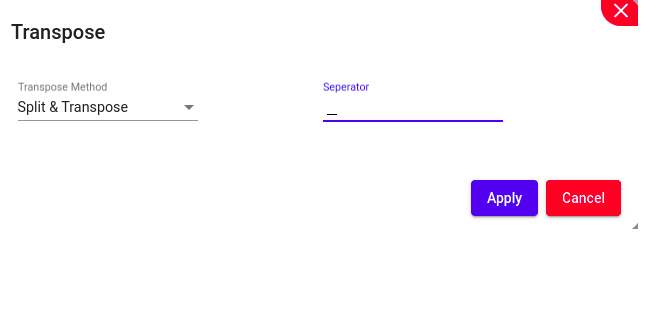
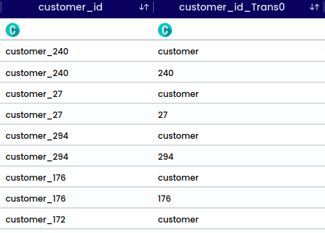
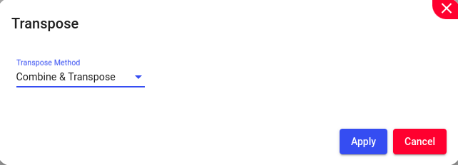
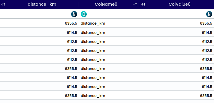
Transpose refers to the operation of flipping or rotating a dataset, typically switching its rows and columns. This operation can be useful for various purposes, such as changing the orientation of data for easier analysis or visualization, or preparing data for specific computations or algorithms. When a dataset is transposed, the rows become columns and vice versa.
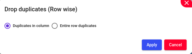
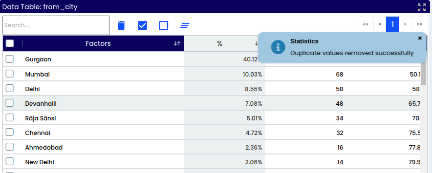
Dropping duplicates refers to removing Duplicates in column or entire row duplicates. This operation ensures that each row in the dataset is unique, which can be important for various data analysis tasks
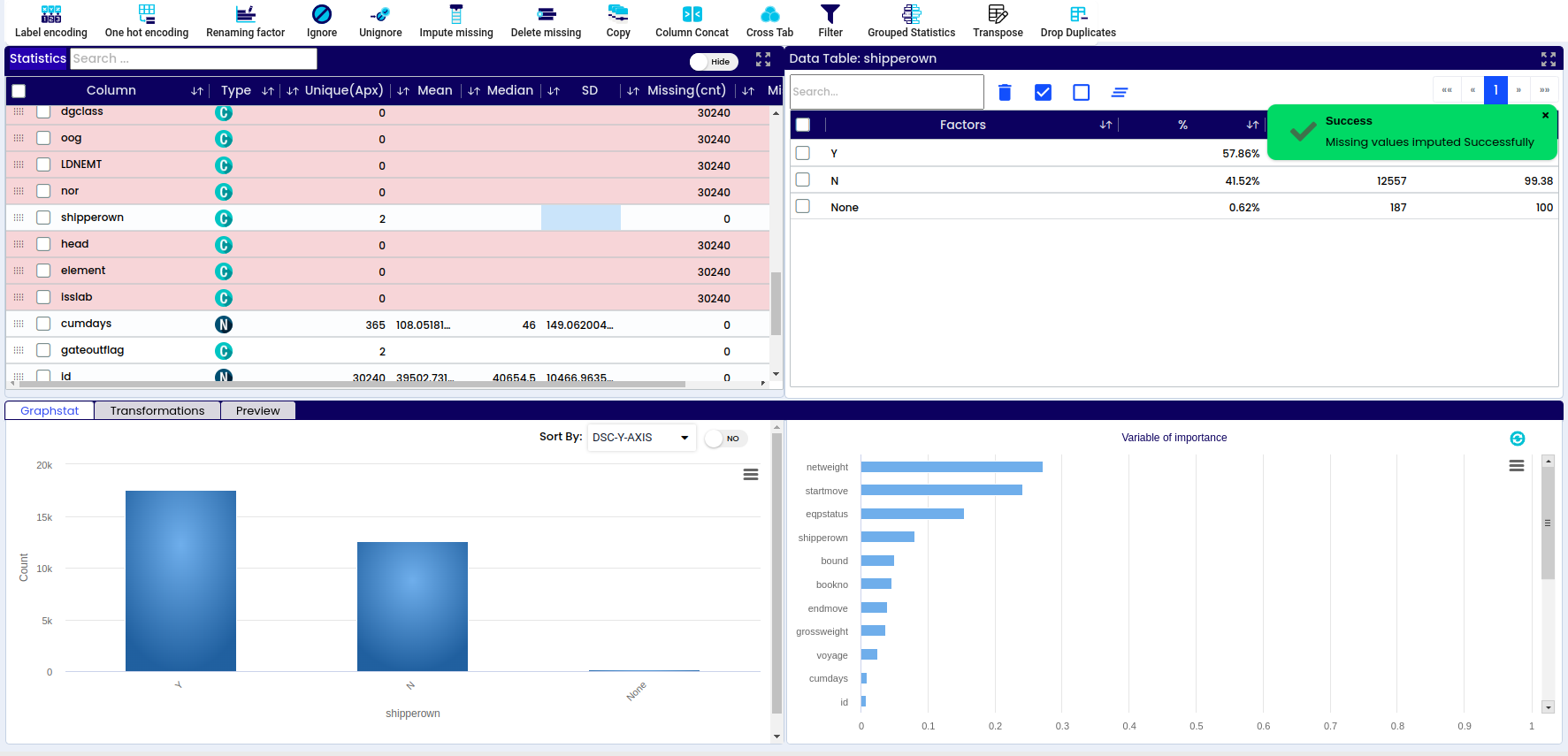
In the selected Column ( from_city) contains 2033 missing records.
After applying the function to the selected column, the validation results will be displayed.
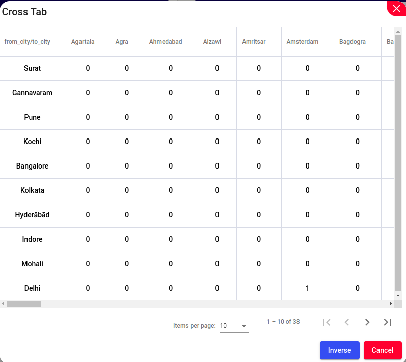
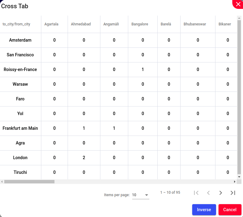
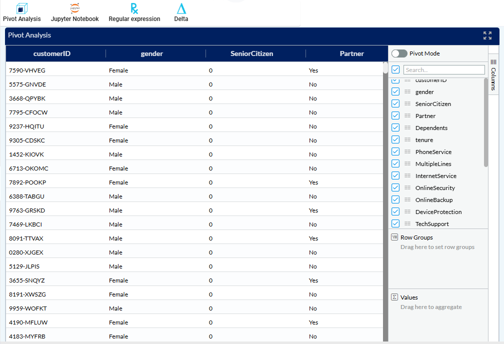
Analysis based on pivoting data - a Pivot Table is used to summarise, sort, reorganise, group, count, total or average data stored in a table. It allows us to transform columns into rows and rows into columns.
We have two options in this section - either a “Pivot mode” or a regular chart mode.
In the regular chart mode we can select all the rows that we are interested in, in our example we selected Age, Fare, Sex, Ticket purchase, Cabin Detail and Number of meals. We get a basic chart with the selected values.
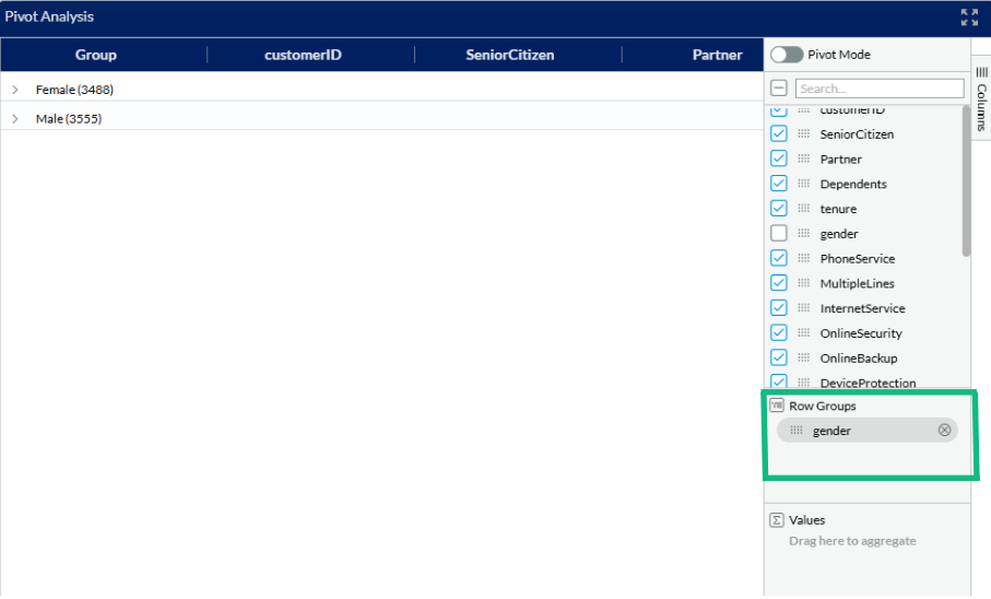
In the next step, we can also divide our selected columns in groups, by dragging the preferred group type down to the “Row groups” section. We have selected “Gender” to differentiate the groups. We can see we have 3555 items in group “Male” and 3488 items in group “Female”. We can open each group by clicking on the group name.
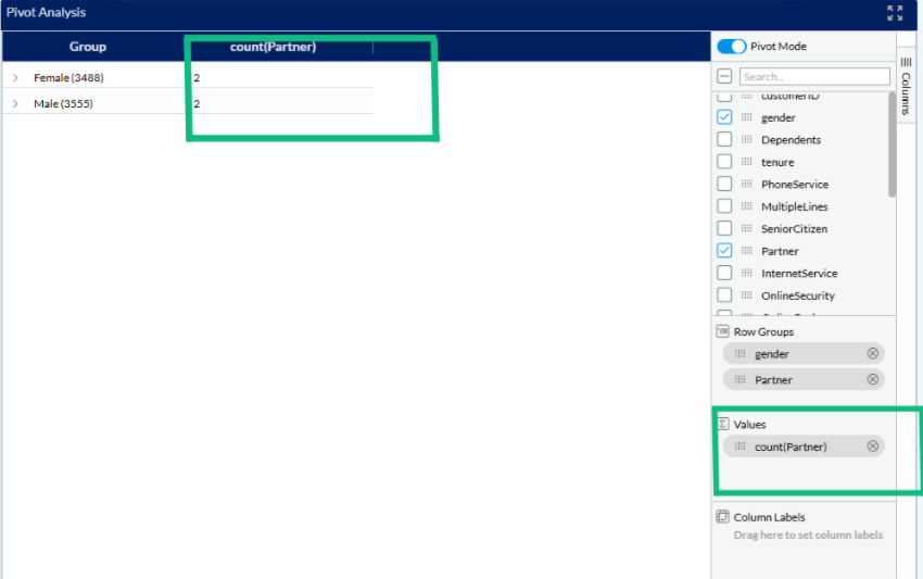
In the next step, we can add some other numerical values that we are interested in. In our case, we dragged the “Partner” down bellow to the “Values” section and by clicking on the desired value in the bottom green box. We can also select in which form the value should be displayed - average, count, first, last, max, min or sum. In our case it was the “average fare” value.
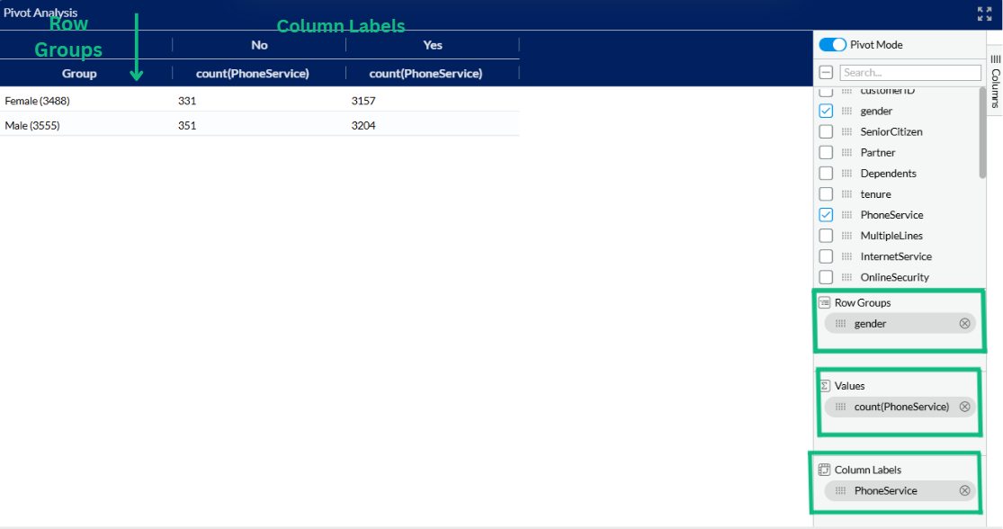
After enabling Pivot Mode, the fields were arranged to analyze the distribution of phone service subscriptions by gender. The gender field was added to the Row Groups, so the data is grouped row-wise into Female and Male categories. The PhoneService field was placed under Column Labels, splitting the table into two columns labeled No and Yes based on subscription status. Finally, count(PhoneService) was added to the Values section to display the count of records for each combination of gender and phone service status. This setup provides a clear comparison of how phone service is distributed between male and female customers.
Jupyter is an open-source, interactive web tool known as a computational notebook, which researchers can use to combine software code, computational output, explanatory text and multimedia resources in a single document. User can create a customised program/code using Jupyter notebook and import it back to EDGE.
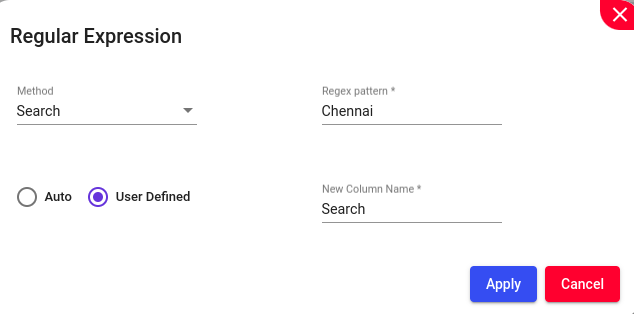
Regular Expressions (REs) offer a mechanism to select specific strings from a set of character strings. They provide a context-independent syntax capable of representing a wide variety of character sets and their orderings, with interpretations based on the current locale. In addition to using Search and Replace for finding and replacing simple text strings, you can perform more precise searches using Regular Expressions (RegEx). RegEx allows you to accurately match a particular pattern in your search.
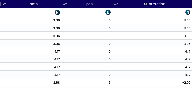
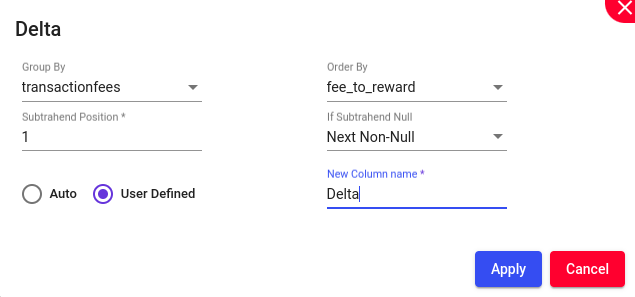
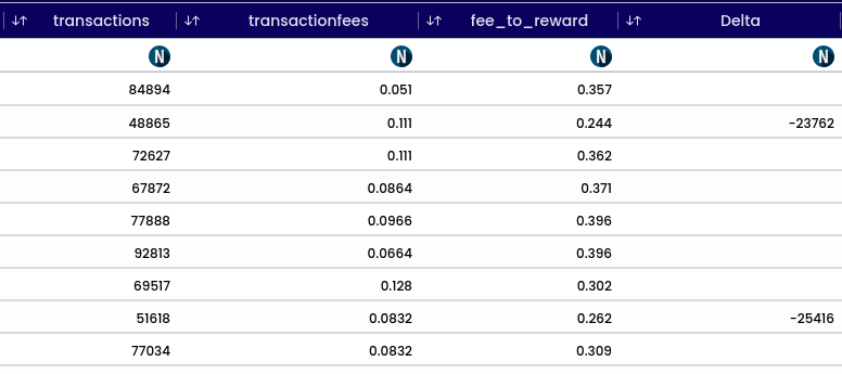
Delta (Δ) is a generalized function that calculates the difference between each row value and the value from its corresponding subtrahend position in the given numerical column grouped & sorted through the groupBy & orderBy columns respectively.
Refers to missing or nonexistent values in a dataset.
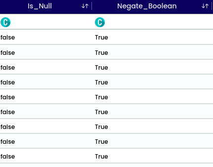
When checking for null values in a specific data field or observation, the result is typically a boolean (true or false) indicating whether the value is null (true) or not null (false). This process of checking for null values is essential for data cleaning and quality assessment before analysis.
Means flipping its truth value. For example, if the original boolean value is true, its negation would be false, and vice versa. It’s a way to change a statement from being true to false, or vice versa.
Note
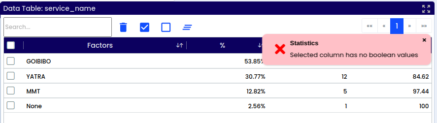
This function applicable only to the Boolean values.
When selecting non boolean data type variable it will show the validation called “Selected column has no boolean values.
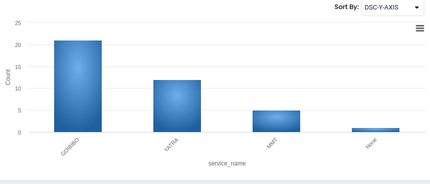
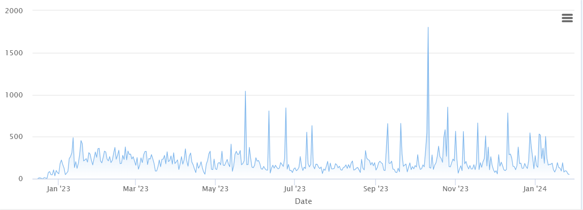
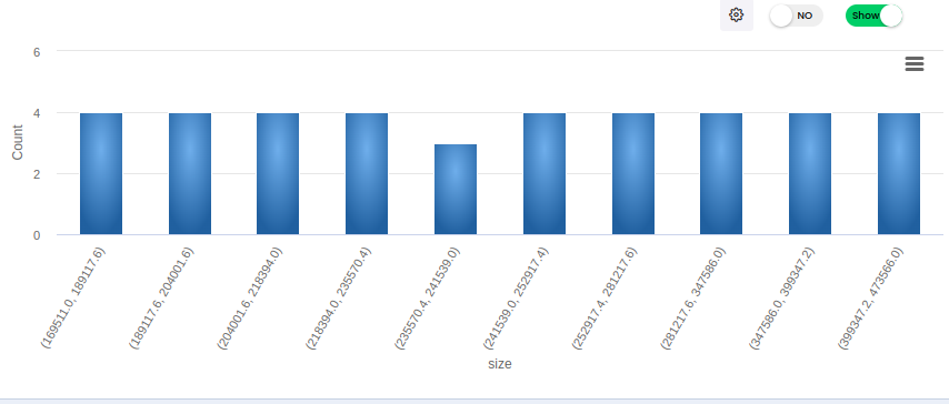
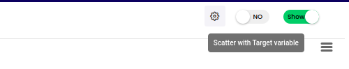
This feature presents a bar chart for the selected column, displaying the value and its count. It supports numerical, categorical, and date data types for bar chart visualization. Numerical data types offer an option to adjust the number of Bins. Text data types are represented using a word cloud. Scatter plots can be enabled to visualize two numerical variables against each other, typically the selected variable and the target variable. Users can view charts in full-screen mode and utilize a print option. Chart download options include PNG, JPEG, PDF, and SVG formats. Data can be downloaded in CSV or XLS format.
Note
Categorical and date data types display only bar charts, while numerical data types offer both scatter plots and bar charts.
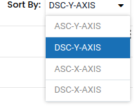
For categorical variables, the ‘sort by’ feature is available.
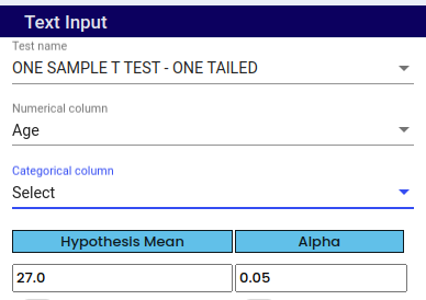
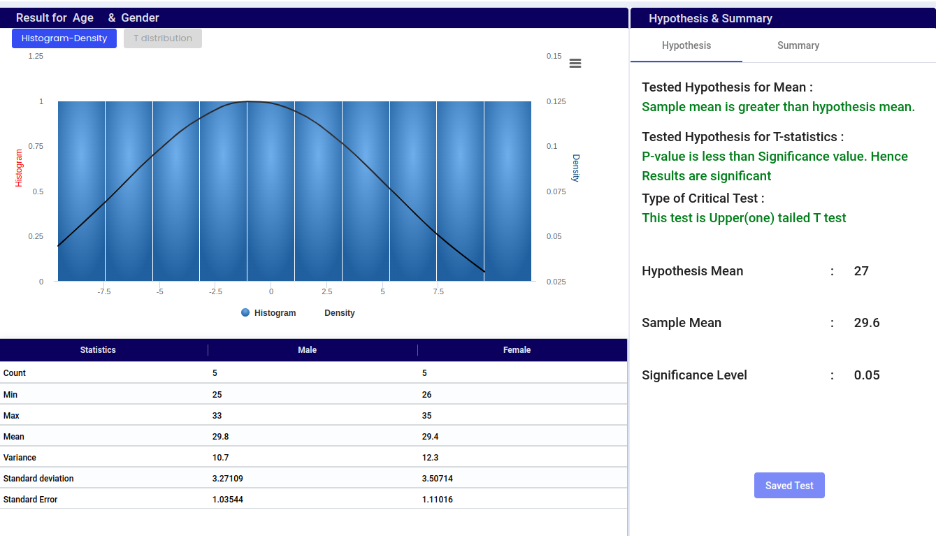
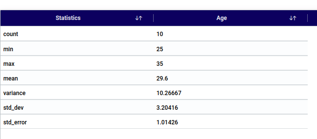
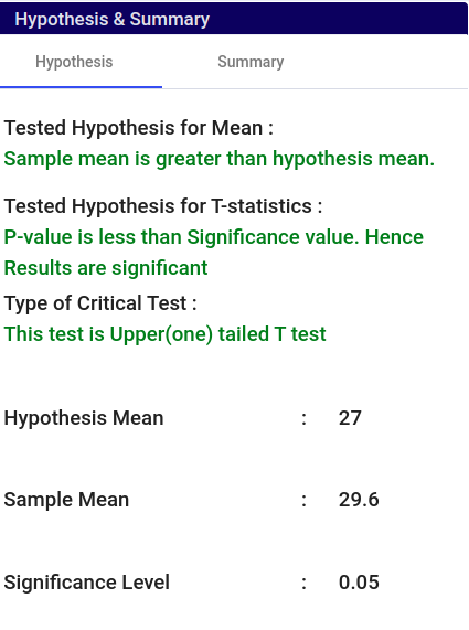
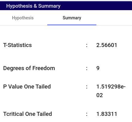
Select One Sample T Test - One tailed under test name.
Under Numerical column select Numerical variable.
Under Categorical column select categorical variable. Select if it is required.
Choose a hypothesis mean value based on existing theories, previous research findings, or practical considerations. For example, if previous studies suggest that the average height of adults is 170 cm, you might set your hypothesis mean value to 170 cm.
The default Alpha (Level of significance) value is 0.05. Change the value based on your requirement.
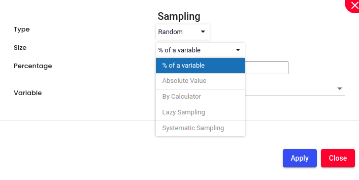
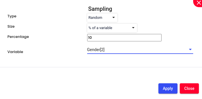
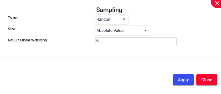
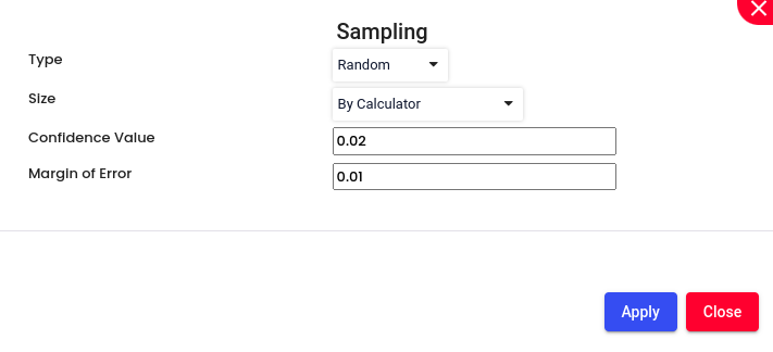
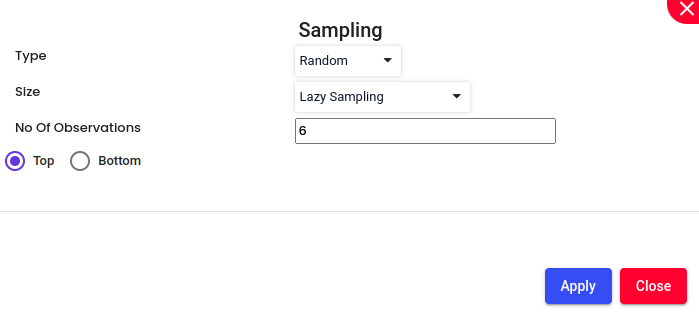
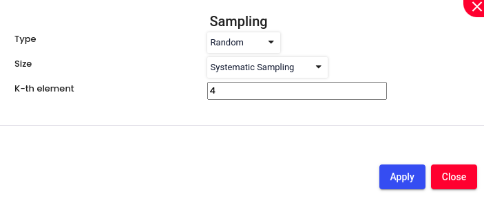
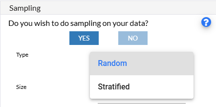
Sampling:
Enable Sampling, if required. Choose the sampling method Random (each member of the population is selected purely by chance. This means that every individual or item has an equal chance to be included in the sample, and selection is not biased by any personal judgment or preference.)or Stratified (method of sampling in which the population is divided into subgroups, or strata, based on certain characteristics that are relevant to the research question. Then, samples are randomly selected from each stratum independently. This approach ensures that each subgroup is represented in the sample, and it allows for more precise estimates and comparisons within each stratum.)
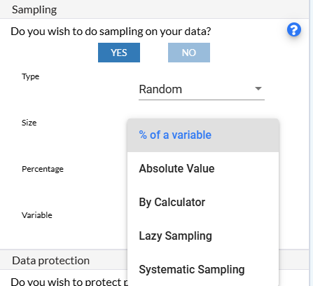
Size:
% of a Variable: Selecting a sample size that is a certain percentage of a particular variable. For instance, if the variable is the total population, and you choose 10%, your sample will include 10% of the total population. This approach is useful when you want the sample size to be proportional to the size of a certain variable.
Absolute Value: Selecting a sample size by specifying an absolute number. For example, if you decide that your sample size should be 5 individuals, you simply select 5 individuals from the population. This method is straightforward and is often used when the required sample size is predetermined by external factors such as budget or time constraints.
By Calculator: Using a calculator involves employing a statistical tool or software to determine the appropriate sample size based on certain parameters such as confidence level, margin of error, and population size. This method ensures that the sample size is statistically valid and sufficient to make reliable inferences about the population.
Lazy Sampling: A less rigorous approach where the sample is selected based on convenience or ease of access rather than using a strict randomization process. This method is quick and cost-effective but may introduce bias and is not always representative of the population. It’s often used in exploratory research or when resources are limited.
Systematic Sampling: Selecting every nth item from a list or population. For example, if you have a list of 1,000 individuals and you want a sample of 100, you would select every 10th individual. This method is easy to implement and ensures a spread across the population, but it assumes that the list is randomly ordered to avoid periodicity bias.
Filtering: Enable Filtering and filter the data, if required.
Once the steps are done, Click on ‘Test’ and verify the result.
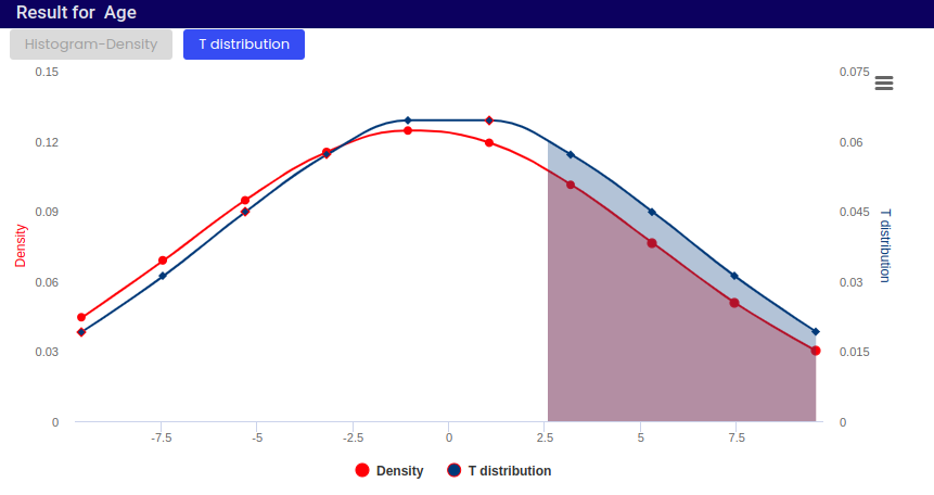
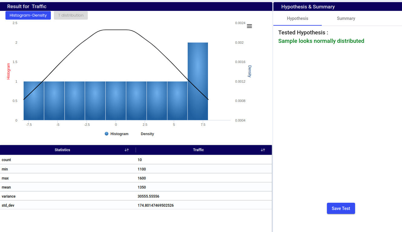
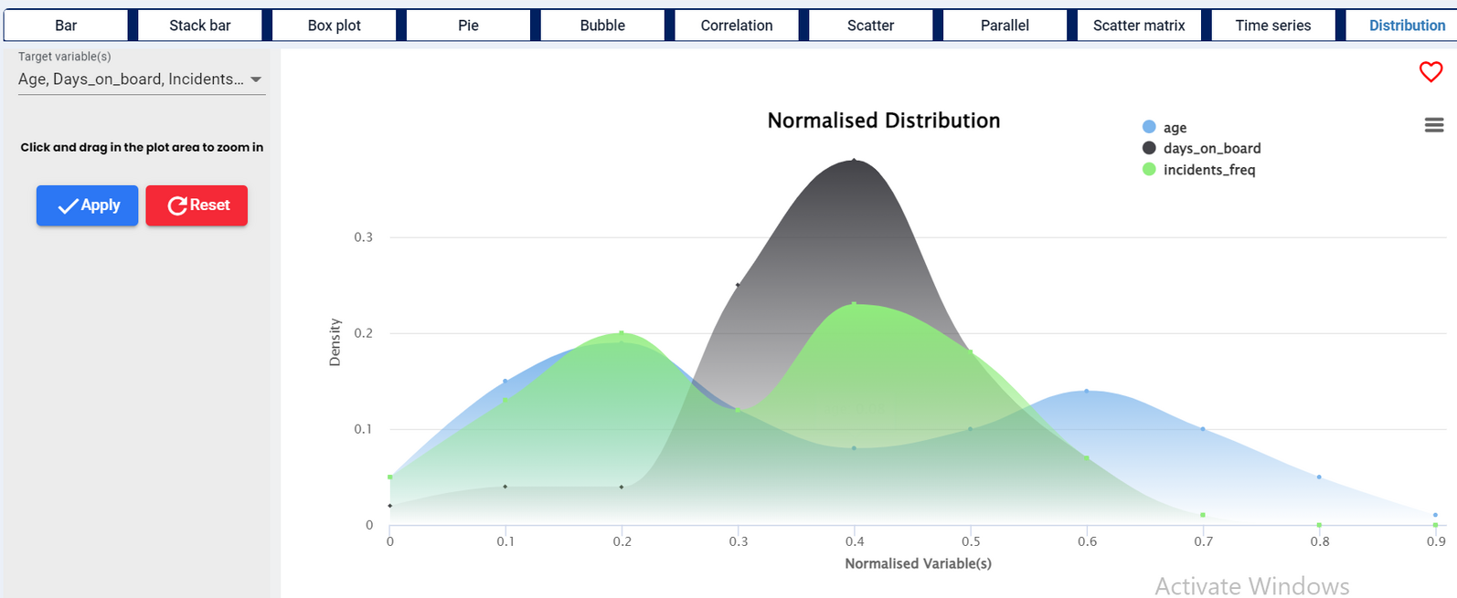
Provides a normalized representation of the distribution of data, making it easier to compare distributions and understand the relative proportions of data within different intervals.
Histogram:
The histogram displays the frequency distribution of age data within specified intervals (bins).
The blue bars represent the number of data points (frequency) that fall within each age interval.
The height of each bar corresponds to the count of data points in that interval.
Density:
The black curve represents the density estimate, showing the distribution of the data in a continuous manner.
The area under the density curve represents the entire data set and sums to 1.
The histogram gives a direct count of data points within intervals, while the density plot provides a smoothed view, highlighting the shape of the distribution.
Together, they offer a comprehensive view of the data, with the histogram showing discrete counts and the density plot illustrating the overall distribution pattern.
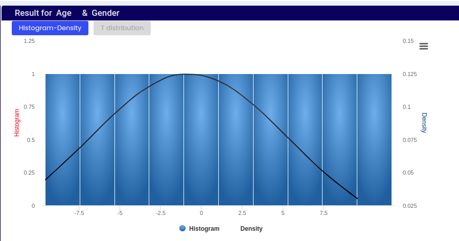
Provides a visual representation of how the shape of the distribution changes with different sample sizes and illustrates the properties of the t-distribution relevant for statistical inference.
Central Tendency of Age Data:
The peak of the density curve (red line) suggests that the most common or average age in the dataset is around 0 on a standardized scale. This means that the data is centered around this value.
Spread and Distribution of Age Data:
The shape of the density curve (red line) and the t-distribution curve (blue line) indicates how age values are distributed in the dataset.
The t-distribution curve (blue line) closely follows the density curve, but it’s slightly smoother and broader. This suggests that the data may have been fitted to a theoretical distribution, such as the t-distribution, often used in statistics for small sample sizes.
Significance of Tail Area:
The shaded area under the t-distribution curve (pink) represents the tail of the distribution.
This area is significant in statistical terms, especially for hypothesis testing, where it helps determine the probability of observing values beyond a certain threshold (e.g., ages above a certain point).
In a one-sample t-test with a two-tailed hypothesis, one examines whether the sample mean significantly differs from a hypothesized population mean. This involves calculating the t-statistic based on the sample data and comparing it to critical values from a t-distribution. The aim is to determine if the mean significantly deviates from the hypothesized value in either direction, hence the term “two-tailed”.
Select One Sample T Test – Two Tailed under test name.
Under Numerical column select Numerical variable.
Under Categorical column select categorical variable. Select if it is required.
Choose a hypothesis mean value based on existing theories, previous research findings, or practical considerations. For example, if previous studies suggest that the average height of adults is 170 cm, you might set your hypothesis mean value to 170 cm.
The default Alpha (Level of significance) value is 0.05. Change the value based on your requirement.
The two-tailed test checks whether the sample mean is significantly different from the hypothesized mean in either direction (greater or smaller).
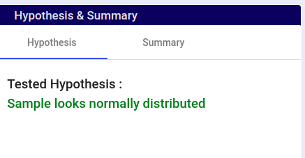
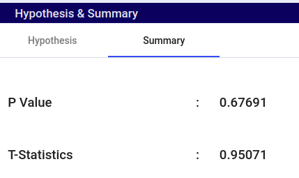
The Shapiro-Wilk test is a useful tool for determining the normality of a data set, which is a crucial assumption in many statistical analyses. It provides a clear decision-making process based on the p-value derived from the T-statistic.
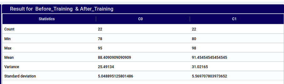
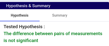
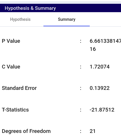
The paired Student’s t-test compares the means of two related groups to determine if there is a statistically significant difference. It is used when the same subjects are measured before and after a treatment or in matched pairs. The test calculates the difference between paired observations, then computes the mean and standard deviation of these differences to determine the t-statistic. If the p-value is less than a chosen significance level (e.g., 0.05), the null hypothesis (no difference) is rejected, indicating a significant difference between the means.
This won’t display the Histogram-Density Plot and T-distribution.
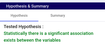
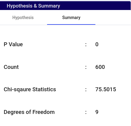
The Chi Square test is a statistical method used to determine whether there is a significant association between categorical variables. It compares the observed frequencies of categories with the expected frequencies if there were no association.
This won’t display the Histogram-Density Plot and T-distribution
SEDGE provides 192 transformation functions organized into seven categories.
Use transformations to create new columns, clean data, perform calculations,
and reshape your dataset.
Both Categorical and Numerical values are supported.
The new column created is a Categorical type.
Example:
append(temperature,'Deg C')astemp_with_unit
Assuming the temperature column is a numeric value, appending the string DegC
will append the text to the numerical value. Example 13.5 becomes 13.5DegC,
and the new column is a string.
ascii(): Returns the ASCII code of the first character of a string.
Syntax:
ascii(column)asascii_column
Note
Works for categorical columns.
Example:
ascii(name)asfirst_code
We have a categorical column Geography and we want to transform the variables
into numerical ASCII representation. We have variable France, Spain and
Germany and after the transformation we get results of 70, 83 and 71
as per the ASCII characters table.
if(): Conditional if-then-else function. Supports logical operators (and, or),
nested functions in conditions and values, and can be embedded inside arithmetic expressions.
Syntax:
if(condition,true_value,false_value)asif_column
Note
Condition format:columnoperatorvalue
Supported operators: >=, <=, >, <, ==, !=, =
Logical operators:and / or to combine multiple conditions.
Nested support: Functions can be used inside conditions and values.
Arithmetic embedding:if() can be used inside arithmetic expressions.
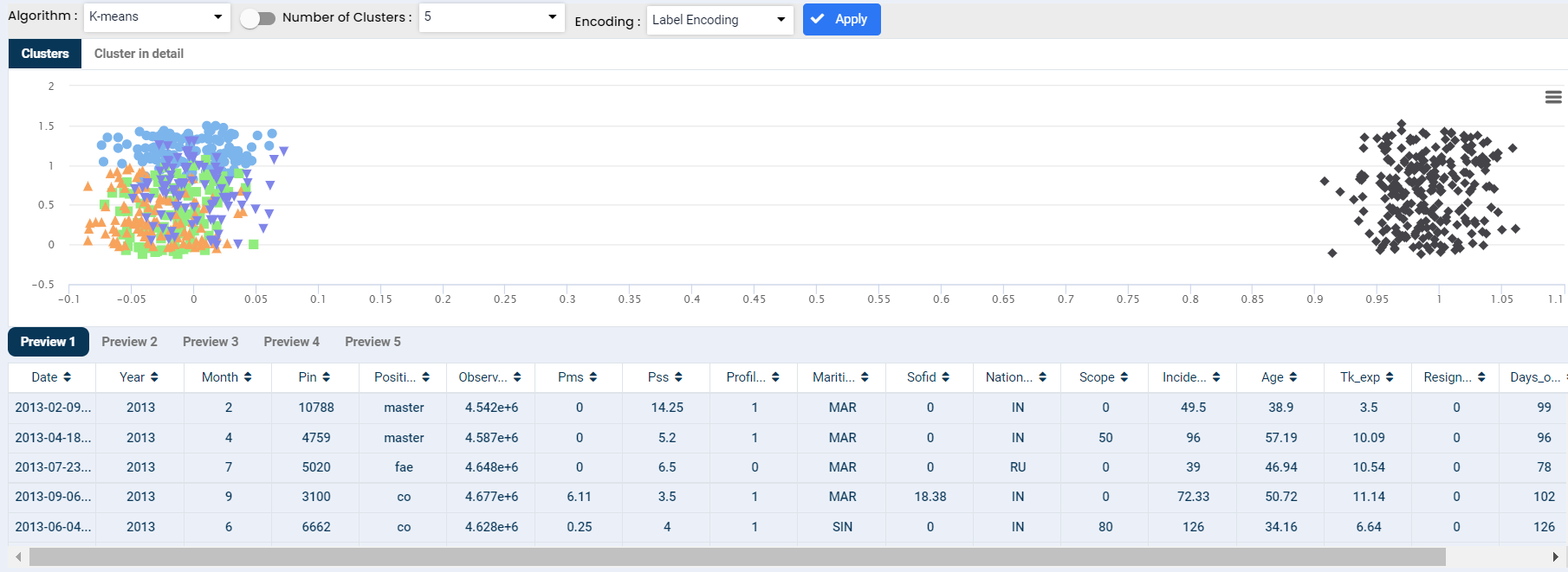
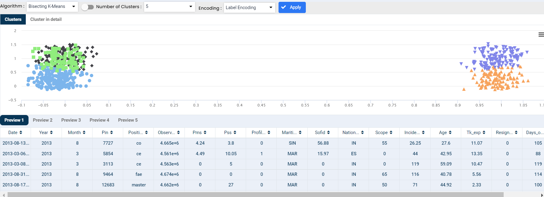
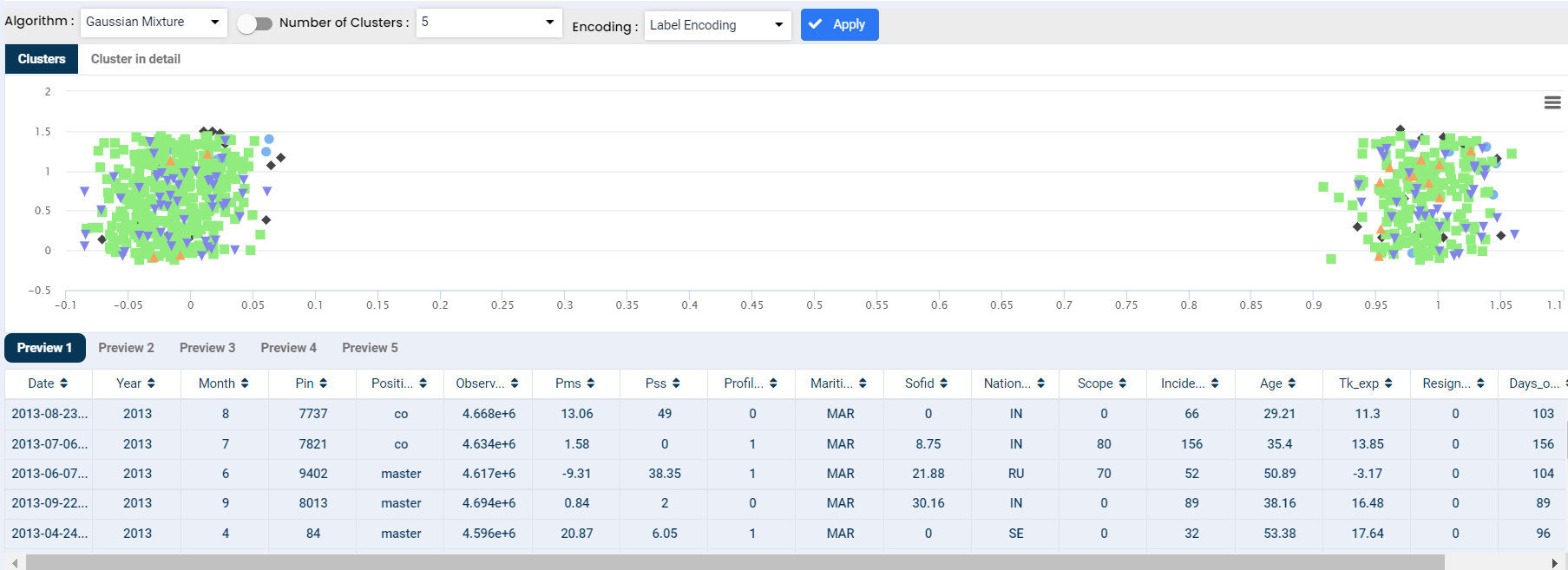
Cluster analysis is a technique to group similar observations into a number of clusters based on the observed values of several variables for each individual. It is an exploratory data analysis technique that allows us to analyze the multivariate data sets.
Bisecting K-Means is a hybrid approach of the K-Means algorithm to produce partitional/hierarchical clustering. It splits one cluster into two sub-clusters at each bisecting step (using k-means) until k clusters are obtained.
The Gaussian mixture model is defined as a clustering algorithm that is used to discover the underlying groups of data. Gaussian mixture models have a higher chance of finding the right number of clusters in the data compared to k-means.
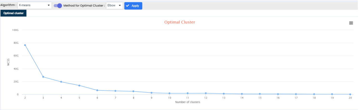
Elbow Method is an empirical method to find the optimal number of clusters for a dataset. In this method, we pick a range of candidate values of k, then apply K-Means clustering using each of the values of k. Find the average distance of each point in a cluster to its centroid, and represent it in a plot. Pick the value of k, where the average distance falls suddenly.
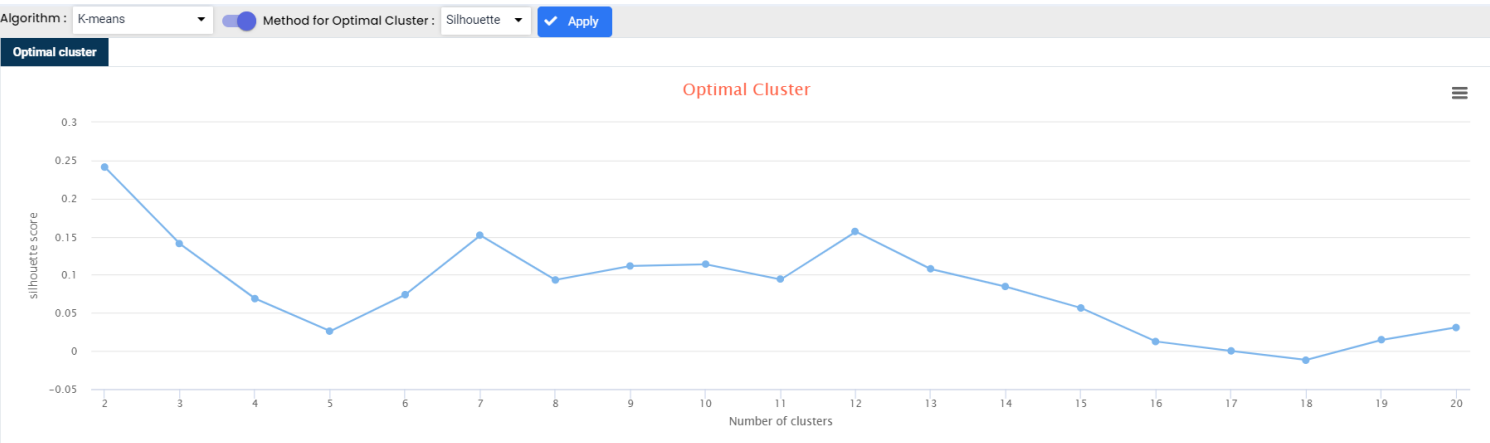
The silhouette Method is also a method to find the optimal number of clusters and interpretation and validation of consistency within clusters of data. The silhouette method computes silhouette coefficients of each point that measure how much a point is similar to its own cluster compared to other clusters. by providing a succinct graphical representation of how well each object has been classified.
Graphs are used to display large amounts of numerical data and to represent the relationships between numerical values of different variables. They can also be used to derive quantitative relationships between variables.
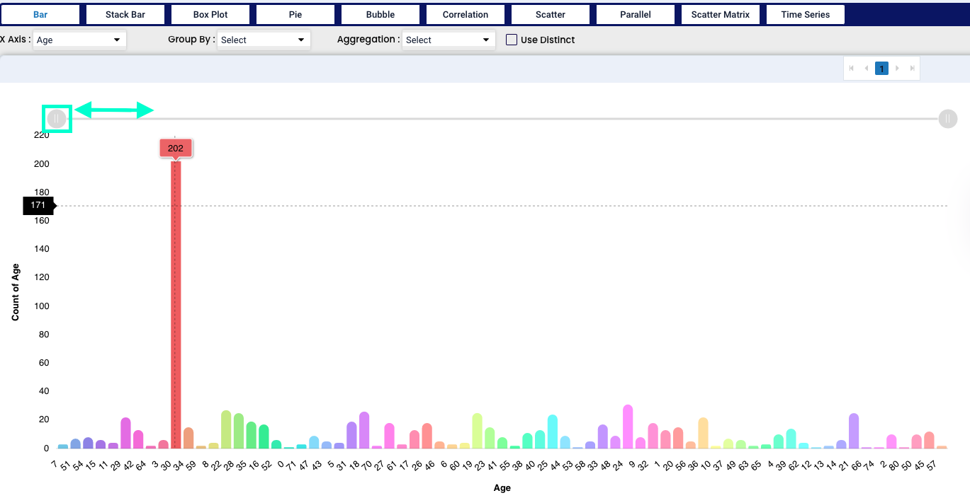
We have chosen age as an example for our bar chart. We can point our mouse at any part of the bar and the system will tell as which point we are currently standing - X axis tells us the location of our mouse and Y axis tells us the total count in the bar. Also we can zoom in or out by the grey tool in the upper part of the graph (highlighted in green).
“Group by” tool and “Aggregation” tool works with categorical values.
Note
We can also select the “Use Distinct” tool - which represents percentage of each category in the pie irrespective of the count in each category.
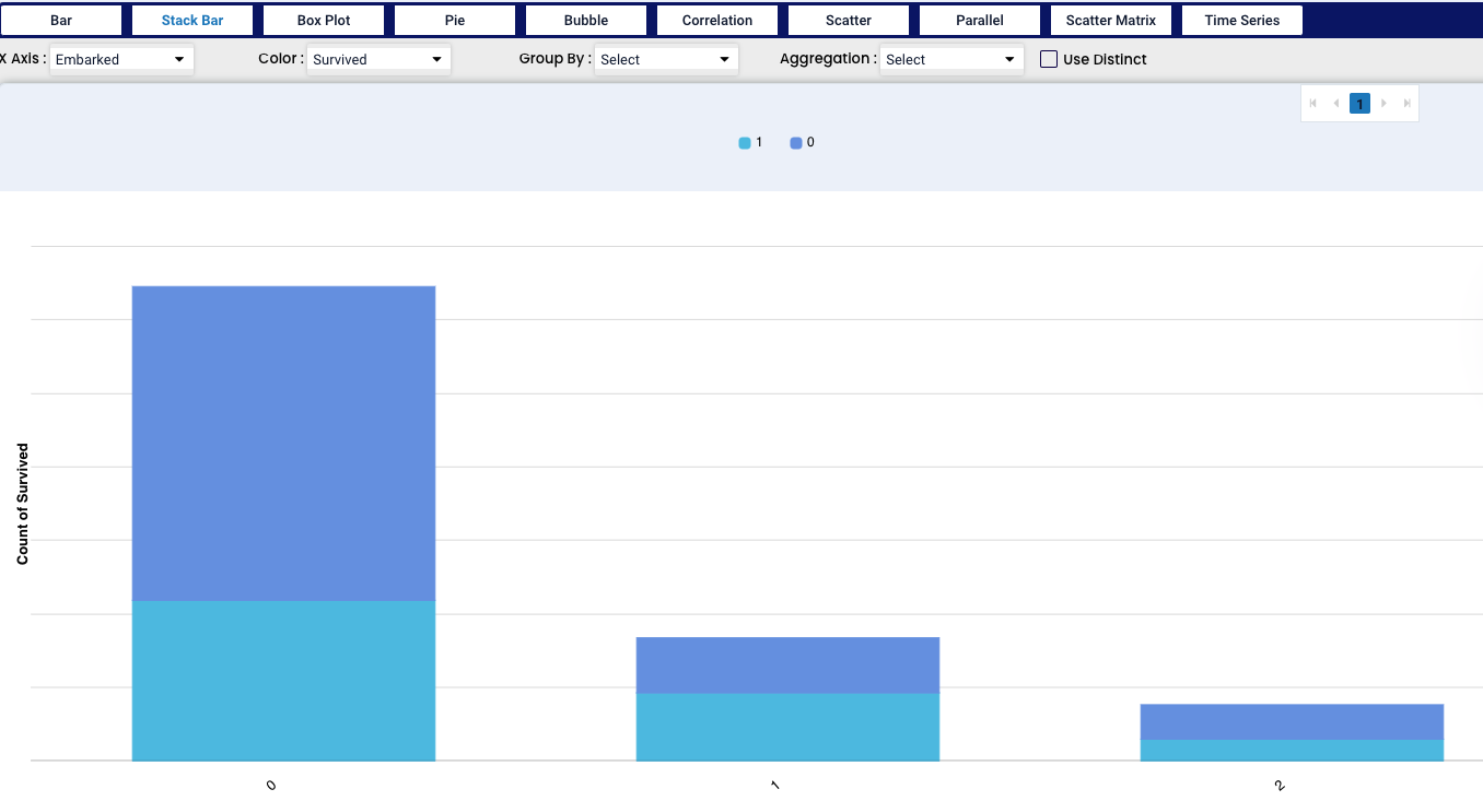
The stack bar chart extends the standard bar chart from looking at numeric values across one categorical variable to two, where each bar is divided into a number of sub-bars.
In this Stack Bar chart we have selected two factors - “port of embarkment” and “survived”. We can see that each port of embarkment - 0,1 and 2 is dived into two colours - 1 showing those who survived and 0 showing the opposite. By pointing the mouse on any section of the bar we can see the total number of cases in the group.
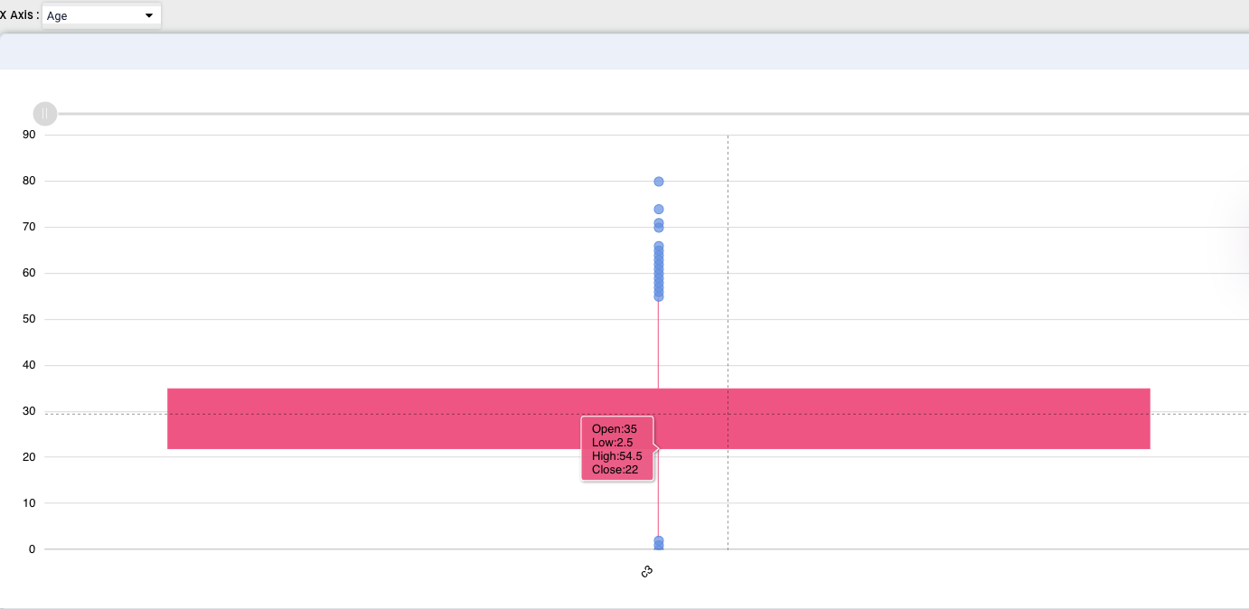
Box Plot graph depicts groups of numerical data through their quartiles. Box plots have also lines extending from the boxes (whiskers) indicating variability outside the upper and lower quartiles, these are the outlier values.
We used age as an example, we can see how mostly the age of passengers was in between 22 and 35 years, other values re represented as outliers. By pointing at the graph we can also see the Open, Low, High and Close values.
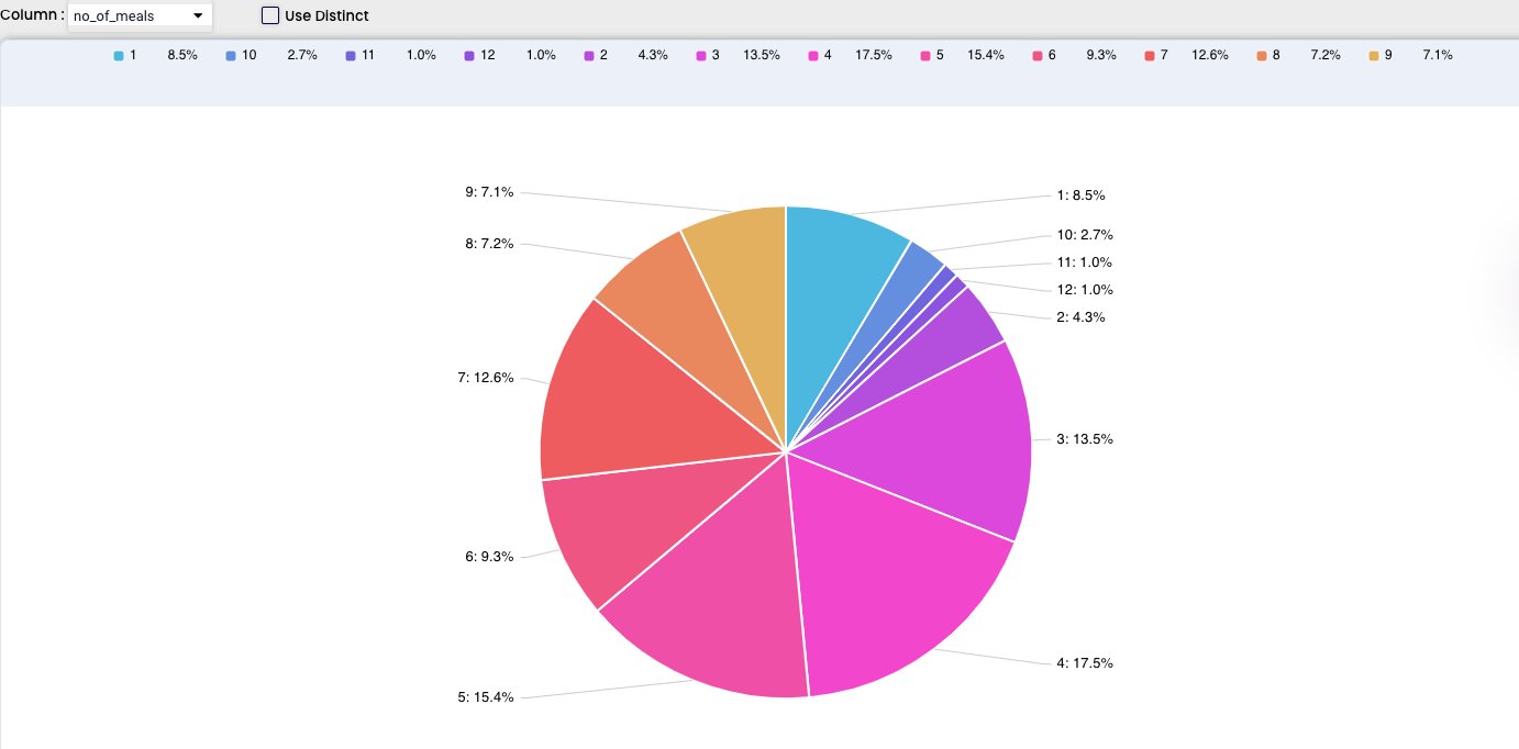
Pie charts are beneficial in expressing data and information in terms of proportions. A pie chart is most effective when dealing with the collection of data. It is constructed by clustering all the required data into a circular constructed frame wherein the data are depicted in slices.
For our example we used the number of meals and we can see the number was between 1 and 9, each part of the pie is also represented by the percentage and after pointing at each section we can also see the total number of cases
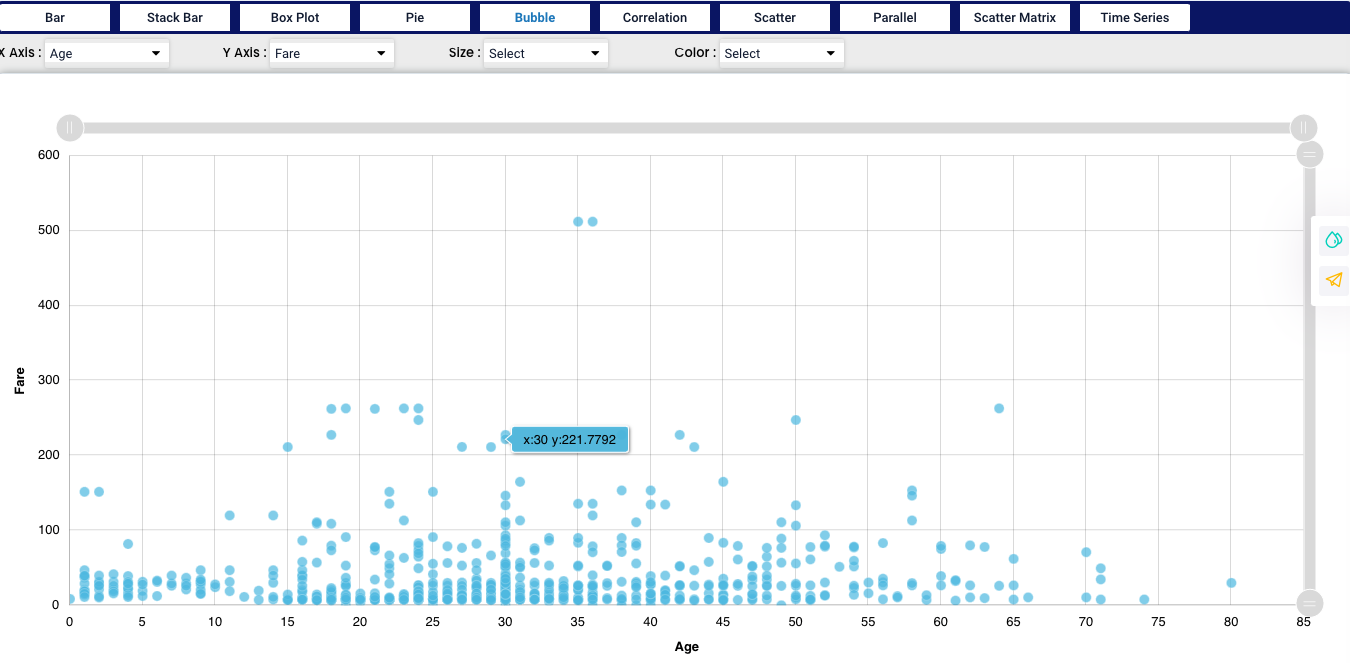
A bubble chart is a type of chart that displays three dimensions of data. Each entity with its triplet of associated data is plotted as a disk that expresses two of the vᵢ values through the disk’s xy location and the third through its size.
We used Age and Fare for our example and we can now see how the values are spread in the graph.
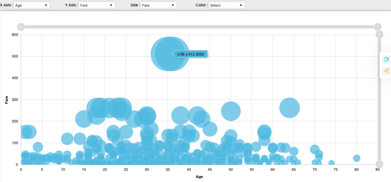
We can also add another factor in our chart, which represents the “Size” - we selected “Fare” and after that we can see the bubbles size is corresponding with the increasing fare.
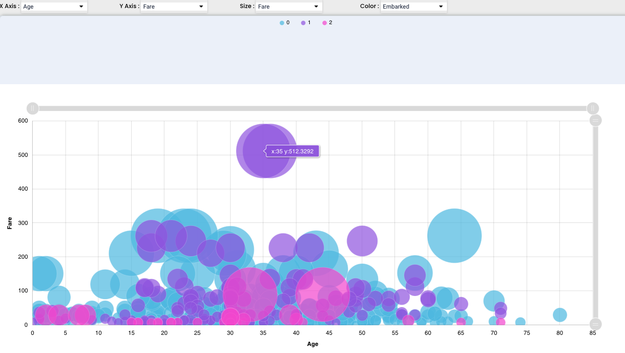
We have another feature that can help us represent the values effectively - we can add another factor and represent it in colour, in our case we have added “Embarkment point” so we can see the results also differentiated by the point of embarkment
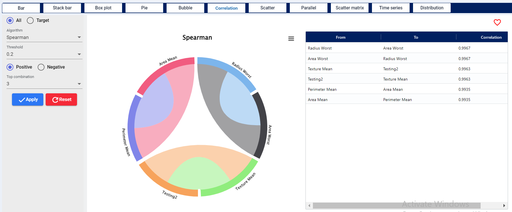
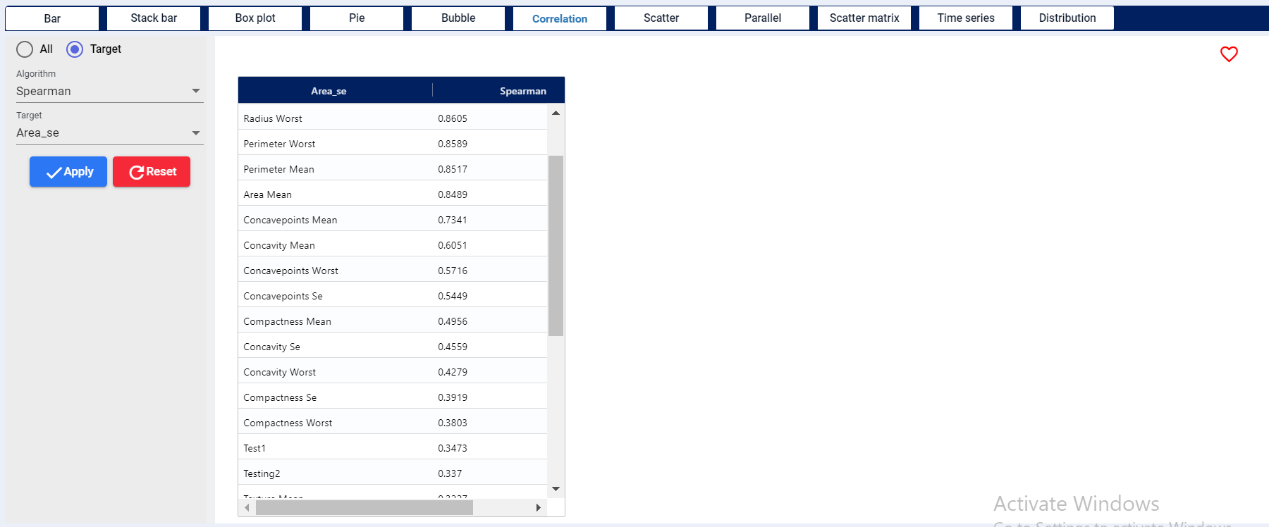
The depiction address each numerical variable’s correlation against all other variables. Bigger the connection better the correlation between the variables.
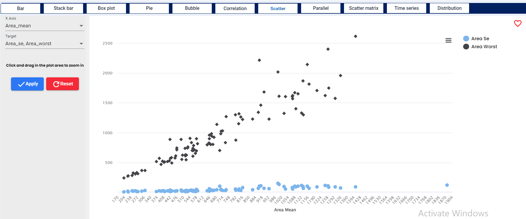
Scatter graph uses dots to represent values for two different numeric variables. The position of each dot on the horizontal and vertical axis indicates values for an individual data point. Scatter plots are used to observe relationships between variables.
For our demonstration we have used three different numerical variables - Age as the target on X axis and Fare and Total meal cost on the Y axis. We can even add more numerical variables and all will be displayed in one chart.
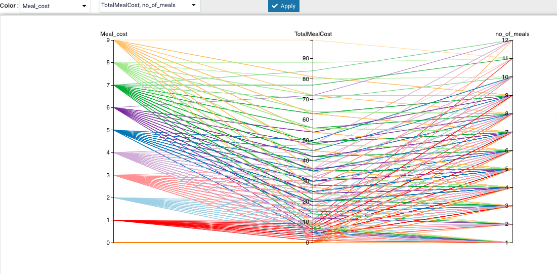
Parallel coordinates are a common way of visualising and analysing high-dimensional datasets. It is applied to data where the axes do not correspond to points in time, and therefore do not have a natural order.
In multivariate statistics and probability theory, the scatter matrix is a statistic that is used to make estimates of the covariance matrix, for instance of the multivariate normal distribution.
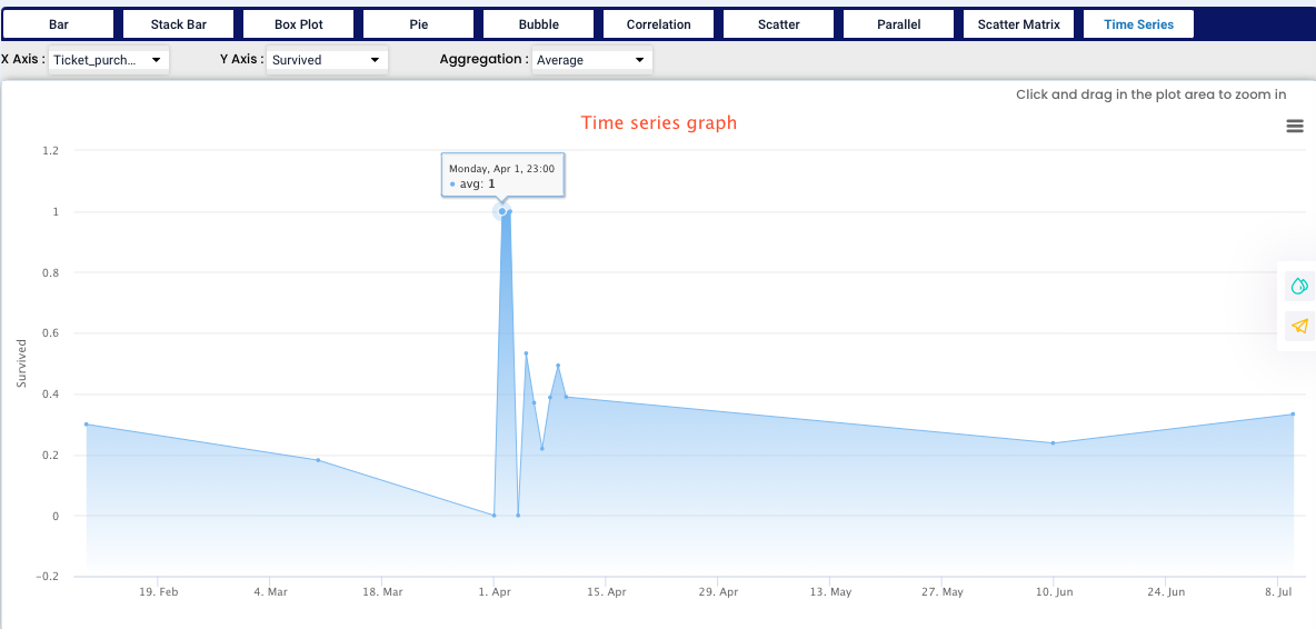
On the X axis we need to use a date variable, in our case “Ticket purchase” and on the Y axis we used “Survived”, for aggregation we have selected Average value (we have also option of Count, Sum, Average, Minimum, Maximum, Median, Standard Deviation and Variance). From our graph we can see, that everybody who purchased the ticket on April 1st survived.
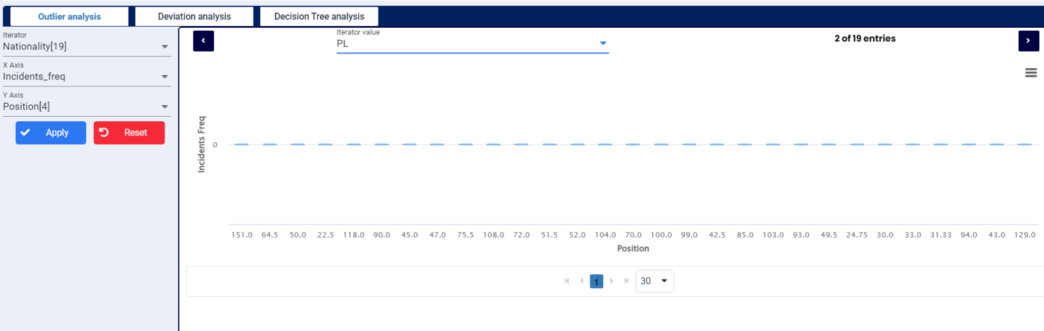
Outlier analysis is the process of identifying outliers, or abnormal observations, in a dataset. Also known as outlier detection, it’s an important step in data analysis, as it removes erroneous or inaccurate observations which might otherwise skew conclusions.
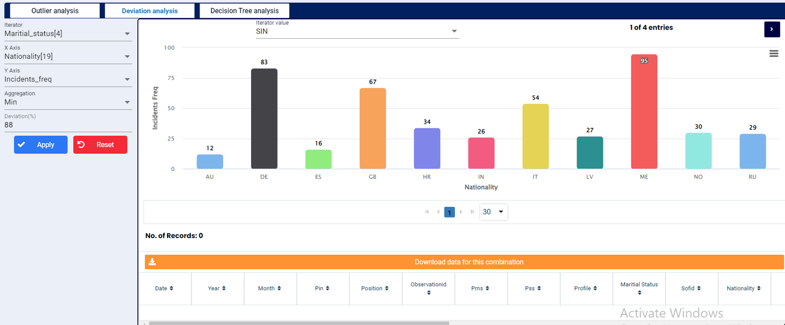
The measurement of the absolute difference between any one number in a set and the mean of the set. Deviation analysis can be used to determine how a specification will behave in the face of such deviations.
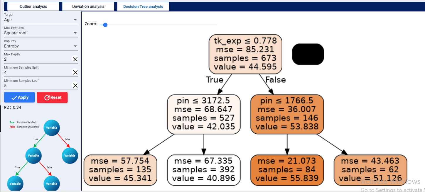
Decision tree analysis is the process of drawing a decision tree, which is a graphic representation of various alternative solutions that are available to solve a given problem, in order to determine the most effective courses of action. Decision trees are comprised of nodes and branches. Nodes represent a test on an attribute and branches represent potential alternative outcomes.
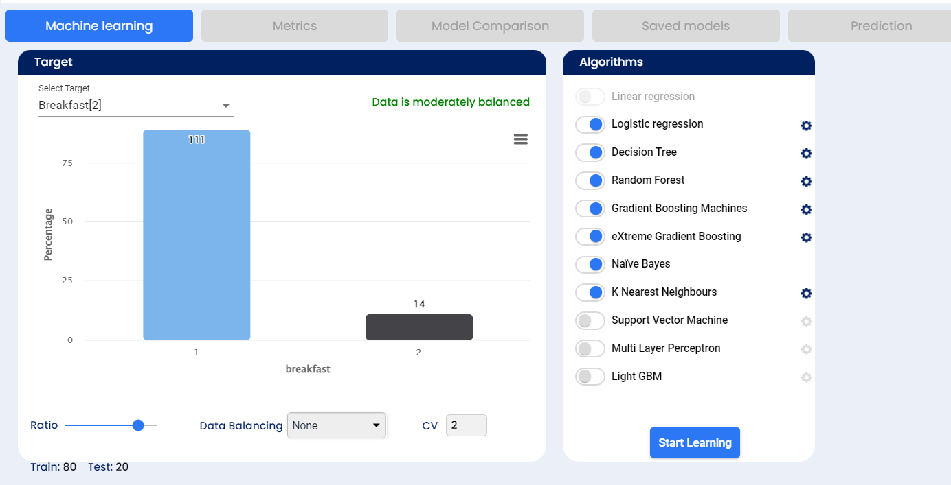
After completing our data manipulation and graphical analysis, we can move to the last part, which is the Predictive Analytics. In the “Statistics” part, you need to select all the columns that are important for your research and ignore those that have small or no relation to the target. From the beginning our target for the research is the “Survived” field. Very important step in this research was to convert the field “Survived” from “Numerical” to “Categorical” type, as keeping it as “Numerical” will result in very low accuracy.
Balancing
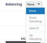
In following step we can choose the type of balancing - “None”, “Down sampling”, “SMOTE” or “Up sampling” - in our example we selected “None”. Sampling is used to resolve class imbalance, because the imbalance in the observed classes might negatively impact our model. Machine learning algorithms have trouble learning when one class dominates the other so the balancing of data helps us avoid these problems.
None - no sampling of data performed, data stays as it is the dataset.
Down Sampling - the system will randomly subset all the classes in the data set so that their class frequencies match the least common class
SMOTE - Synthetic Minority Over sampling Technique - this technique synthesises a new minority instances between already existing minority instances
Up Sampling - the system will randomly sample and replace the minority class to be the same size as the majority class
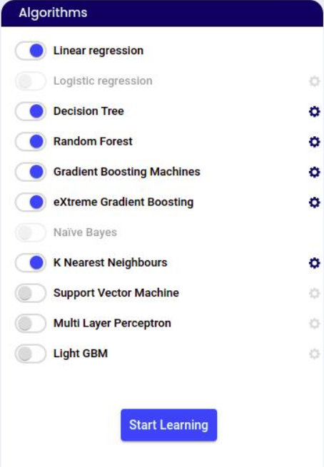
Next step is to select which algorithms should be used, the ratio (default is 80:20 - which means 80% of the sample is used for training and 20% is used for cross validation) and cross validation number (in how many groups the cross validation sample should be split into) and then click on the “Start learning” button and the system will run these algorithms.
Decision Trees are a type of Supervised Machine Learning where the data is continuously split according to a certain parameter. The tree can be explained by two entities, namely decision nodes, and leaves.
The random forest is a classification algorithm consisting of many decisions trees. It is an ensemble method that is better than a single decision tree as it reduces over-fitting by averaging the result. It uses bagging and feature randomness when building each individual tree to try to create an uncorrelated forest of trees whose prediction by the committee is more accurate than that of any individual tree.
eXtreme Gradient Boosting or XGBoost is another popular boosting algorithm. In fact, XGBoost is simply an improvised version of the GBM algorithm! The working procedure of XGBoost is the same as GBM. The trees in XGBoost are built sequentially. XGBoost also includes a variety of regularization techniques that reduce overfitting and improve overall performance.
The Naive Bayes is a classification algorithm that is suitable for binary and multiclass classification. Naïve Bayes performs well in cases of categorical input variables compared to numerical variables. It is useful for making predictions and forecasting data based on historical results.
KNN is a non-parametric method used for classification. It is one of the best-known classification algorithms in that known data are arranged in a space defined by the selected features. When new data is supplied to the algorithm, the algorithm will compare the classes of the k closest data to determine the class of the new data.
Support vector machine algorithm helps to find a hyperplane in N-dimensional space(N — the number of features) that distinctly classifies the data points.
A multilayer perceptron (MLP) is a feedforward artificial neural network that generates a set of outputs from a set of inputs. An MLP is characterized by several layers of input nodes connected as a directed graph between the input and output layers.
Light Gradient Boosted Machine, or LightGBM for short, is an open-source library that provides an efficient and effective implementation of the gradient boosting algorithm. It can be used for data having more than 10,000+ rows. No fixed threshold helps in deciding the usage of LightGBM. It can be used for large volumes of data especially when one needs to achieve high accuracy.
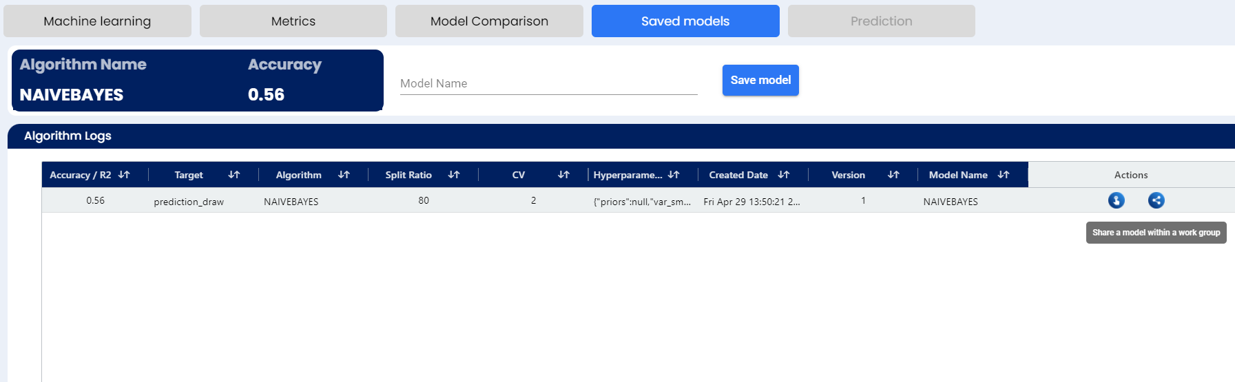
We can see the status of each algorithm, some of these are more complicated and will take more time. After all are at 100% of completion, the algorithms are sorted by their accuracy.
In our case, we can see 7 algorithms were used.
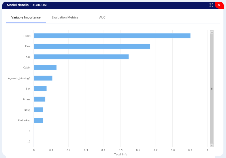
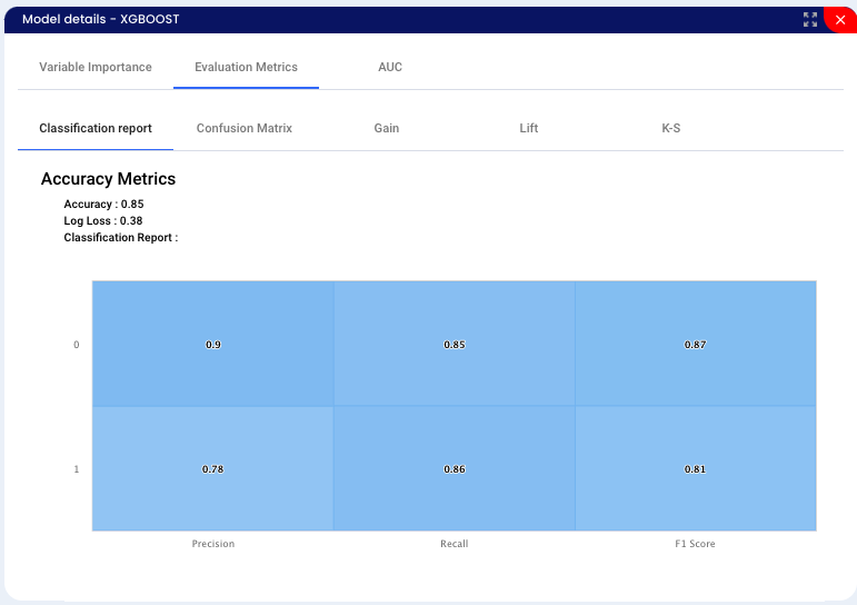
XGBOOST - decision-tree-based ensemble Machine Learning algorithm that uses a gradient boosting framework - with this algorithm we got an accuracy of 85%.
Decision tree
GBM - Gradient boosting
Random forest
Logistic regression
Naive Bayes
KNN - K nearest neighbors
We can also see further details of the algorithm - after clicking on the “Metrices” button.
Classification report is used to measure the quality of predictions from a classification algorithm. The metrics are calculated by using true and false positives, true and false negatives.
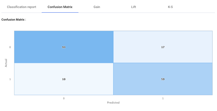
Confusion matrix, also known as an error matrix, is a specific table layout that allows visualisation of the performance of an algorithm. It shows the “True Positives”, “True Negatives”, “False positives” and “False Negatives”.
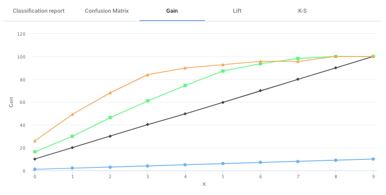
Cumulative Gain charts are used for visually measuring the effectiveness of classification model and a very popular metrics in predictive analytics. Gain charts measures the performance for a proportion of the population data. It is calculated as the ratio between the results obtained without model (random line) or with the model (the model line). The greater the area between these two line the better the model is. The Y-axis shows the target data and the X-axis shows the percentage of the population.
In the image in the Gain Charts, the black line is the random line, and the green and orange Line is results based on the model for the two classes. From the figure above it can be see that orange class model has performed better than the green model, and both the line has performed better than the random line (black).
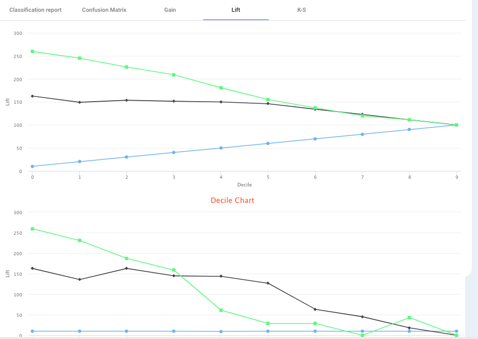
Lift charts are used for visually measuring the effectiveness of classification model and also a popular metrics in predictive analytics.
Lift Charts shows the actual lift. The lift curve is determined by measuring the ratio between the result predicted by model and the result using no model. A lift chart graphically represents the improvement that a model has when compared against a random guess, and it measures the change in terms of a lift score. A model can be determined which is best, by comparing the lift scores. A lift chart shows the point at which the model’s predictions are strong and when it become weak (less useful).
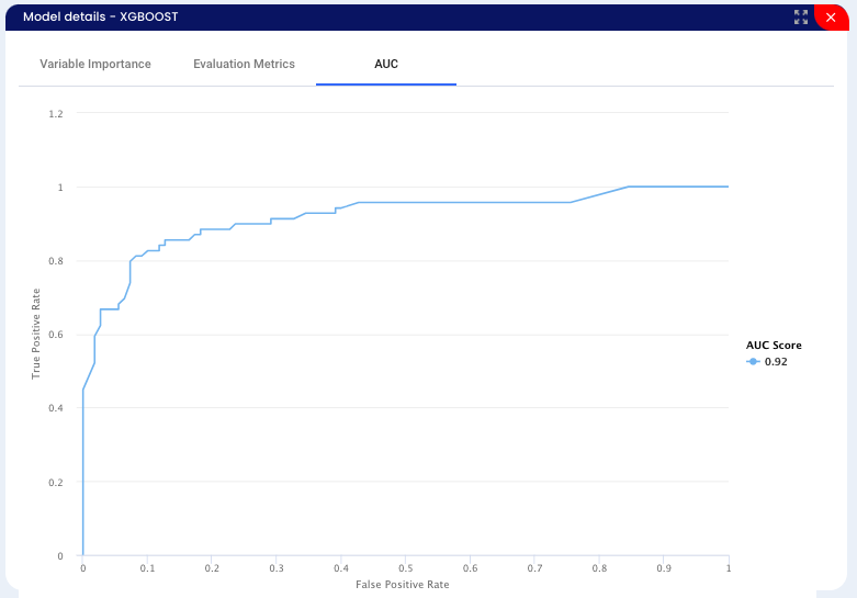
On the Y axis we can see the True Positive Rate - samples that were evaluated correctly, on the X axis we can see the False Positive Rate - samples evaluated incorrectly. When we plot each of the results, we get the ROC curve. We evaluate the AUC - area under the ROC - if the value is near to zero, the selected model is not classifying correctly. If the value is near to 1, the selected model is classifying correctly. In our case the number is 0.92.
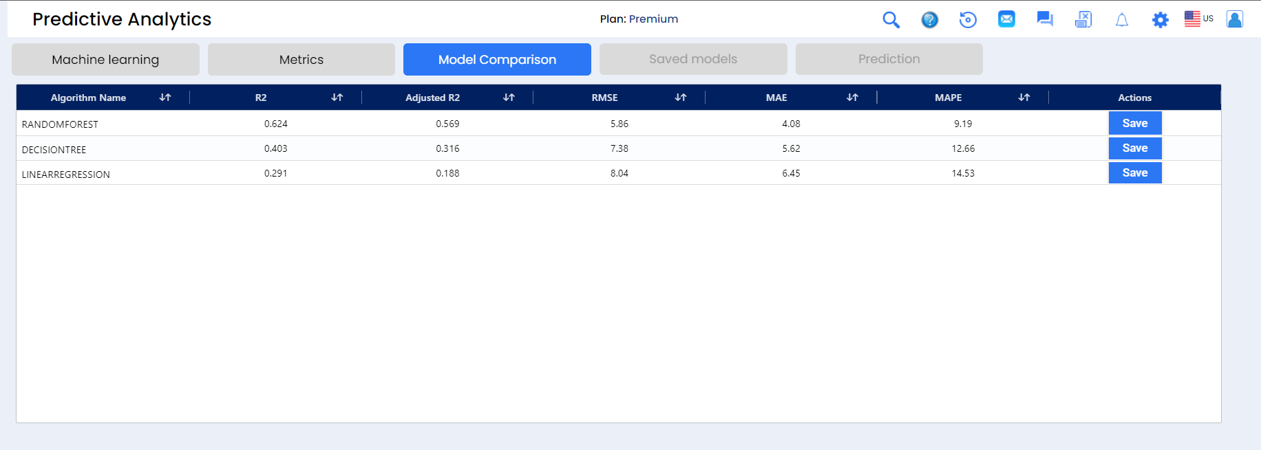
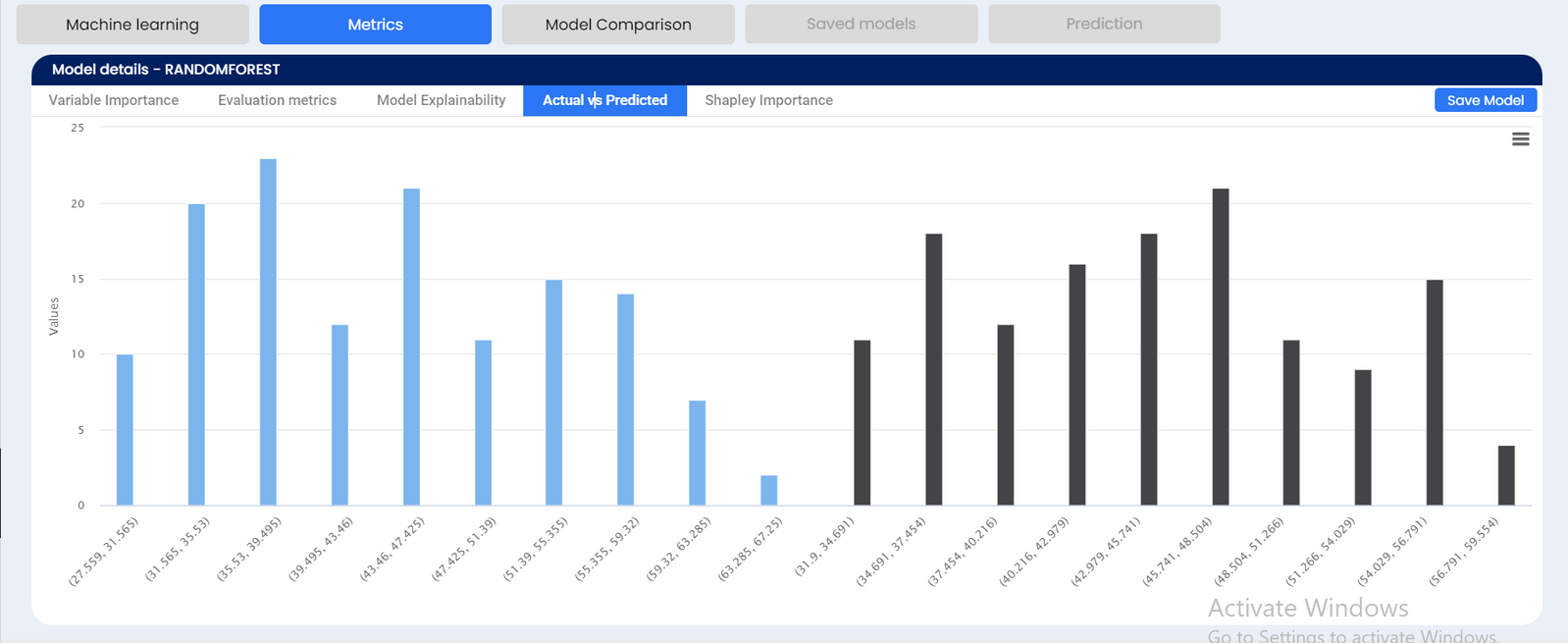
The SEDGE application now allows data analysts to review and compare models by MAPE (mean absolute percentage error), RMSE (root mean square error), MSE (mean squared error), MAE (mean absolute error), and MLCH. This allows the analyst to save and test models for greatest accuracy.
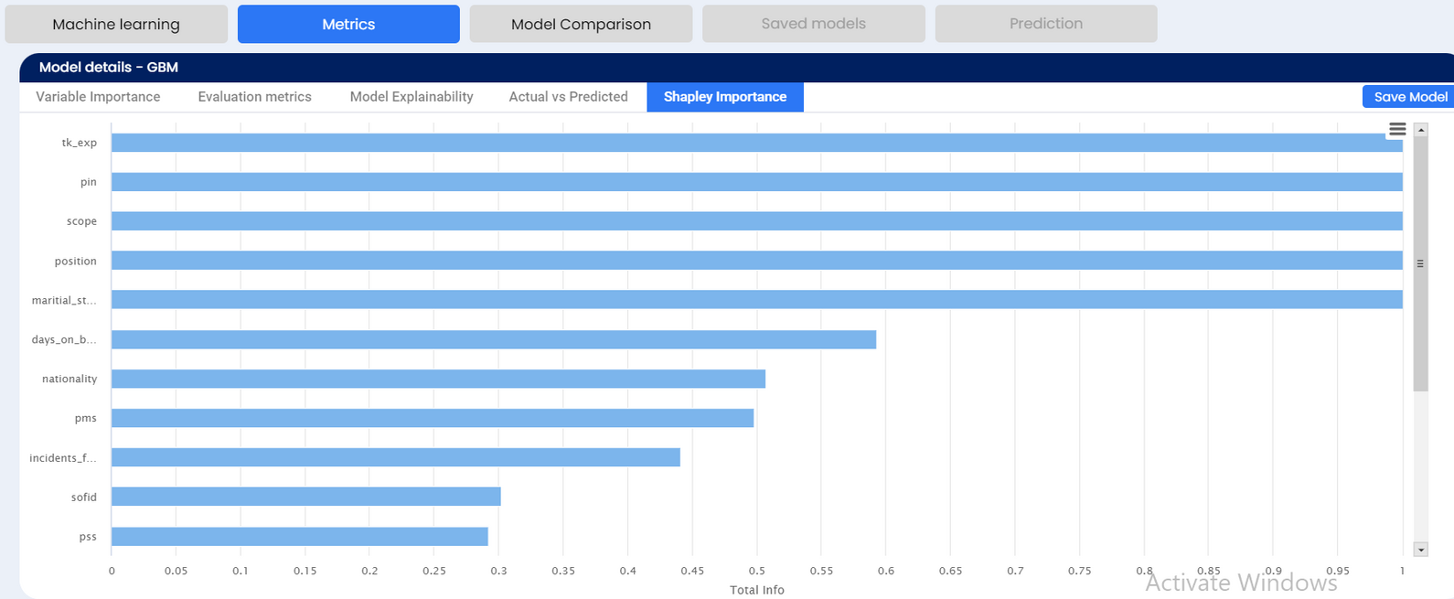
SHAP or Shapley Additive exPlanations is a visualization technique that can be used for making a machine learning model more explainable by visualizing its output. It can be used for explaining the prediction of any model by computing the contribution of each feature to the prediction. If the SHAP value is much closer to zero, we can say that the data point contributes very little to predictions. If the SHAP value is a strong positive or strong negative value, we can say that the data point greatly contributes to predicting the positive or negative class.


.png)
.png)